Wheatley Ranch
Establishing a new heritage chocolate brand.
Designhouse was commissioned to develop an identity and packaging for a new American chocolate brand.
The challenge was to develop an identity that would stand out as a unique new brand when displayed alongside established, high-profile chocolate like Hersheys and Mars.
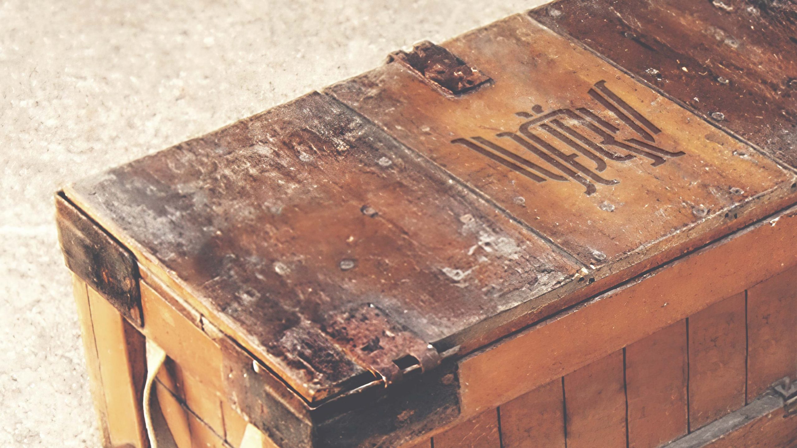
The logotype was inspired by the tools used by ranchers for hot branding, with two fonts customised to reflect the uniqueness of the brand. The Wheatley Ranch monogram references the ornate American fonts of the 19th Century, while the second font introduces a more contemporary feel. The use of the monogram reinforces the connection to pride and passion by physically branding the chocolate and packaging.
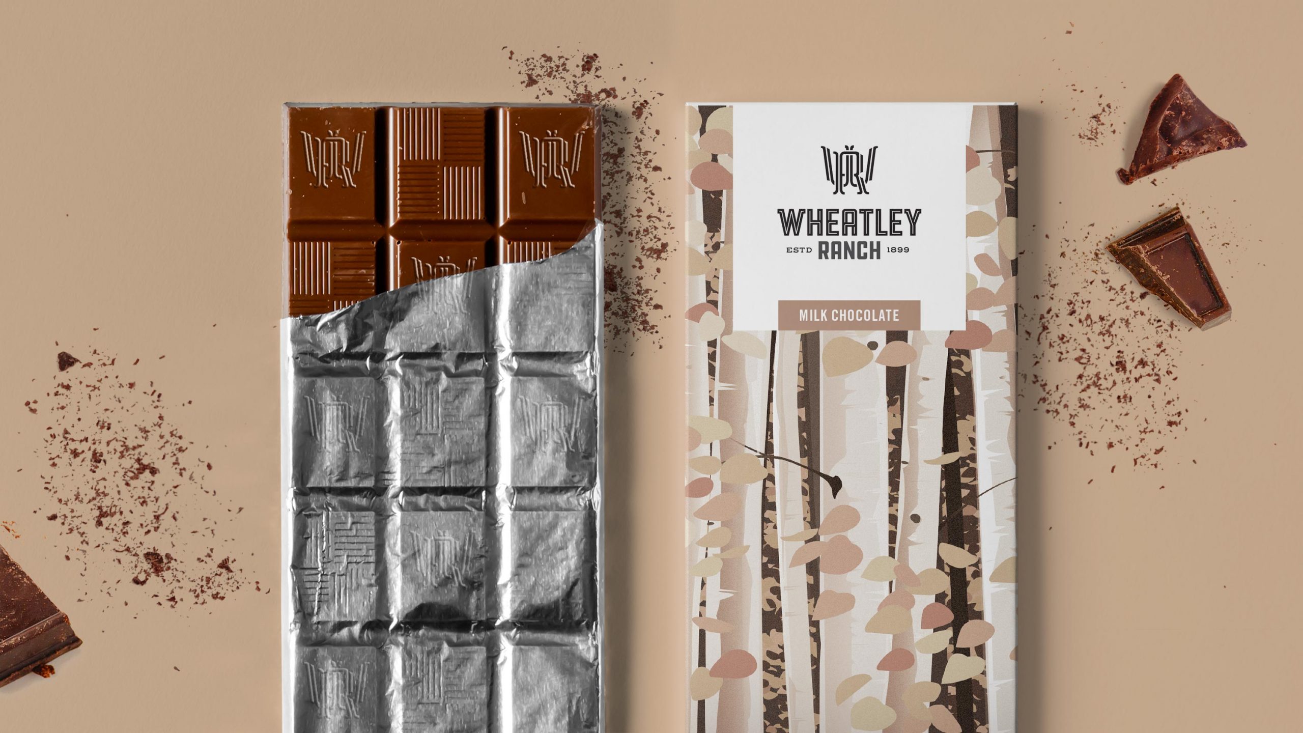
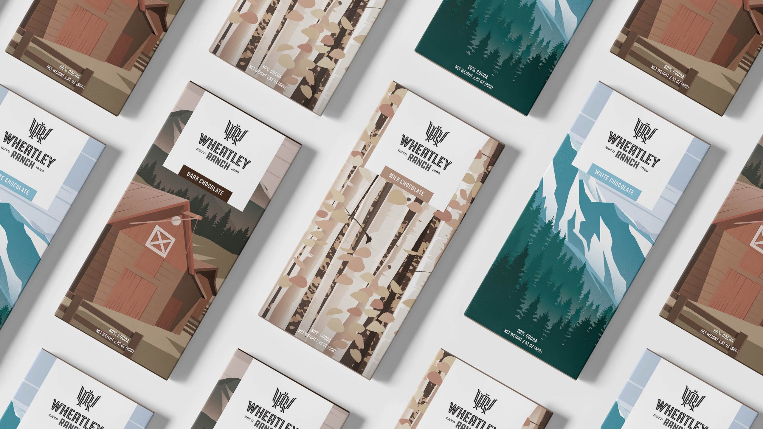
For the launch, three different creative treatments were developed for dark, milk and white chocolate packaging, using a muted, natural colour palette to create nostalgic graphic illustrations of the Colorado landscape and Wheatley Ranch.
