EMCOR UK
A new strategic brand purpose to support sustainable and ethical growth, leading to £190m acquisition.
The business challenge
EMCOR UK are leaders in the facilities services outsourcing market. They generate a turn over of £240 million annually and have 4,000 employees across 14 different services. They are fully owned by the US Fortune 500 group, EMCOR Group Inc.
After 60 years of trading, the vision, values and brand strategy needed updating for employees, customers and stakeholders.
Our brief was to deliver a new strategic brand proposition. One that truly reflected organisations’ unique collaborative, human-centric culture.
Therefore, a vision that reflected Emcor UK's sustainable and ethical approach, was required. And that required a deep dive into what Emcor UK was really all about.
Approach
Over four months, we interviewed staff, customers, supply-chain partners and industry influencers. And, we ran a series of brand strategy workshops and an all-staff survey.
As a result we garnered a comprehensive set of insights that underpin a new strategic brand proposition. The insights led to a refreshed brand model. The model now reflects the firm’s culture. And it acts as a powerful enabler of EMCOR UK’s ambitions.
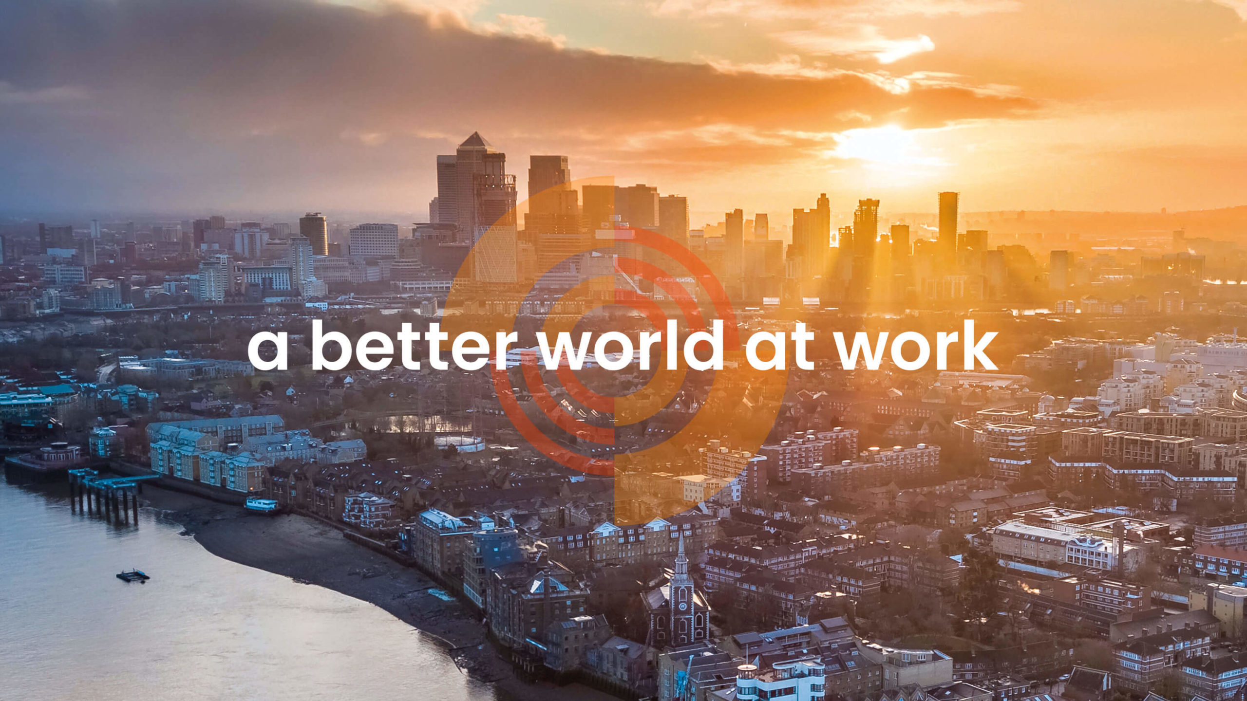
The new brand proposition includes a reimagined vision: ‘A better world at work’.
Moreover, we simplified the brand hierarchy, refining the model from 14 different services into four relatable and memorable service propositions:
- experience
- create
- enhance
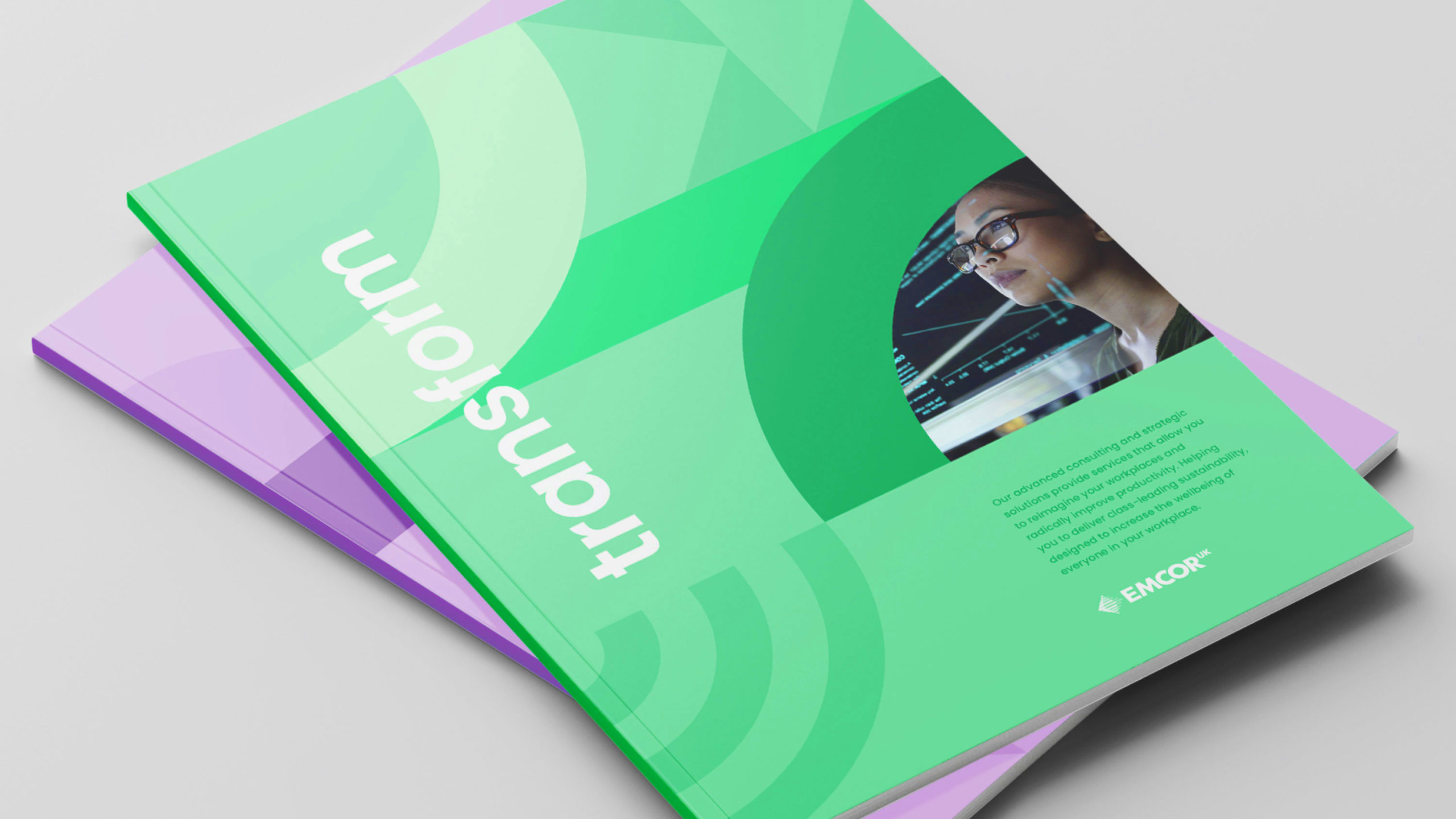
- transform
As we usually do, we collaborated closely with the UK executive board and the US team. In this was we ensure buy-in from all internal stakeholders.
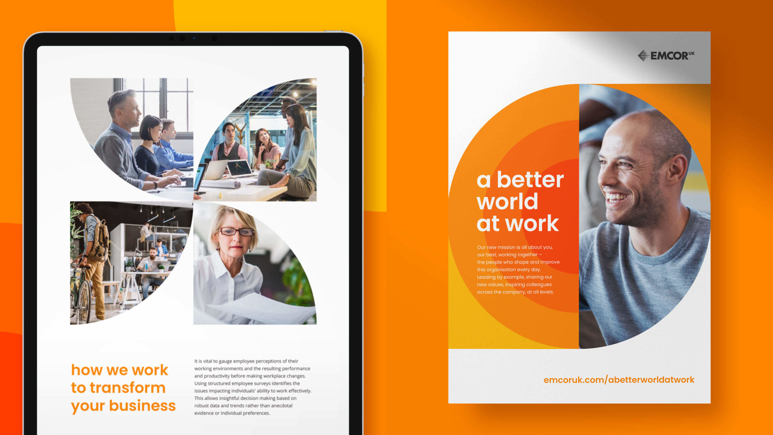
The “A better world at work” vision statement is brought to life with both a vibrant new colour palette and a new graphic style.
Orange replaces teal blue, symbolising a new dawn and progression.
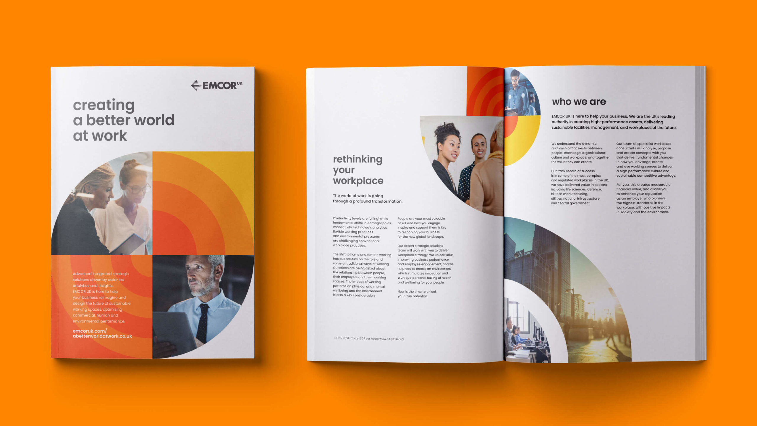
In addition, the ring graphic concept reflects the world, as well as the O of EMCOR UK. Based on a circle, the graphic style allows for rich and diverse communications. Semi-circles and quadrants lend themselves to infographics and iconography as well as interesting crops of photography.
Finally, the new soft, rounded typeface is empathetic and approachable. It is used with lower case headlines, hero messaging and infographics to improve communications.
Outcomes
Another key point is the refreshed logo, with a simplified diamond formation and refined wordmark. It is clean, modern and bright, reflecting the updated brand values.
Additionally, the "UK" element now sits top right as superscript. This makes it easier to reproduce and apply as a lockup.
The four new service propositions are given personality. Which is why each has their own complementary colour palette and iconography.
For the internal launch, we created a video and supporting digital and printed materials. And this campaign material introduced the new brand purpose and strategy to employees.
The new brand identity was introduced in a controlled roll-out. We created updates to brochures, website, document templates and social media platforms.
Profitability increased from an average net profit margin of 3% in the five years to 2020, to more than 5% in the five years post the rebrand.
Subsequently, in 2025, EMCOR UK was acquired by US facilities management firm OCS Group, for £190 million. This represented a healthy EBIT multiple of 8.8%.