2025 Brand Glow-ups and Blow-ups
The Year Digital-First Design Became Non-Negotiable
2025 marked a turning point – the world’s most valuable brands stopped designing for print and started designing for screens. The evidence is clear in the work, and more importantly, in the results.
- 30% of stock market value for S&P 500 companies is driven by brand strength (The Economist)
- 40%+ of a company’s market cap comes from brand and reputation, according to 60% of CEOs. (World Economic Forum)
- 56% higher total returns and 32% more shareholder return come from strong-reputation brands (McKinsey & Company).
Play with your brand equity at your balance sheet peril (yes, we’re looking at you Cracker Barrel and HBO Max)
So who were the winners and losers in the rebrands, evolutions, make-overs and muck ups of the year? We’ve listed a few below, and identified the three strategic trends that have defined 2025…
Trend 1: The Gradient Shift, Signalling Adaptability in Static Logos
Google, Microsoft, TDK Electronics, and Eventbrite all introduced gradient colour systems where solid blocks previously existed
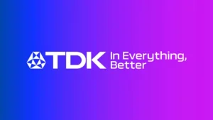 |
TDK logo redesign, before and after
Microsoft’s Jon Friedman explicitly connected this shift to AI and “how AI is shifting the discipline of design.” Gradients signal continuous transformation and adaptability, critical messages when your market perceives change as the only constant. TDK’s gradient, developed by Interbrand “symbolizes TDK Transformation,” directly tying visual evolution to business strategy.
![]()
the evolution of MS icons
These aren’t aesthetic choices, they’re positioning statements that communicate organisational agility with innovation to secure ROI.
Trend 2: Screen-Native Design (The Death of Print-First Thinking)
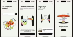
Rounded corners replaced sharp edges across Microsoft Office, Walmart‘s spark motif, and Bentley’s winged B. Lufthansa Group removed its circular frame entirely. Amazon‘s rebrand by Koto prioritized “digital-first” colour saturation for Prime.
 |
Simpler shapes, sharper, brighter colours all features of 2025 most successful brand redesigns
With Microsoft alone serving 400+ million Office users daily on screens, legibility at small sizes became business-critical. The Word icon dropped from four rectangles to three specifically to “reduce visual noise”, a direct response to mobile-first usage patterns.
Brands that haven’t optimized for 20px favicon displays and notification icons are actively losing recognition in the environments where engagement happens.
Trend 3: Vibrant Colour Recalibration: Standing Out in Saturated Digital Feeds
Eventbrite introduced “highlighter neons,” Alpen moved from heritage muted tones to “creams, blues and greens designed to bring vitality,” Amazon standardized “Smile Orange” after years of iterating sub brands with different colours, type fonts and inconsistent shades. And Walmart’s “spark” motif logo and yellow and blue palette were designed to be bolder and brighter than the 2008 iteration while remaining largely similar.
 |
||
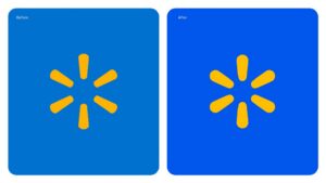 |
Eventbrite’s neons, Alpen’s colour glow-up, Walmart’s subtle evolution, with more vibrant blues and yellows
In algorithmically-curated feeds where users scroll past 300+ posts daily, colour becomes the primary stopping mechanism. Brands competing for attention needed saturation levels that registered on backlit screens, not just printed packaging.
The Billion Dollar Cost of Brand Equity
Cracker Barrel demonstrated how not to mess with your brand logo this year:
- Removed 98-year heritage logo for generic wordmark
- Stock dropped 10% within days (-$200M value)
- Full reversal within weeks
![]()
original logo -> August 21 2025 rebrand -> August 27 2025 revert
And Cracker Barrel were not alone in what industry experts call the “corporate walk of shame”.
The HBO Max → Max → HBO Max debacle was roundly ridiculed and described as “the pinnacle of walking away from brand equity.” Having dropped the most recognisable and much loved brand element, HBO, two years ago, HBO has now been re-instated to the platform branding. The rebrand cost alone exceeded “what some streamers spend on content.”

Both brands confused modernisation with erasure. The strategic failure is the knowledge that 50+ years of consumer recognition has quantifiable value that vastly exceeds the cost of evolutionary refinement.
The New Brand Paradox: Instant Credibility Without Heritage
When Shell and Equinor needed branding for their North Sea joint venture, they faced the opposite problem: how to project 50 years of credibility on day one when entering a market where competitors were actively exiting.
The solution required encoding durability into every design decision, from the name (the A of Aberdeen + dura of durability) to the custom wordmark “deliberately designed to feel dense, as if carved out of granite.” Even the phonetics were strategic: spoken with a Scottish accent, the hard “D” softens to “Ajura,” balancing industrial authority with regional warmth.
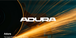
Instant authority, Adura, Shell and Equinor’s North Sea joint venture
Whether preserving existing equity or manufacturing instant credibility, strategic design must encode the business positioning into visual systems that communicate before words do.
Designing For Tomorrow’s Digital Context
The brand evolutions we’ve seen in 2025 are infrastructure investments responding to three measurable pressures:
- Mobile-first consumption: 60%+ of brand interactions now happen on screens under 6 inches
- Algorithmic distribution: Brands must optimize for feed-based discovery, not destination sites
- Global scalability: Multi-market operations demand systematic consistency over artisanal variation
The best redesigns came from creatives at Interbrand, Koto, Buck Design Ltd, BrandOpus, and our teams at Designhouse, all delivering work that prioritized systematic scalability over singular creative expression.
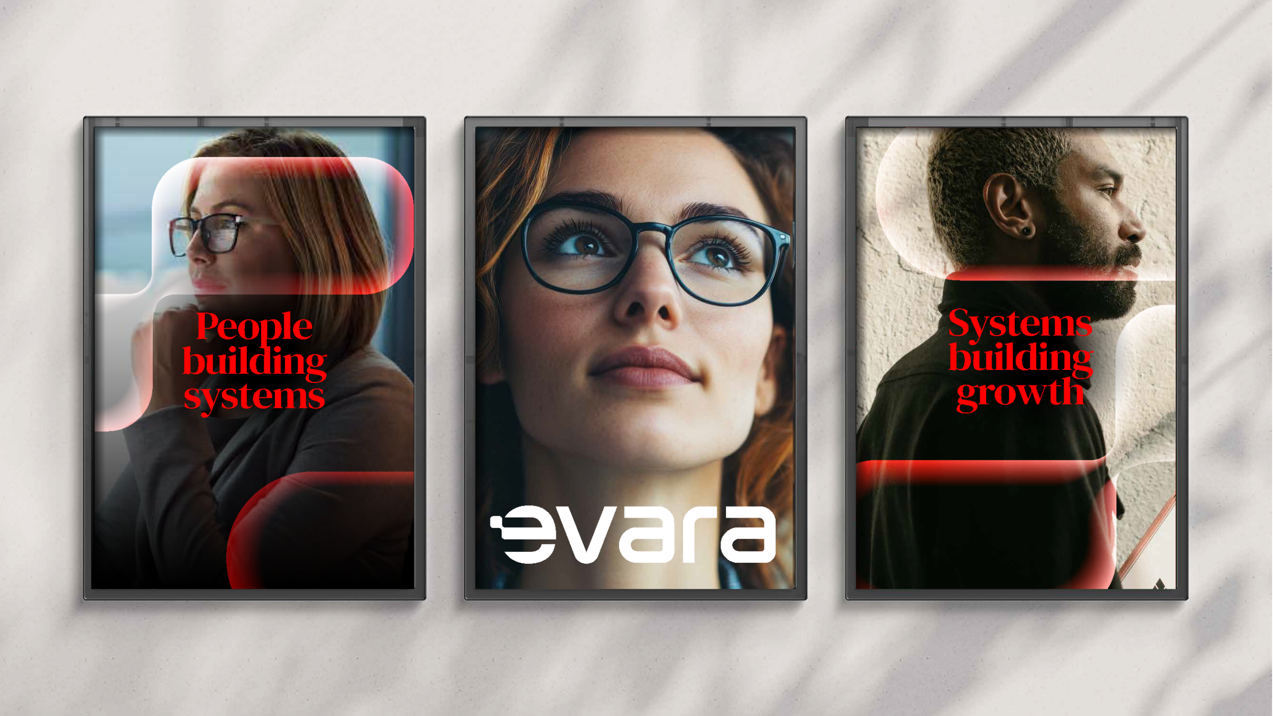
Whether unifying 50+ sub-brands (Amazon/Koto) or encoding instant credibility into new ventures (Adura/DesignHouse), the emphasis shifted from logo artistry to strategic systems thinking.
What This Means for B2B Brands in 2026
If your brand identity was designed before 2020, it likely optimizes for contexts that no longer drive business outcomes:
- Print collateral that sits in drawers
- Trade show booths visited by declining attendance
- Desktop-first websites losing traffic to mobile
The question isn’t whether to evolve, it’s whether to do so proactively or reactively after your competitors have already captured the positioning premium.
DesignHouse has created strategic brand transformations for global leaders across telecommunications, transport, energy, and consumer sectors for over 50 years. Based in London, we combine strategic rigor with design excellence to create identities that drive business outcomes.