ADURA, Brand Design for Shell and Equinor JV
Our brand design agency is proud to unveil Adura, a bold new name and brand for a new joint venture between Shell and Equinor.
Brand Design Background
Shell and Equinor formed an Independent Joint Venture (IJV) to consolidate their North Sea energy operations. They faced a critical brand design challenge. How to establish credibility for a newly formed entity in an industry where heritage and track record are paramount to stakeholder confidence?
We developed a brand identity to project authority, safety, stability, and scale.
Creating the Brand Design
The name Adura, combines the “A” of Aberdeen with the “dura” of durability. This reflects the solid enduring granite geology that forms Aberdeen’s foundation and the new company’s commitment to the North Sea’s long-term economic future.
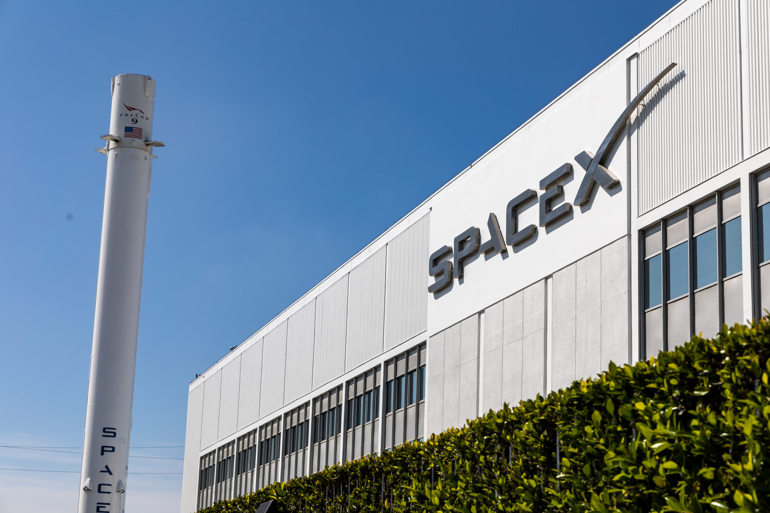
The visual identity works across extraordinary scale variations. From monolithic offshore oil rigs visible for miles at sea, to hard hats, safety equipment, digital favicons, and corporate communications. It speaks credibly to government regulators, reassures transitioning employees from two energy majors, and resonates with industry partners. As well as the Aberdeen community whose economy depends on North Sea operations.
Design Thinking
The Adura brand design system centres on a bold, confident logotype. As an established and experienced brand design agency we excel at creating custom-design logotypes. Adura balances industrial strength with modern precision. We compacted the letters deliberately to feel dense, to look rock solid, carved out of granite. Even the way the characters interlock reflects the name’s strength and resilience. Unlike its competitor brands, Adura has no brand icon, it stands strong, authoritative and confident.
Our wordmark employs geometric letterforms to suggest engineering excellence and structural integrity. These qualities are essential to offshore operations. The clean, contemporary character signals forward-looking capability.
In addition, Adura’s brand colour palette is inspired by the earthy tones of stratigraphy. A Scottish pulse of purple provides flashes of patriotic optimism and energy. This is in contrast to the competitor landscape, which is filled with blues (North Sea). Vivid and energetic colours are more typical brand palettes of the energy sector in general.
Brand Credibility
The identity successfully positions Adura as a credible player in the North Sea energy landscape. The visual language differentiates Adura within a crowded market of established players.
Few brand design agencies have the experience and skill to create a seriously strong brand design, for a serious infrastructure business built for long-term operations.
Read the press releases here
Designhouse has partnered with FTSE 250 companies and global enterprises for over 50 years, delivering strategic brand consultancy that creates measurable competitive advantage. If you’d like to discuss your brand challenges, we’d be glad to talk.