
£3 Billion Brand Built from Scratch
Naming strategy, visual identity and brand positioning for the Shell and Equinor North Sea joint venture, Adura. A brand credible enough to underpin a landmark £3 billion financing facility within months of launch.
The business challenge
In late 2024, Shell and Equinor formed an independent joint venture to consolidate their North Sea oil and gas assets, creating what would become the UK’s largest independent oil and gas producer.
The business entered a market where credibility is built on operational heritage. But for Adura, regulators, financial lenders, industry partners and the 1,300 employees transferring from two major oil companies all needed to form a rapid and confident assessment of the new entity before it had the track record to support one.
Multiple stakeholders, one objective
In summary, the new company needed to establish clear independence from its parent companies. It had to avoid any perception of being a subsidiary arrangement. At the same time reassuring those same employees that their careers remained within a substantive, credible business. It also had to connect with the Aberdonian community whose economy depends on North Sea operations.
Accordingly, the strategic question that lay at the heart of the new brand was: how do you build a brand with immediate institutional standing, across five distinct and demanding stakeholder groups, before the company has even begun operations?
The approach
Designhouse began with stakeholder workshops involving senior leaders from Shell and Equinor, Aberdonian community representatives and external advisors, alongside a review of regulatory stakeholder expectations.
From this, a naming methodology was established around five criteria:
- Authority and Substance
- Independence
- Regional Connection
- Durability
- Flexibility
Each criterion addressed a specific commercial or reputational risk. The independence criterion recognised that the IJV needed to attract talent and capital in its own right. The flexibility criterion anticipated future business evolution, requiring a master brand architecture capable of accommodating sub-brands such as Adura Energy and Adura North Sea Energy without diluting core equity.
How the name evolved
The naming exploration generated 173 candidates across five strategic territories:
- geographical references
- technical and industry terms
- abstract constructions
- Aberdeen-heritage names
- invented words
Each underwent systematic evaluation across four phases, including criteria scoring, international IP availability, pronunciation and clarity, and focus groups.
The final evaluation included focus groups representing transferring employees, Aberdeen community representatives, industry analysts and communications professionals. Each group tested the names for rational associations, stability, competence and independence, as well as emotional responses.
Adura emerged as the strongest candidate across all five criteria.
A name with meaning
The result is a portmanteau, fusing the 'A' of Aberdeen with the 'dura' of durability. In doing so, it embeds regional heritage and brand promise in a single word.
Furthermore, spoken in an Aberdeen accent, the hard ‘D’ softens to ‘Ajura’, creating an intentional flexibility between industrial authority and regional warmth. This phonetic duality allowed the brand to address different audiences with different registers of the same name, a structural property that truly differentiates the brand identity.
Identity for industrial scale
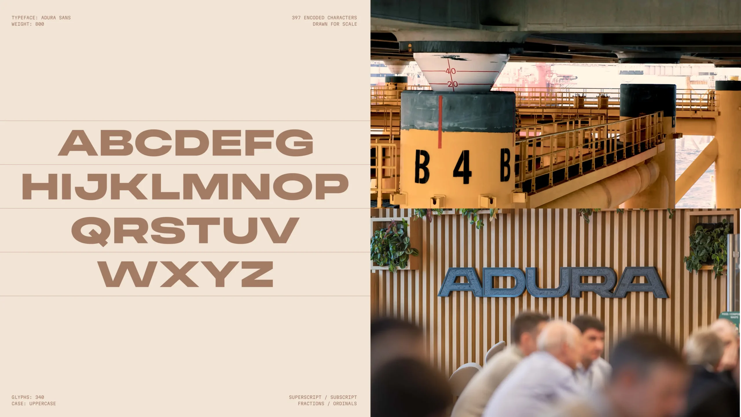
The visual identity needed to perform across an extreme range of applications: from monolithic offshore oil rigs visible at sea, through safety equipment and hard hats, to corporate communications and digital favicons.
The custom logotype uses compacted geometric letterforms, deliberately dense, with interlocking characters that read as load-bearing.
The wordmark symmetry, the opening and closing 'A' forming a trapezium, reinforces structural stability.
There is no separate brand icon. In a sector where most established operators carry symbolic devices, that choice communicates a business confident enough to stand on the wordmark alone.
The colour palette equally departs from convention. The sector defaults to blues associated with the North Sea. The energy industry more broadly favours vivid, optimistic palettes.
Adura’s palette draws instead from North Sea stratigraphy, the earthy tones of long-established sediment layers. A Scottish purple adds a differentiating signal of regional identity, without resorting to obvious tartans or heraldic motifs.

The results
- £3 billion reserve-based lending facility secured within months of launch
- Named UK’s largest independent oil and gas producer at launch
- Full trademark clearance across UK, Norway, EU and global oil and gas jurisdictions, with no conflicts
- Transform Awards Europe 2026: Gold, Best Strategic or Creative Development of a New Brand
- Transform Awards Europe 2026: Gold, Best Visual Identity, Energy sector
- Transform Awards Europe 2026: Silver, Best Naming Strategy (New Name)
- Launch coverage in Energy Voice, Design Week, gCaptain, Offshore Engineer, Splash247 and SPE Journal of Petroleum Technology
Strategic brand design
The Adura project demonstrates that strategic brand design has a measurable role in accelerating institutional credibility. And this acceleration carries direct commercial consequences.
In capital-intensive sectors, credibility determines access to financing, regulatory confidence and the willingness of experienced professionals to commit to a new entity.
The conventional path to that credibility runs through years of operational history. The Adura brief compressed that timeline to months. A £3 billion lending facility is the quantified result.
The methodology that made this possible, establishing precise criteria before generating names, running candidates through four phases of rigorous evaluation, and building phonetic and architectural flexibility into the name itself, applies directly to any organisation forming through a merger, demerger or joint venture.
The speed at which a new brand achieves institutional standing is a determinant of commercial momentum. It is also a variable that strategic brand design can materially influence.
Talk to us about your brand
Designhouse has partnered with FTSE 250 companies and global enterprises for over 50 years. We also work with start ups and scale ups to create brand identities that can grow with their business. If you’d like to discuss your brand challenges, we’d be glad to talk.