Preserva: a new brand that’s more than a load of old balls
Young entrepreneur Freddie Bott was 23 when he looked at a dead tennis ball and thought, there has to be a better way.
The result is Preserva a brand that is as fun to look at as it is clever in concept.
 |
 |
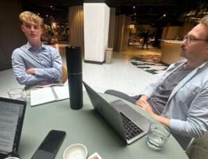 |
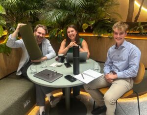
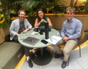
from L: Design Director Matt Gillman, Account Exec Millie Regan and Freddie Bott discussing the project
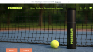
Product
The product is simple and brilliant. Preserva is a fully automatic, rechargeable pressuriser that restores tennis and padel balls to their original playing condition, keeping them performing like new for at least four times longer.
With over 300 million tennis balls going to landfill every year, Bott’s solution is timely, practical and genuinely impactful.
Solution
The brand identity we created for Preserva reflects exactly what the product is: unpretentious, energetic and a little bit cheeky. The logo is deliberately soft and rounded, playful in its form. It has a squishy quality that feels at home on a court bag as much as it does on screen. Like Freddie, the logo does not take itself too seriously, and that is entirely the point.

After a detailed briefing with Freddie, the creative treatment is inspired by the pressure inside the balls and the tube. The logo’s letterforms designed to reflect that pressure.
And while many sports brand are heavily visually influenced by data and performance, Preserva deliberately is not. For example, brands like F1, Adidas, NBA, WHOOP and Oura build their entire visual identity around metrics, waveforms and performance-data.
While there is an obvious performance benefit to keeping tennis and padel ball pressure at their best, the brand isn’t truly about this. At it’s heart it’s about extending ball life, and in doing so extending play-time, as well as being more economical and sustainable along the way.
The bright, bold and confident green and orange of the colour palette are synonymous with the worlds of tennis and padel. They also pay more than a passing nod to the enthusiastic energy of the founder.
All of which make for a brand that’s hard to miss on a crowded retail shelf or a fast-moving social feed.
Underneath the playful exterior, the functional message is always present. The packaging is clean and clear, the product promise is front and centre, and every touchpoint communicates reliability without sacrificing the brand’s character.

Freddie set out to solve a real problem. Designhouse set out to make sure the world noticed. We think we managed both.
Designhouse has partnered with FTSE 250 companies and global enterprises for over 50 years. We also work with start ups and scale ups to create brand identities that can grow with their business. If you’d like to discuss your brand challenges, we’d be glad to talk.