Accuity
An agile, fluid and dynamic new brand ready for an ever-changing world.
Designhouse was commissioned by global data and software experts Accuity to refresh their brand identity, so that it better reflected the business’ leading role within the sector.
Following a comprehensive brand repositioning exercise, we developed a brand strategy that reflected the newly redefined brand values of collaboration & connectivity; courage & curiosity; integrity & honour and energy & endurance.

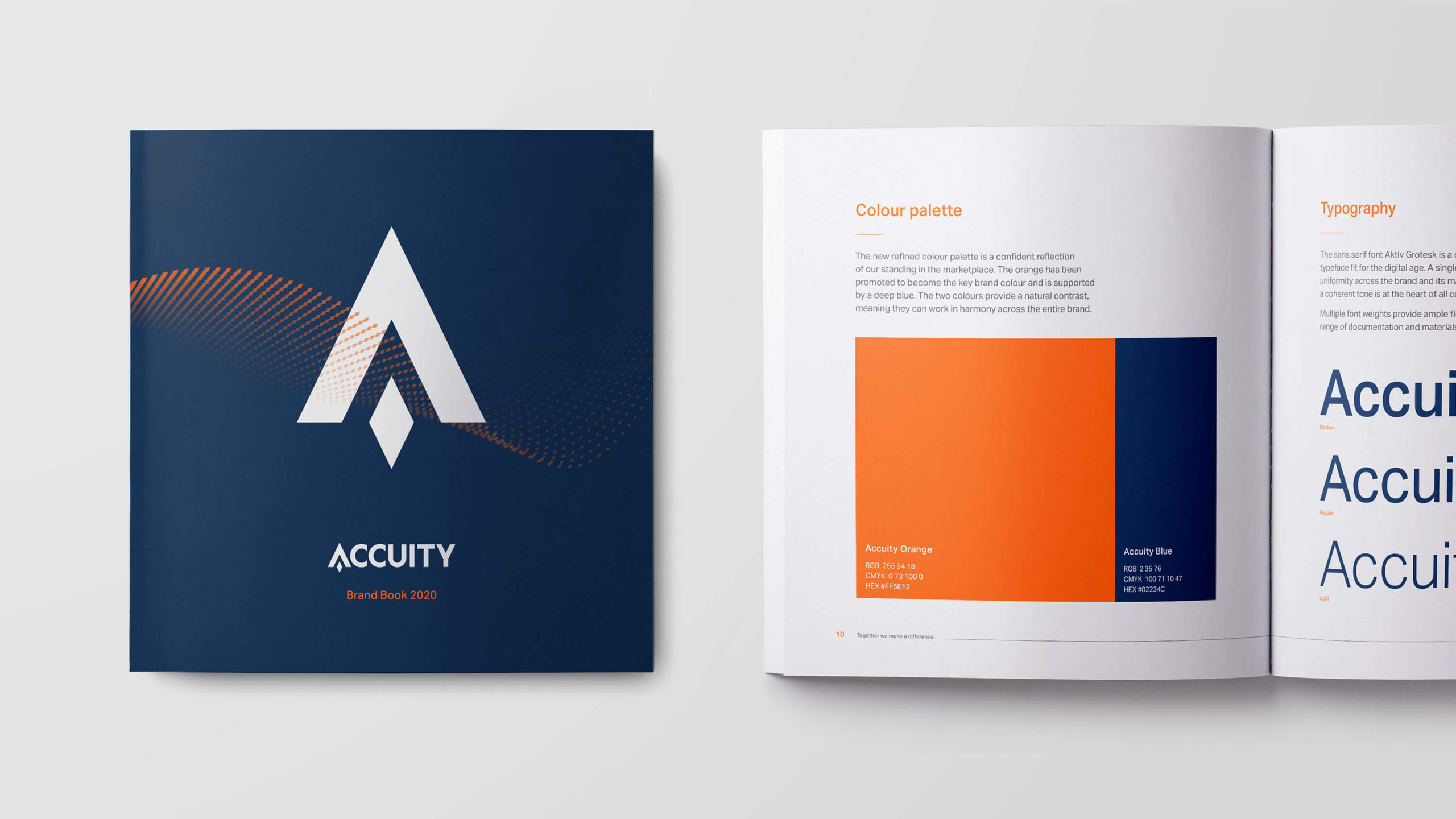
The new identity celebrates the hero colour orange, retained from the original palette, to create a bold, single colour identity that puts the master brand centre stage. Blue has been added to the palette as an alternative or contrasting accent colour, and a new strapline, “Together we make a difference”, has been introduced.
The height and spacing of the original wordmark have been corrected and refined, mirroring the precision of the Accuity products themselves, and the recognisable ‘Accuity diamond’ has been retained in the new logo for continuity.
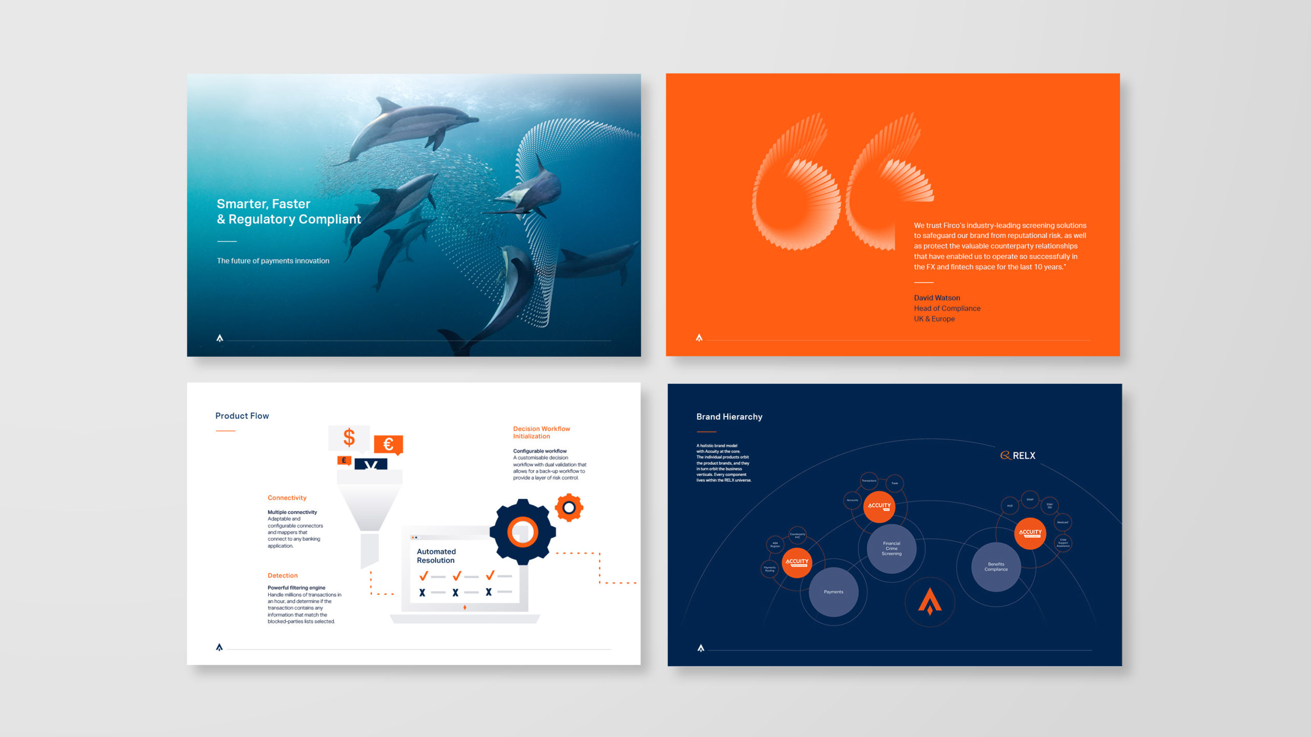
Multiple diamonds form a powerful matrix of data, giving the brand a flexible graphic device, born out of fluidity and movement.

Imagery has been updated, moving away from clichéd financial stock shots to treated photographs from the natural world as a metaphor for migration, speed and movement.
The new identity has been introduced across Accuity operations globally in a comprehensive rebrand, including digital assets, templates, stationery, marketing materials and internal communications supported with a launch video for employees.
We also produced brand guidelines to ensure that the new identity would be introduced consistently across all applications.

