Retail Realisation
A straightforward and plain-speaking new brand.

Designhouse was appointed by Retail Realisation’s founding partners to develop the corporate identity for their new consultancy, supporting retailers restructuring.
With a wealth of senior experience, Retail Realisation provides inventory realisation for businesses facing significant challenges, achieving the maximum commercial benefit for clients while also providing support and advice through the process.

The challenge was to develop an identity that reflected both the commercial credentials of the partners as well as their ability to empathise with clients and support them through the emotions of the closure.
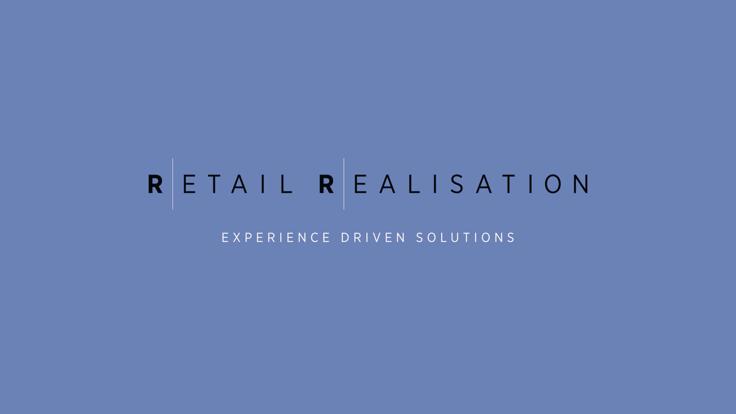
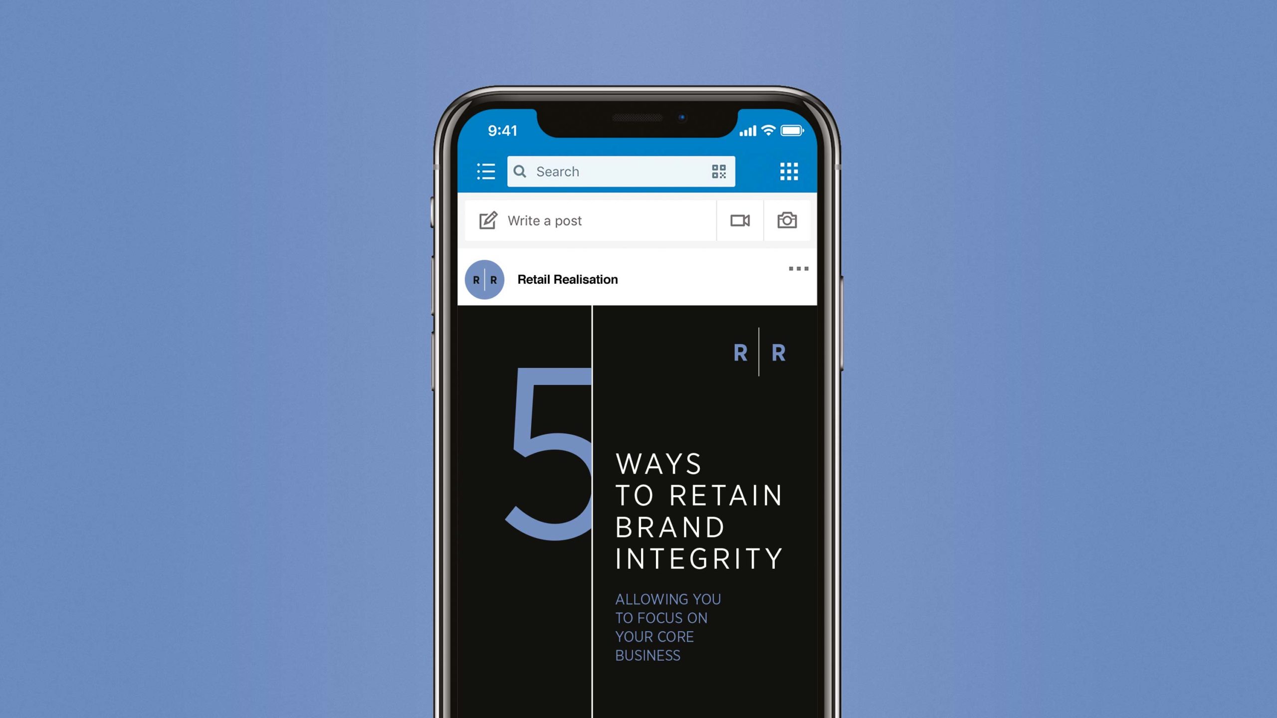
The clear, straightforward wordmark employs ‘Gotham Narrow’ as a typeface, customised through exaggerated spacing. We introduced a divider line as a graphic device representing closure and repeated this throughout the applications, creating RR avatars for the new website and social media platforms as well as new iconography and animations.

A simple colour palette of blue, white and black further reinforces the brand values: straightforward; reliable; calm; while the lavender blue tint allows Retail Realisation to ‘own’ its space in the sector.
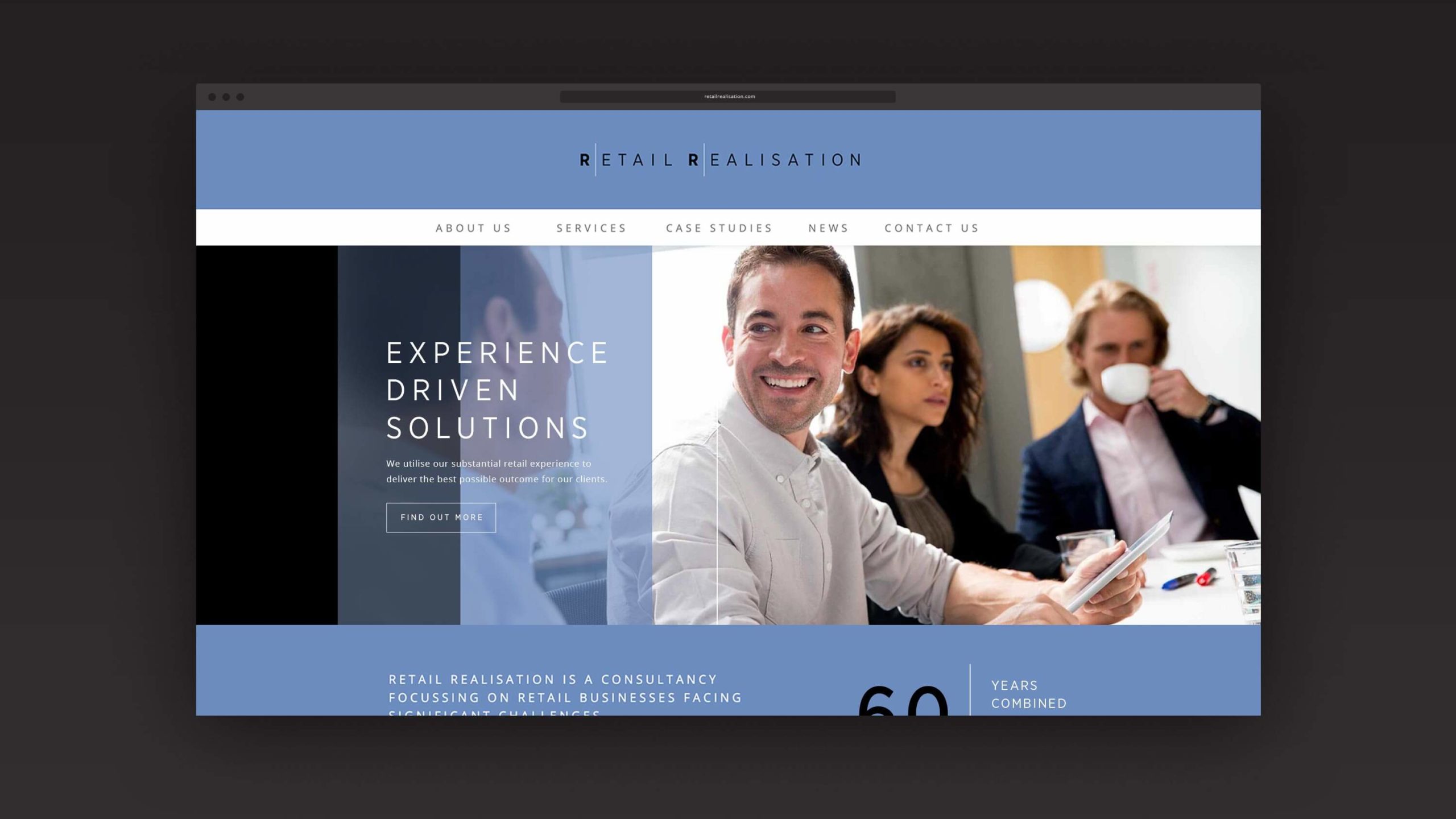
We recommended engaging, semiinteraction imagery, moving away from clichéd financial stock photography.
The new identity was introduced across website, social media pages, stationery and presentation templates.

