Stonehage Fleming
Creating a contemporary graphic style for an established international family office.
Stonehage Fleming is one of the world’s leading international family offices.
Designhouse was commissioned to refresh their campaign look and feel for the launch of a new research report, working with the existing brand identity, typography and colours.
The challenge was to create a more contemporary style without undermining the heritage and traditional values of the business.
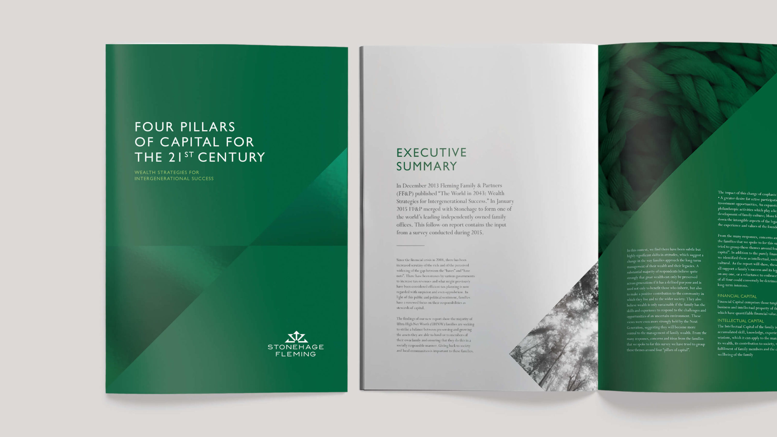
A new graphic system was introduced, where the cropping angle for imagery mirrored the lines of the existing Stonehage Fleming crown logo.
The rich green primary colour was celebrated and used more dominantly, alongside lime green as a highlight tone, giving standout and ownership.

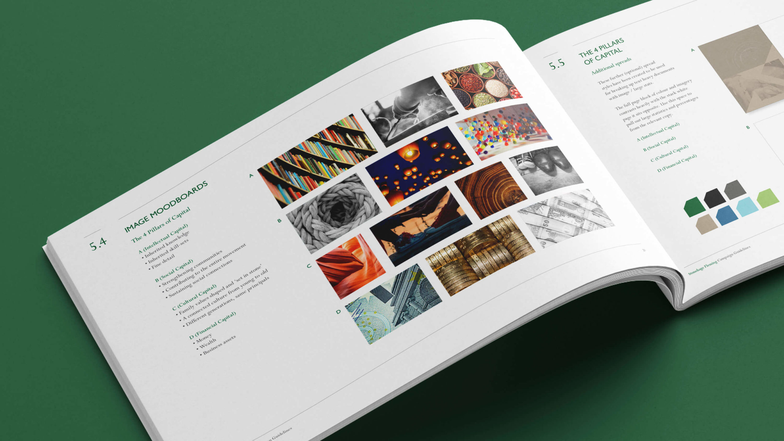
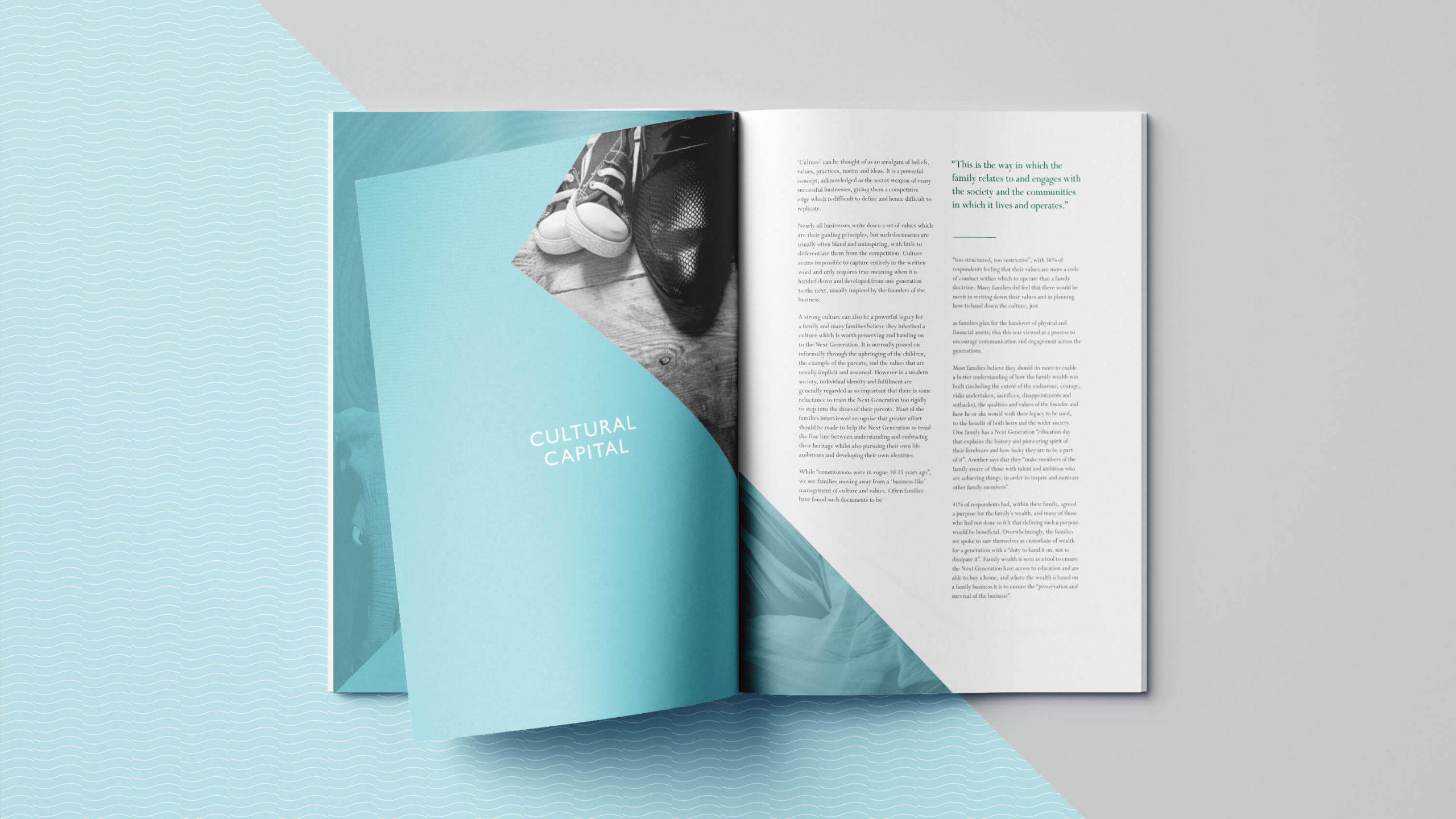
Four colours from the existing secondary palette were used to signpost the four key themes or ‘pillars of wealth’ detailed in the report, each complemented by an assigned graphic device evoking banknote watermark patterns.
Imagery has been updated, moving away from financial stock shots towards more evocative and thought-provoking close-up and abstract imagery.
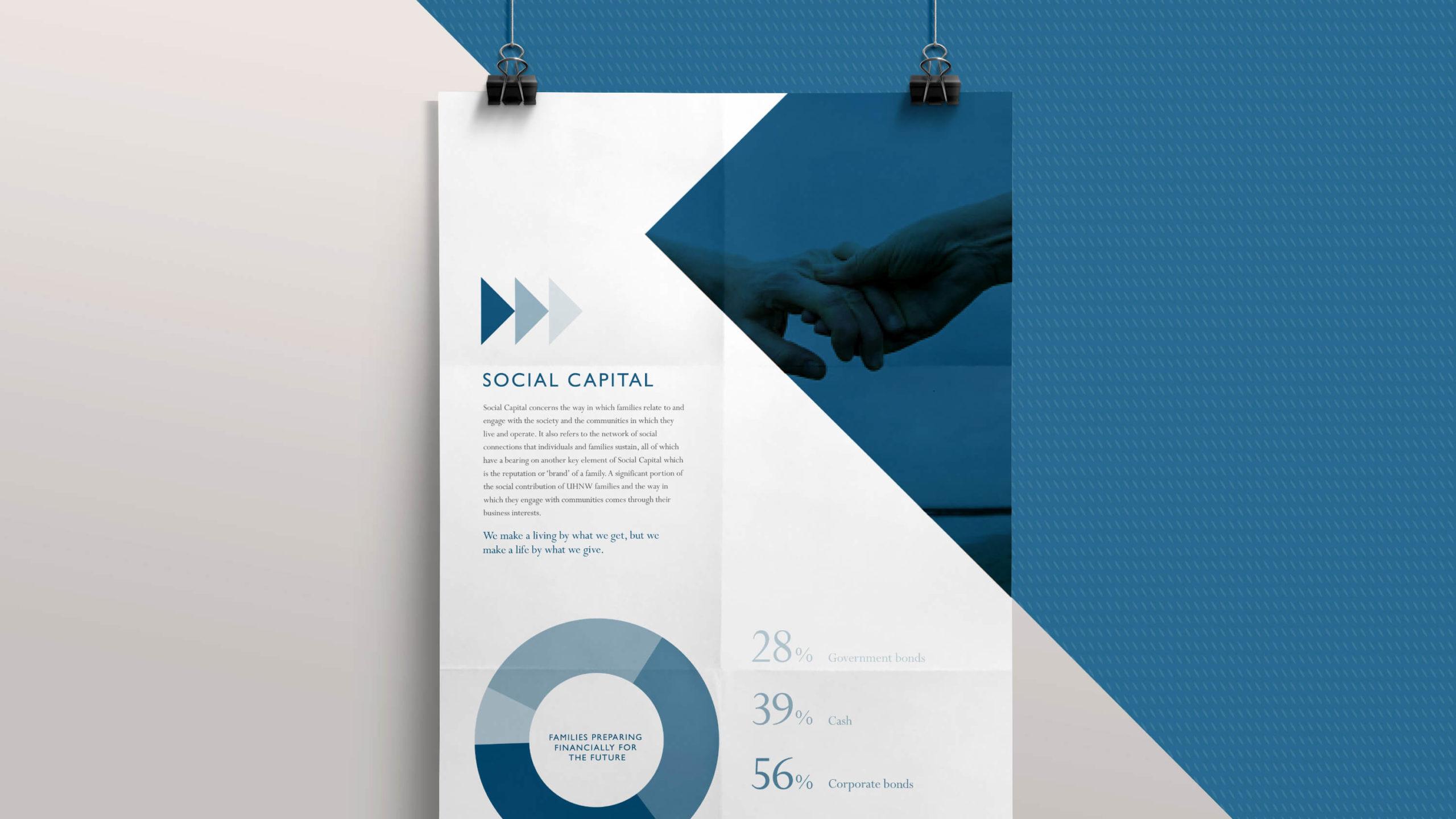
The existing typeface has been refined, and a dynamic new infographic style helps present data and research in an engaging and fresh way.
Designhouse has produced new design guidelines detailing the evolution of the graphic style and messaging going forward, including design templates, guidance on the use of imagery and moodboards.