OncoSil
Developing a brand refresh for a groundbreaking pharmaceuticals company.
OncoSil is a global medical device company dedicated to improving the outcomes for people living with pancreatic cancer. Their advanced technology and research has had a hugely positive and substantial impact on Oncology developments. Headquartered in Sydney, Australia and founded in 2004, OncoSil has recently received regulatory approval in both Switzerland and Malaysia now giving them global reach.
In order to cement the company’s position as a sector leader and authority in vital clinical and scientific discussion, Designhouse were engaged to refresh their brand to build awareness and reputation.
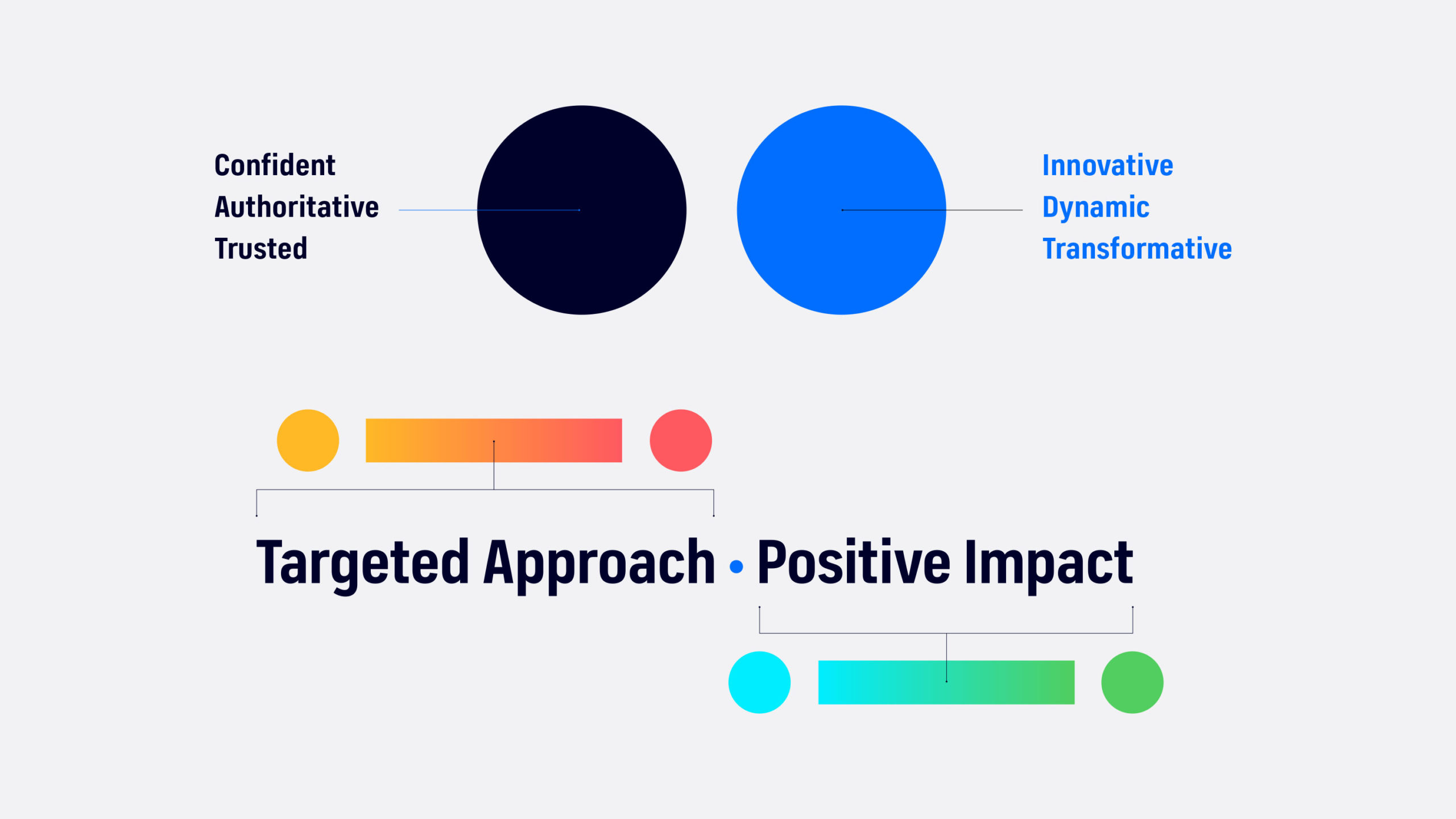
We set out to create a dynamic new look and feel for the brand whilst bringing the human face of the company’s values to life by using arresting imagery and a more emotive tone of voice in copy. Designhouse evolved the existing brand assets and introduced a new and impactful strapline: ‘Targeted Approach, Positive Impact.’

This new brand approach was then worked through a range of marketing and communication content and assets aimed at external audiences such as a new website design, social media assets, video, exhibition graphics and corporate literature.
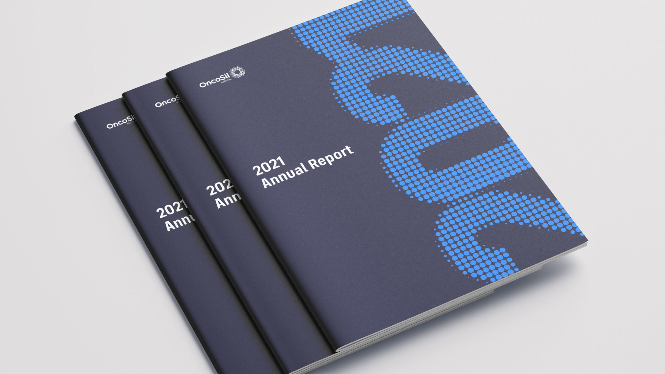
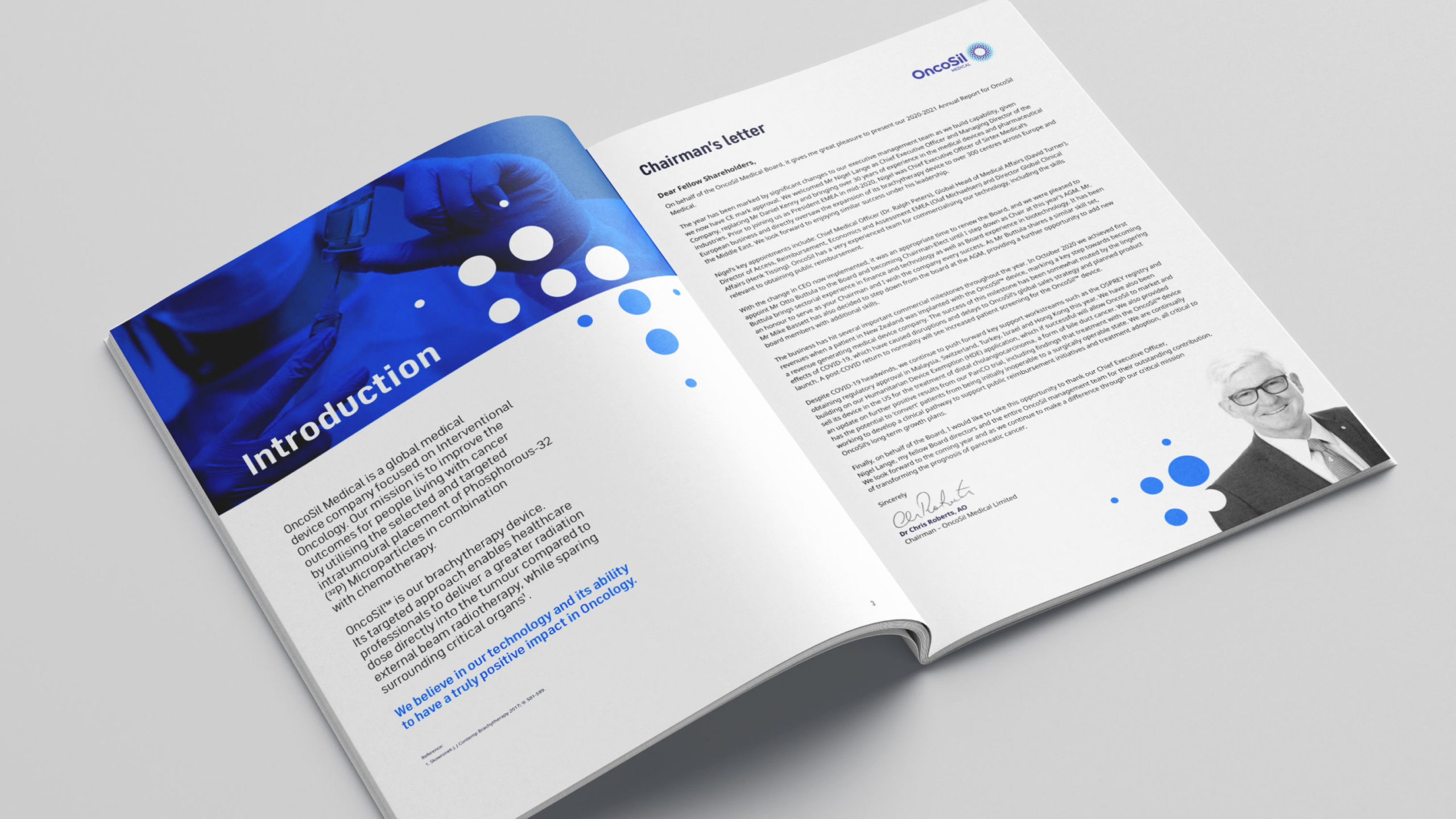
The brand design was broad enough to manage important didactic communication including a suite of video content focusing on ‘mode of action’ and ‘dose preparation’ videos specifically created for healthcare professionals to help them understand how to handle and prepare the product. Specific corporate literature was also produced including an annual report detailing the past performance of the company along with a radiation safety guideline document. A corporate brand video was produced to help launch and communicate the new brand direction to employees and external stakeholders.

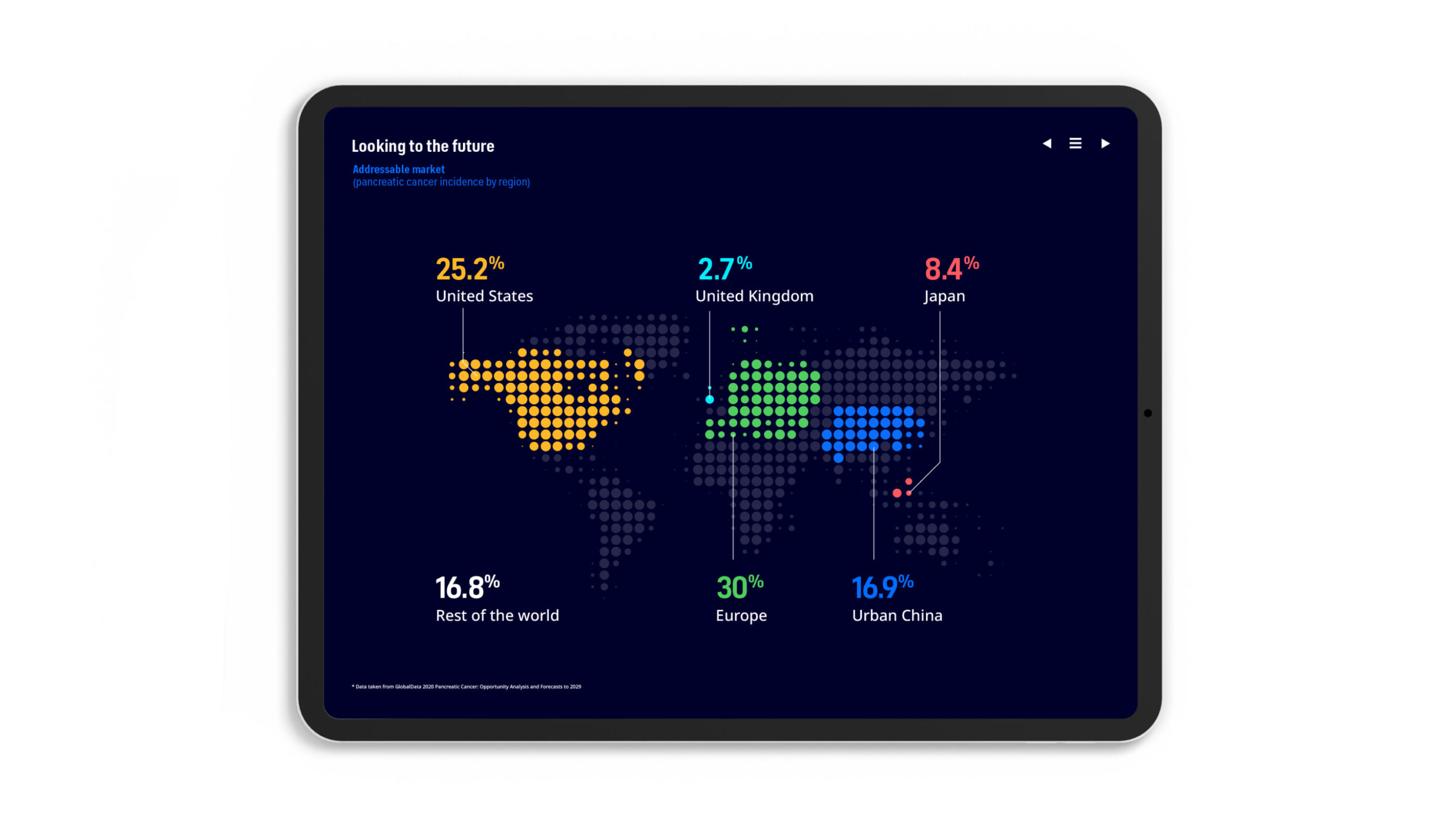
Creatively, we reflected the brand’s expert precision through selecting a clean and technical typeface semi-condensed ‘FS Industrie’ which will be used going forward as the brand font across all media. The brand’s existing dots had some good equity so were retained as a graphic device and showcased across the assets including animation to show how flexible it could be across channels.
The primary colour palette was simplified and refreshed, using a dark navy and bold electric blue to cue both trust and exciting transformation. A secondary palette was developed to complement the primary colours. Green and blue represent OncoSil’s positive impact in the world, whilst red and yellow are used to highlight precision. The colour choices perfectly communicate OncoSil’s very human approach to healthcare with the professional and expert science at the core of the brand.


