
AMPYR Solar Europe
Powering up AMPYR for the European market: From Land to Power
Background
AMPYR Solar Europe was born in 2021 through the merger of NaGa Solar and AMPYR Energy UK, a joint venture between AGP Group and Hartree Partners.
The partnership established a major new European solar enterprise with a combined pipeline of over 6GW of large-scale ground-mount and rooftop solar projects across the UK, Germany and the Netherlands, on track to become a key player in the European solar energy space.
AMPYR Solar Europe is headquartered in London and combines AGP’s experience in developing large-scale renewable power projects, Hartree’s cutting-edge power trading analytics and zero carbon solutions and NaGa’s in-depth local knowledge and land development prowess.
AMPYR Solar Europe handles every stage of the solar power journey, from discovering secure land, obtaining permits to developing projects to build, operating and selling the energy from its solar plants to support local farming communities.
The challenge
AMPYR Solar Europe wanted to ensure they effectively operated across their European markets and presented a strong brand and consumer identity.
The team at Designhouse were called upon to implement a simple and scalable design system that was consistent with the umbrella organisation.
It was important that the identity had the flexibility to appeal to local audiences as well as larger-scale finance and corporate partners at a pan-European level.
The approach
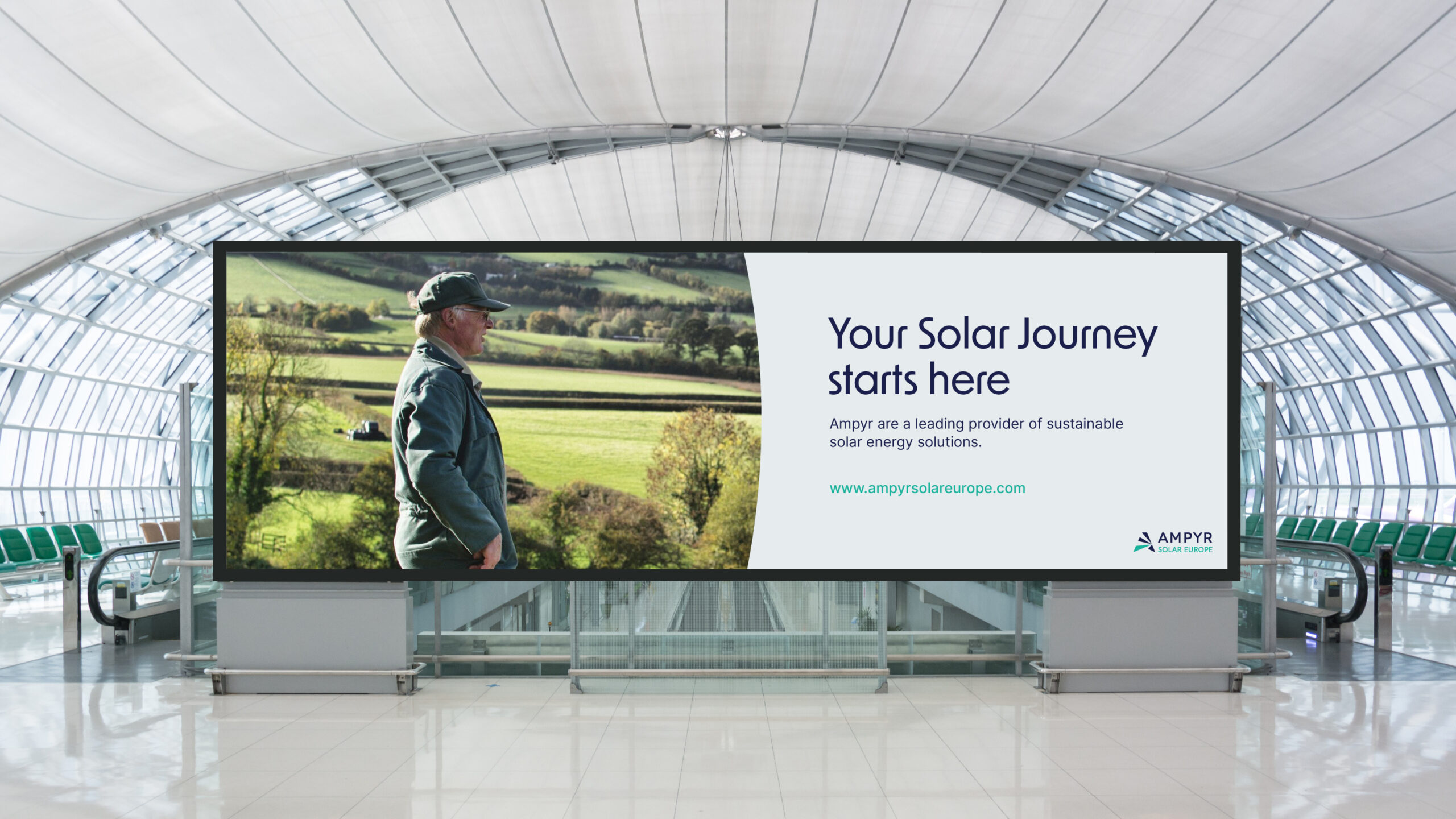
Our design and website identity worked to elevate the on-the-ground stories of local farming communities with a more approachable and warm essence.
Our device, imagery and typeface are all inspired by landowners who work hard to achieve biodiversity and sustainability from dusk till dawn, using a 360-degree geometric form and gradient that revolves and frames AMPYR’s solutions, evoking a sense of nature and harmony.
The change
Our aim was to implement a simple and scalable design system that illustrated the business’s proposition at both pan-European and local levels (UK, Germany, and Netherlands) whilst delivering consistency with the global AMPYR brand identity guidelines.
Our identity rehaul and website launch worked to elevate the on-the-ground stories of local farming communities with a more approachable, warm essence and identity.
Our device, imagery and typeface are all inspired by landowners who work hard to achieve biodiversity and sustainability.
Our 3D design incorporates lines and gradients to deliver a 360-degree geometric form that revolves and frames AMPYR’s solutions, evoking a natural and more personable touch.