
Inbound Fintech becomes Evara
Built to win: new brand strategy and identity for Evara
A full rebrand and rename transformed Inbound FinTech into Evara, repositioning a nine-year-old award-winning consultancy. We developed a new name, strategy, brand identity and brand architecture designed to attract enterprise clients and support a 2030 growth horizon.

The business challenge
A scaling business outgrowing its start-up identity
Inbound FinTech had spent nine years building a genuinely differentiated practice: an integrated financial consultancy. By 2025 the firm had supported more than 150 organisations, held ISO 9001 and ISO 27001 certifications, and won FinTech Agency of the Year in six of the previous seven years. It’s start-up brand identity didn’t reflect the credibility and scope of what the company now offered its clients.
The name Inbound FinTech anchored the firm in a marketing-agency category. And that no longer described what it actually did or whom it was competing with.
The firm's growth strategy is to be recognised as the number-one specialist for CRM technologies and Revenue Operations in Financial Services. They now require a brand capable of scaling to meet that ambition.
A new name and identity had to build on the foundation and position the firm against tier-one consultancies.
The approach
Discovery
Designhouse structured the project across two phases: Brand Strategy, then Brand Identity and Naming. Before any naming or creative work began, the team needed to understand what Inbound FinTech's best clients valued about the relationship, where the current brand was costing them commercial ground, and what the positioning destination demanded.
Discovery combined a competitive landscape review, a brand and messaging audit, and structured stakeholder interviews with the leadership team and client contacts. The interviews examined brand perception, the firm's unfair advantages, friction points in the current positioning, and the architecture implications of a multi-service, multi-product consultancy. From those findings, Designhouse co-developed three positioning hypotheses, tested them with leadership and a panel of client allies, and aligned on a single strategic model before any creative work began.
Radical Authority
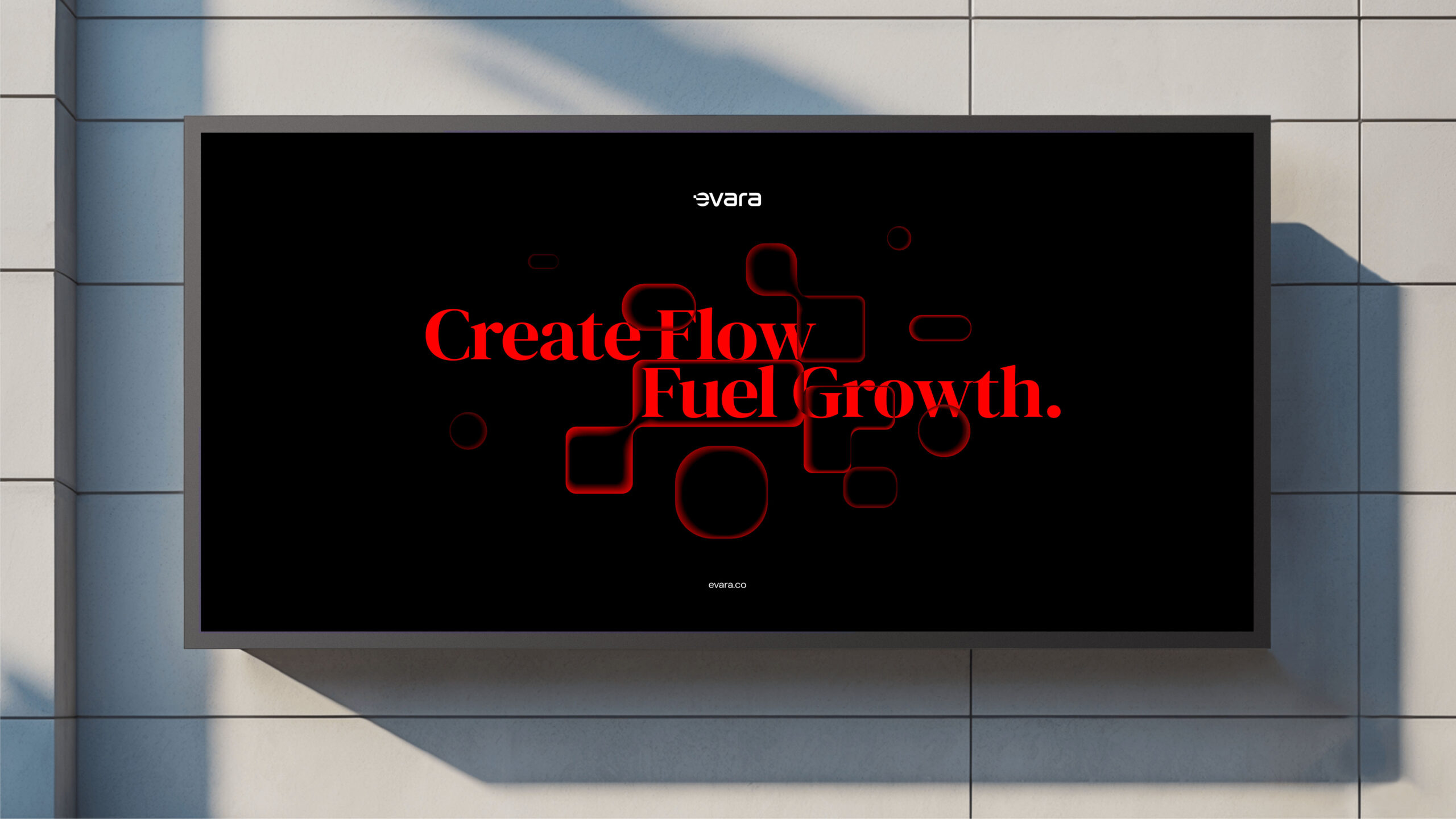
The agreed strategy centred on the defining idea of Radical Authority: a brand personality that fuses the Sage archetype, clarity, intelligence and rigour, with the Creator, imagination, originality and design. The external strapline, People building systems. Systems building growth. gave the team a precise, differentiated articulation of the firm's value in the language of its target audience.
“the most impressive part of all the work we did with Designhouse was the strategy”
Speaking at the brand launch, Fran Sánchez, Managing Director of Evara was direct about where the value of the process lay. "For me, the most impressive part of all the work we did with Designhouse was the strategy. We found our personality, we identified who we are. People building systems, systems building growth. That was an amazing piece of work because it is exactly what we want to do."

Developing a new brand name
The word Inbound was no longer relevant to the strategy of the business. It was too limiting. The replacement needed to be short, domain-acquirable and scalable across future sub-brands and product lines. Designhouse explored descriptive, evocative, invented and compound territories, presenting shortlists across three rounds of internal review. The name Evara, evoking evolution and value, emerged as the consistent first choice throughout.
Evara carries no pre-existing category associations in the FinTech space. It was also chosen for a quality its founders considered significant: it reads as a strong female name.
"We always said the company is a woman," Sánchez explained. "It was founded by two strong women, Sheila Mitham and Marie Hanes, and we didn't want to dilute that."
Visualising modular systemic growth
The creative brief carried a single governing instruction: always relatably human.
In a sector where the product is invisible, technical and frequently cold in its communication, the design challenge was to make growth feel organic, earned and expert rather than algorithmic.
The starting point was a competitor colour audit, which identified red-orange as an unclaimed territory across the entire FinTech consultancy landscape. That became the anchor of the colour strategy: a purposely punchy primary colour, held in tension with a neutral palette of greys, blacks and whites that allows the brand colour to read with maximum clarity.
The central visual idea was to reject the default language of business growth, bar charts, linear data, upward arrows, and replace it with something that reflected what Evara actually does: build modular, systemic growth from the ground up.
Creative Director Richard Debenham referenced cellular structure as the design metaphor. Cells build, multiply, adapt and interlock. They are granular and rigorous. They grow through interdependence rather than addition.
Authentic and warm
“The main thing was visualising growth differently” explains Debenham, “and doing it in a way that felt authentically human, as opposed to the sterile graphs and charts usually associated with financial services”.
The execution moved from literal biological form toward an abstracted interlocking geometric system. It is structured enough to signal precision. And, at the same time, soft enough to signal warmth. This visual system mirrors Evara's methodology. They build considered, adaptive growth architectures for complex organisations.
Keeping it clean
The logo is a clean wordmark with a single deliberate detail: the letter E carries a small organic form that references the interlocking cell system, functioning as a shorthand symbol and scalable avatar.
Imagery is defined across two registers: an aspirational human lead style, focused on the emotional outcome of the client relationship. And a functional secondary style for product and device contexts.
Brand Strategy
Designhouse delivered a complete brand strategy model as a reusable internal blueprint:
- positioning statement
- tone of voice
- audience definitions
- service propositions
- key messages
Identity Strategy
The identity system comprised
- master artwork
- logo lockup
- typographic style
- graphic assets
- imagery direction
- full colour palette
- core brand templates
A full website redesign across the Home, Services, Careers and Contact journeys within HubSpot CMS is confirmed as the next phase of the engagement.
Brand architecture is a growth-strategy decision
Being nobody is the problem
The Evara project illustrates a challenge that arrives for every successful start-up that builds on its original market positioning.
The highly targeted, specialist brand that won the first decade is usually not built for flexibility. The name, messaging and visual identity that communicate competence at one scale may not serve the next growth phase.
Evara demonstrates that the real brand equity was in the team, the methodology, and the client relationships. The start up name was now a constraint, linked to a strategy it has pivoted and outgrown.
Replacing it with an identity built around a precise strategic model and a scalable architecture, create the conditions for commercial growth and new strategic horizons.
"If you want to scale and you cannot communicate properly who you are, then you are nobody” said Sanchez. “And to be nobody is a big problem."
See the work at Evara
Talk to us about your brand
Designhouse has partnered with FTSE 250 companies and global enterprises for over 50 years. We also work with start ups and scale ups to create brand identities that can grow with their business. If you’d like to discuss your brand challenges, we’d be glad to talk.