
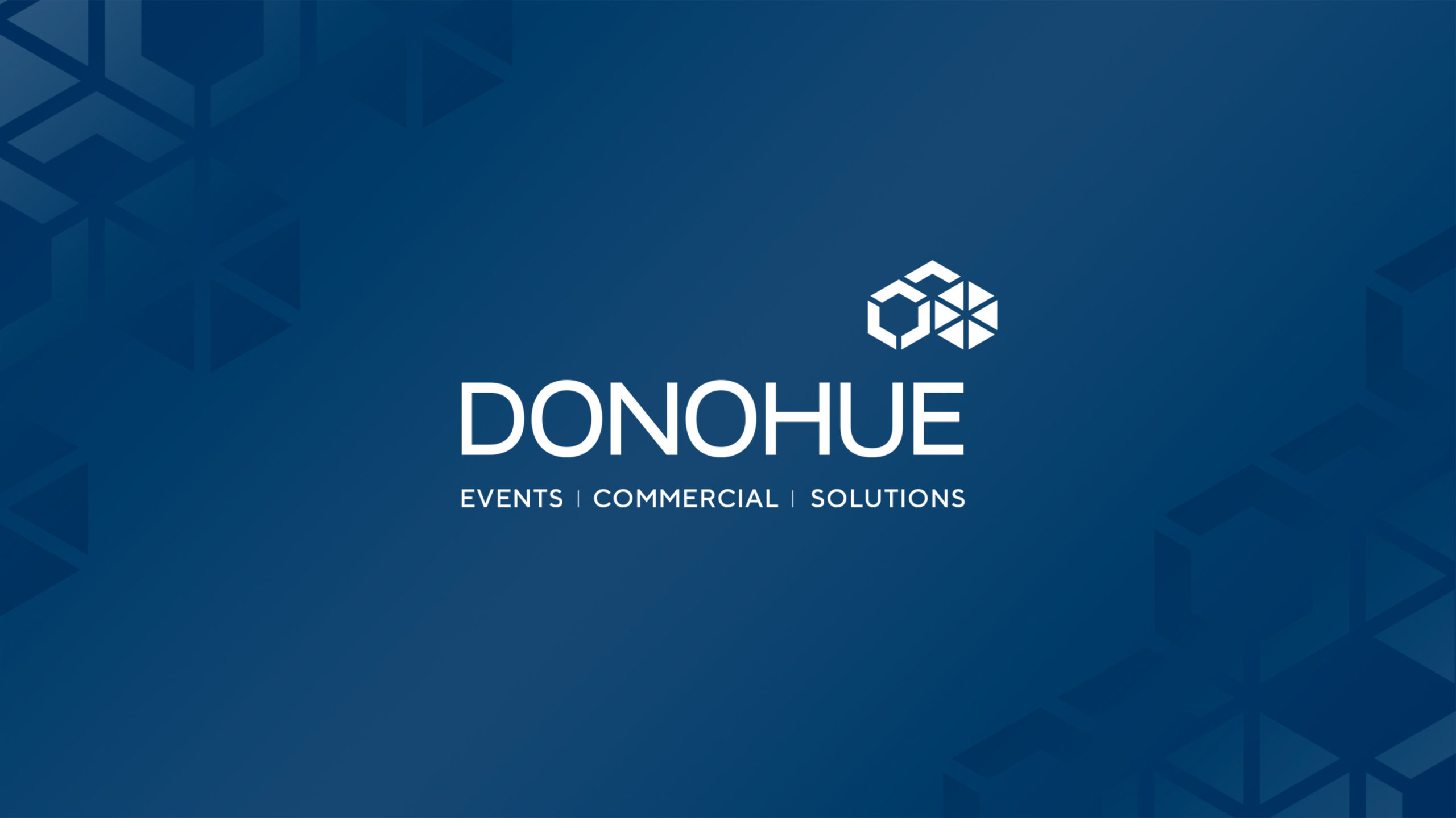
Donohue Solutions
A new name, refreshed brand identity and sub-brands for one of Ireland’s leading marquee and semi-permanent structure companies.
The rebrand as Donohue Solutions last year has already delivered results, with more than 100% increase YoY in turnover from commercial contracts.
Designhouse was commissioned by Donohue Marquees to reimagine the business’ name and brand identity in the wake of changing demand driven by Covid-19.
The rebrand was commissioned to help Donohue better communicate its full range of services, giving equal weight to commercial work as well as the events side of the business.
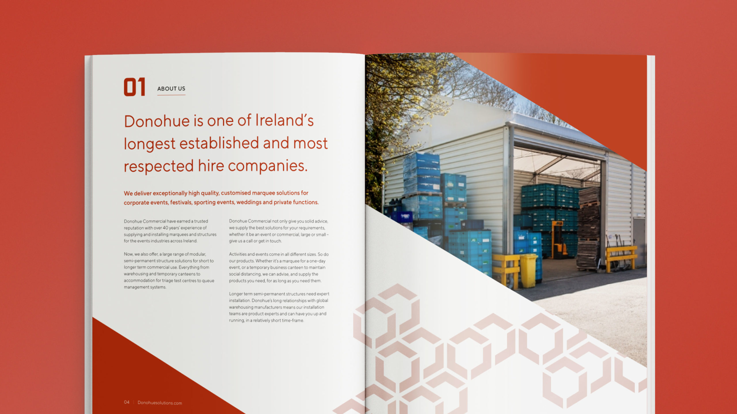
Donohue Marquees had a well-established track record in the events industry, with 40 years of experience supplying and installing marquees and temporary structures for weddings, corporate events, music and sports festivals, as well as semi-permanent warehousing.
Now Covid-19 had increased demand for flexible, modular, semi-permanent structures for short to longer term commercial use, providing everything from warehousing and temporary canteens to extra accommodation for schools and hospital test centres.
We recommended rebranding the business as Donohue Solutions to highlight the benefits of providing expert advice, solutions and outcomes for customers, rather than services and products.
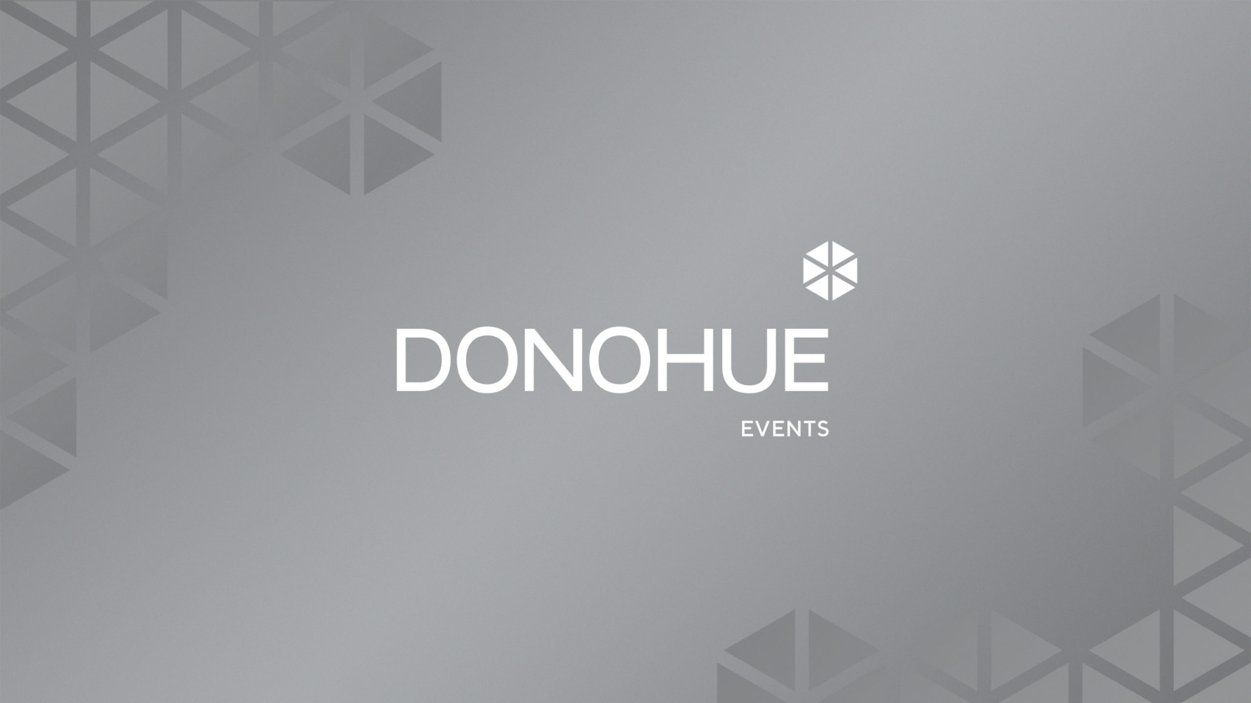
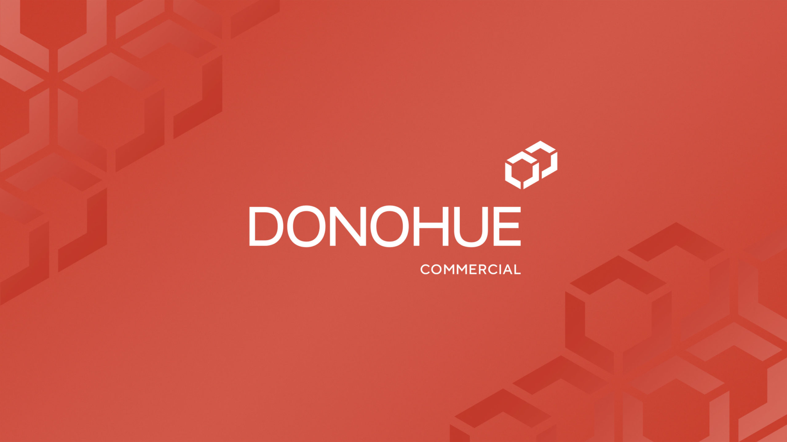
The new, evolved master logo builds on the concept of modular structures with a highly flexible polygon that is adapted for each of the two new sub-brands, Donohue Events and Donohue Commercial.
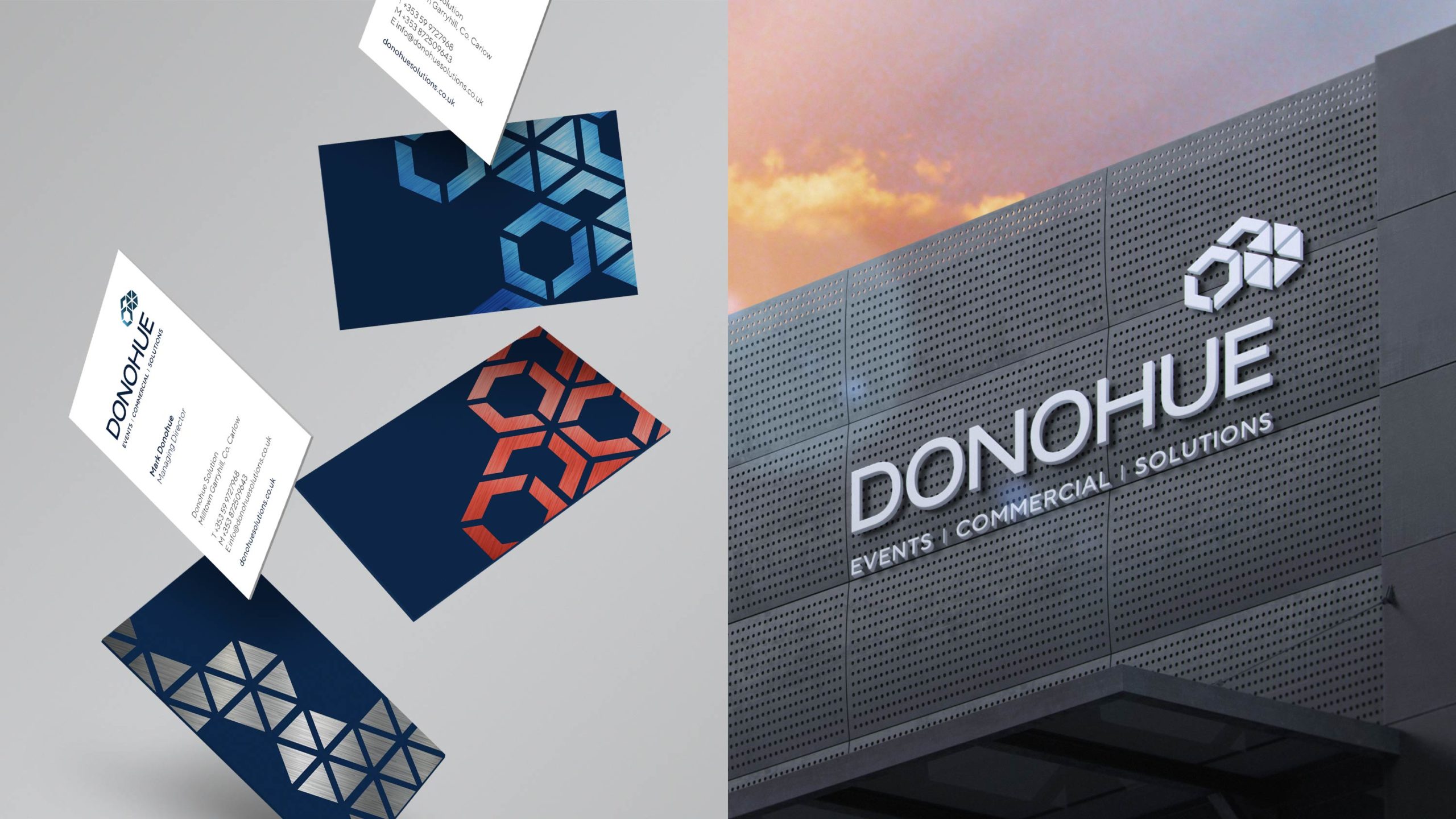
To ensure continuity with the original branding, we retained the existing font for the wordmark and introduced the more contemporary Geometric Sans font, TT Norms, which further complemented the new logo and graphic system.
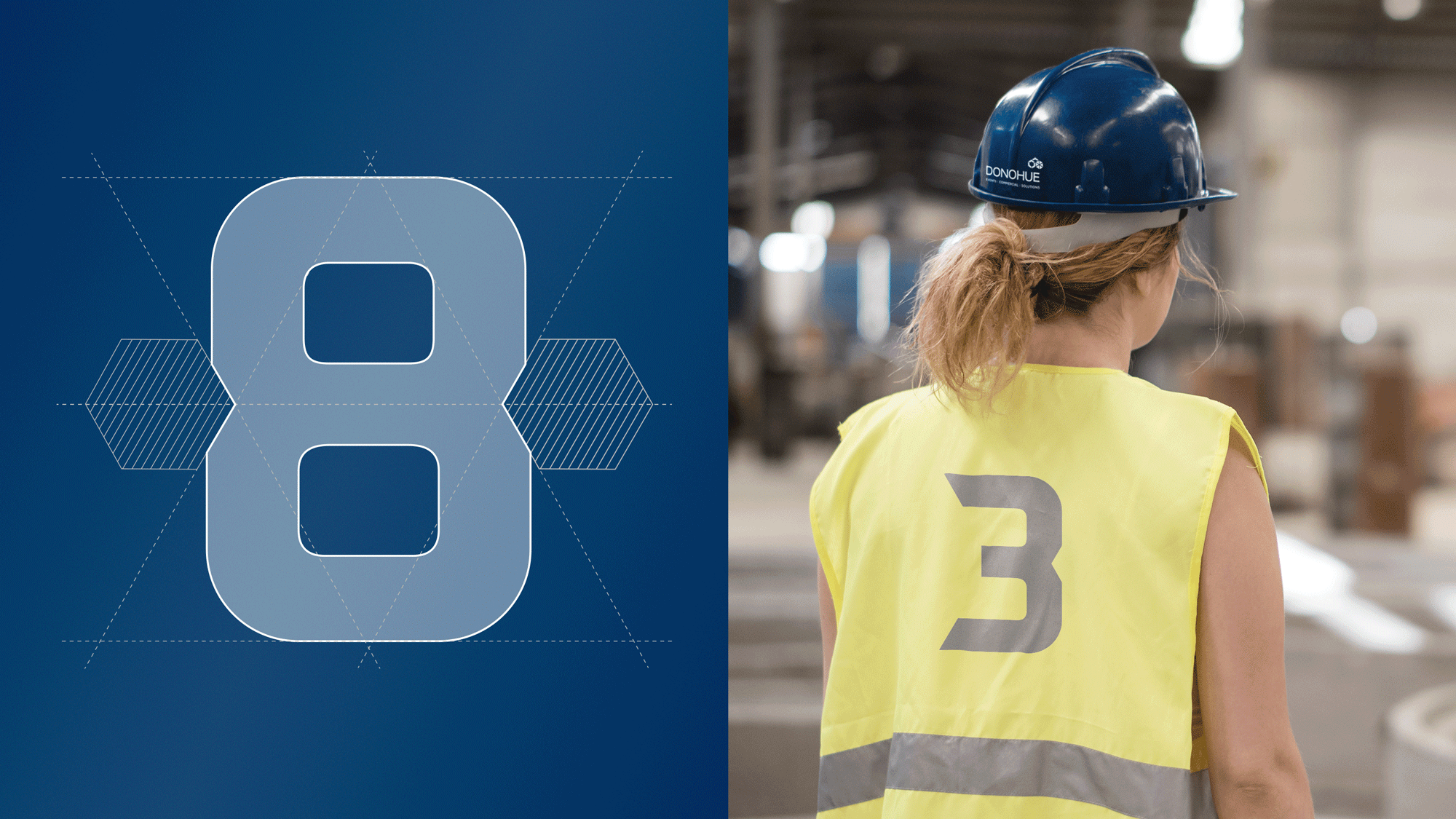
Numbers were customised with a cut mirroring the angles of the logo, giving the digits a bespoke personality that supported the overall visual identity look and feel, particularly when applied to iconography and infographics.
For the colour palette, we retained blue and silver but gave them a metallic finish to create more depth and added copper to represent the new Donohue Commercial sub-brand.
The refreshed corporate identity and sub-brands have been applied to a new website, also designed and built by the Designhouse team, and will be introduced across vehicle livery, clothing and marketing materials.