ISI brand: from patchwork to platform
Challenge
![]()
ISI had a problem that many ambitious, fast-scaling B2B organisations will recognise. The commercial story was compelling, the products were best-in-class, and the growth trajectory was clear. The brand, however, was not keeping pace.
Across five strong product lines, CEIC, EMIS, EPFR, REDD and iMoneyNet, ISI had, through a smart M&S strategy, built genuine market authority. Each sub brand carried real equity with its audience. But viewed together, the portfolio told a fragmented story. Separate visual languages, disconnected narratives and a corporate identity that did not reflect the integrated intelligence platform the business now is.
The brief was clear, and the ambition behind it impressive. Our task was to build a brand architecture that unified the portfolio under a single, coherent identity. The trick was to maintain the product-level equity that ISI’s marketing team had spent years building.
Outcome

The identity is bold and deliberate. A distinctive mark reduced to its most essential form. A primary palette anchored in a striking orange. And a typographic system that balances editorial character with functional precision. ISI’s marketing team now have exactly the framework they need:
- clear rules
- scalable systems
- consistent execution across regions and formats
We started, as we always do, with the strategic work. Stakeholder interviews, a competitive landscape review and a rigorous brand audit. This gives us a coherent base of insight from which to build. Three strategic hypotheses were developed and tested with the ISI leadership team before we settled on a direction.
The resulting brand model established a clear hierarchy. A strong, confident master brand identity for ISI. Each product line with its own lockup and positioning. Crucially all sub brands are now now visibly connected to the group.
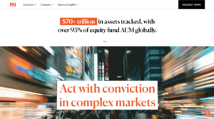
The new website, designed and built by our in-house digital team and launched this month, is the most visible expression of that work. It surfaces the integrated nature of ISI’s data platform. With improved navigation across the product portfolio, it positions the group for the enterprise conversations it is now ready to have.
 |
 |
 |
This bold brand refresh reflects the progress we have made as a group and embodies the distinctive role we play in the ecosystem, helping our customers cut through complexity and act with conviction.
Steve Pulley, CEO
For any marketing leader managing a complex portfolio of sub-brands, ISI’s journey is instructive. Brand coherence is not a cosmetic exercise. Done properly, it is a structural asset, one that reduces the cost of execution, sharpens commercial positioning, and builds the long-term value that a business of this ambition deserves.
Visit isimarkets.com to see the new brand in action.
Learn more about the importance of brand architecture and coherence here
Designhouse has partnered with FTSE 250 companies and global enterprises for over 50 years, delivering strategic brand consultancy that creates measurable competitive advantage. If you’d like to discuss your brand challenges, we’d be glad to talk.