When the sun shines and the longest days keep the evenings bright the Designhouse team go foraging for brain food. Fave hunting grounds include galleries, festivals and the occasional darkened cinema. We asked the studio team for their creative summer recommendations. Here is a veritable menu of must-dos, a smorgasbord for your brain, and restoratives for your imagination.
“A digital interactive art exhibition across a series of rooms with no start or end point. Artworks move out of rooms, relate to other works, influence each other and are influenced by you walking through the rooms and touching the artwork itself. I loved how they fused digital technology, sounds, smells and lighting to create a truly magical few hours of exploration.”
“Vivid, highly saturated and bright, this is the colour world behind some of Anderson’s most iconic films, which is to say most of them. A fascinating window into a brilliantly creative mind.”
“Loads of models, storyboards and insight from the Aardman team. It’s a joy. On until mid November, so plenty of time to go. I’m not biased, but it is in Bethnal Green, so it’s easy to go to my local after.”
“An immersive, interactive space and time journey to 2050. It encourages the 650,000 annual visitors to the Oceanographic Museum to become involved in the protection of the Mediterranean.”
Hockney’s sweeping frieze follows the slow turn of the seasons across the Normandy countryside, painted with the freshness of an artist still chasing the light in his ninth decade.
That is the studio’s summer in one list. Curiosity goes where it likes, and it always comes back with something worth sharing. Enjoy the summer!
Designhouse has partnered with FTSE 250 companies and global enterprises for over 50 years. We also work with start ups and scale ups to create brand identities that can grow with their business. If you’d like to discuss your brand challenges, we’re ready to talk.
UK brand value returned to growth in 2026, with the country’s leading brands adding £45.4 billion over the past year, according to new figures from Brand Finance. At the report launch, Mark Ritson asked the room to look harder at what really drives it.
The UK’s 250 most valuable brands grew by 12% to reach £448.9 billion in 2026, the first year-on-year growth since 2023. This is according to Brand Finance’s annual UK report published this month. Britain’s biggest brands added £45.4 billion in collective value over twelve months.
Growth was broad based, spread across the economy. Banking is now the UK’s most valuable sector, lifted in part by Revolut, the fastest-growing brand of the year at 246% to £5 billion, and a 24% rise in banking sector value overall. Aerospace and defence recorded its strongest gains since 2012, and consumer brands now account for eight of the UK’s ten strongest.
One finding drew particular attention. Brand Finance’s analysis shows the UK’s most trusted brands increased in value by 15% over the year, while the least trusted brands saw their value fall by 4%. Emotional responses to brands are difficult to quantify financially. This report shows that trust is directly associated with performance.
Can we trust trust?
Speaking at the launch, the marketing expert and Mini MBA founder Mark Ritson put a deceptively simple question to the room. Can we trust trust?
Drawing on examples ranging from Johnnie Walker to Betty Crocker, he examined how strong brands build emotional connections, and he questioned the assumption that trust alone drives growth. His argument placed salience, being the brand that comes to mind first, among the most powerful levers available to marketers. He left the audience with this question. Should brands focus on being trusted, or on being remembered?
Consistent and coherent
The answer is, of course, both. Trust and salience accumulate through the same discipline: consistent and coherent brand investment sustained over years. The brands climbing this year’s ranking are remembered because they are visible and distinctive. They are trusted because they behave consistently over time.
Shell, a brand Designhouse is proud to count among its clients, marks a decade as Britain’s most valuable brand. Its value rose 16% to £39.5 billion. Other clients, Vodafone, and British Gas both saw their brand value rise, Centrica held its position in the ranking.
The cumulative value of the UK’s top 100 brands has grown 33% since 2016, through repeated periods of economic disruption. Automotive showed the reverse, with total sector brand value down 22% as Jaguar, Range Rover, Defender and Discovery all declined.
The JLR brands demonstrate the trust and salience point precisely. In 2025 Jaguar interrupted its own identity with a controversial rebrand, and at the same time a cyberattack interrupted JLR’s ability to supply, so the brand was neither reliably recognisable nor reliably present.
Brand value is a financial asset. Brand strength accounts for 30% of a company’s stock market value according to the Economist. And like any investment, Brand when managed well compounds value.
Designhouse has spent 55 years helping clients build brands that endure through exactly these cycles. Whether the goal is to be trusted, remembered, or both, the route is the same. Strategy, applied consistently, takes shape as value.
written by Sam Steele, Marketing and Communications Director, FCIM
Designhouse has partnered with FTSE 250 companies and global enterprises for over 50 years. We also work with start ups and scale ups to create brand identities that can grow with their business. If you’d like to discuss your brand challenges, we’re ready to talk.
What is the brand story behind the largest IPO in history, and what is stopping your organisation from getting there? Maybe less than you think…
In June 2026, SpaceX went public at a valuation near $1.8 trillion. This is a company that posted a net loss the year before. So what was driving the valuation? Investors were pricing in the strategy. And this is how it works…
The value add
SpaceX is the headline act in a wider portfolio that could hardly be more disparate. Moon rockets and inter-planetary spacecraft; satellite internet through Starlink; social media platform X; the Grok AI engine; and even facilities management.
A single stated worldview holds them all together. And that is a future that is multiplanetary, sustainable and AI-powered, framed throughout as work for the good of humanity. Starlink funds the rockets. The rockets carry the mission. Each venture earns its place by advancing the same idea, so the parts compound rather than compete. Whatever you think of Elon Musk, the clarity is the asset, and the market has put a price on that clarity.
Clarity is the gold standard. The more common business reality looks much more brassy.
The complexity cost, or when 1+1=0.25
We are often brought into complex organisations where nobody can articulate the business strategy, and thus nobody can articulate a brand strategy. When the commercial direction is unspoken, the brand has nothing to give shape to, and every decision after that is amorphous and disparate.
Brand gets treated as a cosmetic wrapper. The assumption is that audience understanding will assemble itself through repeated tactical exposure. Brand equity built like that is vapour thin. And it evaporates the moment the activation stops.
The most insidious erosion happens when an organisation sees itself as a federation of sub-brands. Each sub-brand with its own audience, culture and budget. The assumption being that a single-mission-led voice is beyond reach. Well, not according to SpaceX.
In a fragmented business, 1+1 makes something closer to 0.25. Each sub-brand spends to build its own corner, none of it accrues to the parent. Audiences see a scatter of unrelated signals where there should be one organisation worth considerably more than the sum of its parts (hello again SpaceX).
The market has started to price that cost in the open. The 2025 and 2026 wave of corporate breakups, from Kraft Heinz to Honeywell, is a public admission that brand complexity without coherence erodes value. Brand focus is what releases it.
Business first, brand second
The route through is sequential, and the sequencing is crucial.
Business strategy first, so the organisation knows what it is trying to achieve.
Brand strategy next, so that intent takes a form audiences recognise.
Then an architecture that lets each sub-brand borrow equity from the parent and give it back, so the parts strengthen the whole and the whole lifts the parts.
Scale comes from coherence, from every pound and every message pulling in the same direction.
Discipline pays
SpaceX shows what a clearly held mission allows. It can absorb disparate acquisitions because every deal is narrated back to the same idea: compute feeding models feeding applications feeding the multiplanetary, AI-powered future. That is brand discipline. And the IPO shows how it has been used to create record-breaking value.
Brand investment is a business decision, and we treat it like one. At Designhouse we can help you define your strategy, then make that strategy take shape, so you have a brand strategy and a brand that drives ROI across your entire business landscape.
The trillion-dollar insight is business clarity, not rocket science!
written by Sam Steele, Marketing and Communications Director, FCIM
Designhouse has partnered with FTSE 250 companies and global enterprises for over 50 years. We also work with start ups and scale ups to create brand identities that can grow with their business. If you’d like to discuss your brand challenges, we’re ready to talk.
AI tools shape how prospects discover and shortlist brands. The organisations that appear accurately in those answers are the ones with clear, well-structured brand architecture. This article examines why brand architecture has become critical infrastructure for visibility and ROI, drawing on research and our work rebuilding EMCOR UK’s brand into four propositions that every stakeholder, human or AI, can understand.
The way people discover brands has fundamentally shifted. Your prospects are no longer clicking through pages of search results to compare options. Instead, they’re asking ChatGPT, Gemini or Perplexity for answers, and AI is making the choice for them.
For B2B marketers, the implications are profound. When a potential client or customer asks an AI assistant to “find me XXX companies in London,” your brand needs to appear in that response and be accurately represented.
Organisations with clear brand architecture achieve 3.5 times more visibility than those without it. (Harvard Business School)
And different large language models rely on different data sources and retrieval methods. Without a structured approach to how your brand and its offerings are organised and communicated, AI systems struggle to understand and accurately represent your value proposition.
Make your brand work harder to deliver ROI
Companies with well-defined brand architectures deliver superior stock returns, according to research.
Brand architecture delivers even greater advantages in B2B contexts. This is because
20% uplift in EBIT margin which illustrates how brand equity translates into greater profitability. (Mckinsey)
30% of a company’s market value comes from brand and reputation, underscoring the investor relevance of cohesive architecture. (PWC)
97% of B2B decision-makers say branding influences awareness and 95% say it drives differentiation, which is critical in long, multi-stakeholder buying cycles. (LinkedIn)
92% of buyers start with a shortlist and 41% already have a preferred vendor. To succeed, vendors must focus on building brand recognition and trust early to ensure they are on the initial shortlist. (Forrester)
Clarity over complexity
Brand architecture typically follows one of five models.
The branded house approach, used by companies like Apple, unifies all offerings under a single master brand identity.
The sub-brand system references the master brand and adds a unique product or service name, like car manufacturers do eg: the Toyota portfolio includes the Toyota Prius, Toyota Corolla etc…
The house of brands model keeps each brand entirely separate, as Unilever does with Dove and Persil.
The endorsed brand model allows sub-brands independence whilst maintaining a connection to the parent company.
The hybrid model blends these approaches based on specific business needs.
David Aaker, vice chairman of brand consulting firm Prophet, puts it simply: “The goal should be to have the fewest relevant brands needed to meet the business goals”. (Brand Portfolio Strategy, p.16) For most B2B service firms, it’s clarity over complexity every time.
Traditional SEO gave marketers clear metrics: rankings, impressions, click-through rates. AI-driven discovery operates differently. There’s no SERP position to track, no obvious signal that tells you whether ChatGPT is recommending your agency over competitors. Marketing teams are essentially blind to a channel that’s rapidly becoming dominant for discovery.
You can’t tell where your brand is being mentioned or how it’s being described across different AI platforms. You have very little insight into whether AI is reinforcing your intended positioning or subtly reshaping it.
The shift requires a fundamental rethink of brand visibility. Your brand needs to be understood by AI systems as a coherent entity with clear relationships between services, methodologies and client outcomes.
The EMCOR case study
Brand architecture is critical infrastructure. When your brand structure is clear, consistent and well-documented across all digital properties, AI models have the signal clarity they need to accurately represent you. When it’s muddled, AI fills the gaps with assumptions, or simply omits you from recommendations altogether.
We worked with EMCOR UK, a £240 million facilities services business employing 4,000 people across 14 service lines, to address exactly this challenge. Their existing brand architecture had become too complex to communicate clearly to employees, customers or AI systems.
We created coherent brand architecture by delivering a new strategic brand proposition and refining their model of 14 different services into four relatable, memorable propositions: Experience, Create, Enhance and Transform. The result: a brand structure that every stakeholder, human or AI, can understand and represent accurately.
Business impact
Following the 2020 rebrand, EMCOR UK entered a period of accelerated growth in specialist facility services culminating in the sale of the business to OCS Group for £190 million in December 2025. The 2016–2020 period had been characterised by steady, operational performance; the post-rebrand years delivered the focused strategic growth that made the business an attractive acquisition at significant value.
Start by auditing your current brand architecture. Ask yourself
Are the relationships between your parent brand, service lines and methodologies clear?
Is this clarity reflected consistently across your website, LinkedIn presence and case studies?
Most importantly, is it structured in ways that both humans and AI systems can parse and understand?
When every part of your brand portfolio has a clearly defined role and this structure is reflected consistently across all touchpoints, you create the conditions for both human understanding and AI comprehension.
For marketing leaders managing significant budgets and influencing major branding decisions, the calculus is straightforward. The brands that will maintain visibility in an AI-driven discovery landscape are those investing in clear, consistent brand architecture now.
How quickly can you audit, clarify and implement a structure that works for the AI systems rapidly becoming the primary interface between your brand and potential clients?
written by Sam Steele, Marketing and Communications Director, FCIM
Designhouse has partnered with FTSE 250 companies and global enterprises for over 50 years. We also work with start ups and scale ups to create brand identities that can grow with their business. If you’d like to discuss your brand challenges, we’re ready to talk.
Matt Gillman, Designhouse Design Director on the hot topics and heated design debate at this year’s D&AD Festival. Clarity in the face of complexity, the real creative opportunity AI tools represent, courage over caution, and the benefits of actual human interaction.
Simplicity in creativity is not a new idea. But in a world of accelerating complexity, clarity has become a genuine commercial advantage. Spending two days at D&AD last week, surrounded by people who care deeply about ideas, that tension was visible everywhere.
Global creative community, D&AD, has set the benchmark for creative excellence in advertising and design since 1962. Its Pencil awards remain the industry’s measure of the very best creative work globally. And their annual Festival draws together practitioners, strategists and creative leaders to examine where the industry stands and where it is heading.
Challenging Complexity
The strongest work on show tended to be rooted in ideas that felt, in hindsight, obvious. And that is the point. The real creative challenge is taking the obvious idea and making it singular, embedding it into every touchpoint of a brand. So that product, service, experience, all become inseparable from what the brand actually is. In a landscape flooded with AI-generated creative work that is competent and entirely forgettable, distinctive clarity is the force magnifier.
The harder parallel challenge is convincing clients to commit to it. In a volatile commercial environment, bravery is a difficult sell.
That said, simplicity as an antidote to increasing complexity only takes you so far. Reducing everything to its most legible form can become its own kind of constraint. Complexity itself is not the problem. The problem is complexity that is hard to navigate. The most durable brand systems hold genuine strategic and operational depth within an architecture that feels intuitive to use. Making complexity feel effortless is a more precise ambition than simplicity for its own sake.
What AI makes possible
The industry’s response to AI was the other dominant current running through the festival. There is a pronounced resistance, much of it rooted in the speed and scale of change rather than reasoned opposition. Some of it rooted in an instinctive defence of human craft. The comparison to the arrival of the personal computer and the internet gets made often, and it holds some truth, but the analogy is limited. The pace of what is happening now is of a different order entirely. Regulatory and safety questions deserve serious attention. Creatively, however, the more productive question is, what is it that AI makes possible?
I am more confident that AI tools will support our human creative thinking process, for the better. That they can support our emotional intelligence. A way of problem solving that is better calibrated to human behaviour, more attuned to what actually resonates. AI speeds up production, which should mean more time for creative thinking. And that means that, if used responsibly and purposefully, a truly strong creative will have an enhanced level of emotional resonance with their audience. The industry’s current instinct, to lean harder into craft, tactility and the language of human-made work, reads as much as a defence of identity as it does a creative position.
The case for carbon
For me, my experience at D&AD was creatively energising. Being surrounded by people who genuinely care about ideas reminds you why you love it. D&AD felt truly restorative. A reminder, amongst the pressure, to find the joy in what we do. And to power down the digital world and mingle in the real world, with real people, bouncing ideas off carbon-based lifeforms rather than liquid crystal screens.
The industry demands continuous output, continuous thinking, continuous production. Moments like this, that restore the appetite for imagination are vital. I wonder if the pressure to produce has quietly displaced the space to imagine. And if so, maybe the AI impact that everyone is talking about is simply to free up time to think creatively, to find the clarity in the complexity.
Author: Matt Gillman, Design Director, Designhouse
Designhouse has partnered with FTSE 250 companies and global enterprises for over 50 years. We also work with start ups and scale ups to create brand identities that can grow with their business. If you’d like to discuss your brand challenges, we’re ready to talk.
Expose the Glow, is a youth-facing UV safety campaign and interactive educational platform. It was created for skin cancer prevention charity Skcin.
Background
Skin cancer is the most common cancer in the UK. Most alarmingly, melanoma is one of the leading cancers affecting young adults aged 15 to 34. And this is exactly the same demographic most exposed to normalised tanning culture. Because social media influencers, endless sun-baked reality-TV shows and images of looks-maxxed tanned skin, are targeted at them 24/7.
Skcin, the UK’s leading skin cancer charity came to Designhouse with a brief to engage this hard-to reach audience with important information they don’t know they need to hear. As a result Expose the Glow is a campaign identity and interactive classroom platform that talks with teenagers, not at them.
Process
The strategic starting point was a deliberate inversion of the conventional health education model. This is because traditional sun safety messaging has tended toward instruction and warning. The evidence base, and the lived reality of anyone who has interacted with teenagers tells us a different story. This audience disengages with health information because the framing places them in the role of the uninformed.
As a result, Expose the Glow was built around the opposite premise. Therefore it positions the young person as the expert, the investigator, the one with the critical eye. The campaign asks participants to examine TikTok and Instagram inspired content. This includes tanning routines, sunbed advice, and influencer-led narratives, and to classify what they see as myth or fact.
“Expose The Glow is bold, immersive and intentionally designed to meet young people in the digital spaces and visual culture they recognise and respond to every day. “
Kathryn Clifford, Co-founder, SKCIN
The design challenge was to make UV safety feel like a personal act of autonomy and intelligence, not an imposed health obligation.
Expose the Glow identity draws on Y2K visual culture. The outcome is bold, chromatic, and unafraid of noise. And the colour palette is deliberately vivid, drawing from the visual register of the social feeds the campaign is interrogating. In addition, the typographic system pairs expressive display weight lettering with the kind of functional, scan-friendly hierarchy that works at projection scale. A
folder and case file motif, alongside an enigmatic character in “Agent Ray”, guides the UX. All of which reinforces the investigative narrative and brings the story to life. The content has an engaging, tactile quality that translates effectively to the environment of the secondary school classroom.
Outcome
The platform itself is built for 16:9 classroom delivery. This gives teachers a structured, curriculum-compatible tool that requires no prior preparation and deploys in a single session.
Skcin’s reach into secondary school education means the platform can scale nationally. The embedded data capture framework, measures and retains knowledge, attitudes, behaviours, and stated intent to change. This is the hard evidence base that can inform future policy submissions and funder reporting with every session delivered.
“We are incredibly proud of what we have created together and grateful for the passion, collaboration and care Designhouse brought to every stage of the process.”
Kathryn Clifford, Co-founder, SKCIN
For Designhouse, the project is a clear demonstration of a principle at the centre of behaviour-change communication. Cultural credibility is required for success. This comes from a human-centred design process that understands its audience and works backwards from there.
A campaign that looks and feels like the world its audience inhabits has a fundamentally different chance of landing than one that does not. The decisions made in the visual identity of Expose the Glow, the colour, the Y2K references, the investigative framing, the deliberate borrowing from the aesthetic language of social media are strategic first, decorative second.
Expose the Glow is live and being distributed in schools across the UK now. We look forward to seeing it grow.
written by Francesca Bern, Marketing & Communications Executive
Designhouse has partnered with FTSE 250 companies and global enterprises for over 50 years. We also work with start ups and scale ups to create brand identities that can grow with their business. If you’d like to discuss your brand challenges, we’d be glad to talk.
When a nine-year-old fintech consultancy decides to rebrand, the reasons behind that decision matter as much as the outcome. For Fran Sánchez, Managing Director of Evara, formerly Inbound Fintech, the launch on 27 April 2026 was the result of a deliberate, multi-year growth and evolution process. The brand work was its natural conclusion.
“If you want to scale and you cannot communicate properly who you are, then you are nobody.”
Fran Sánchez, Managing Director
Background
Designhouse worked with Evara through every stage of the programme, from the strategic positioning through to naming, visual identity and brand architecture. The brief was demanding. Evara operates in the highly competitive financial services sector, and after nearly a decade of strong growth and responsive product development, it is repositioning from its origins as a digital marketing agency. The business now needs a brand strategy that reflects who it is and where it is heading over the next decade, as a leading growth systems consultancy for financial services.
“We found our personality, we identified who we are”
Fran Sánchez, Managing Director
Speaking at the launch, Sánchez was direct about where the value of the process lay. “For me, the most impressive part of all the work we did with Designhouse was the strategy. We found our personality, we identified who we are. People building systems, systems building growth. That was an amazing piece of work because it is exactly what we want to do.”
Process
The name itself reflects that strategic clarity. Evoking the word ‘evolve’, Evara also resonates as a name with a strong feminine feel, significant to a business founded by two women in a sector that remains male-dominated. “We always said the company is a woman,” Sánchez explained. “It was founded by two strong women, Sheila Mitham and Marie Hanes, and we didn’t want to dilute that.”
The name emerged through three rounds of internal review with the full team and was the consistent first choice throughout. Short, memorable, and free of the literal descriptiveness that constrained the previous name, it is built for scale.
ROI
For Sánchez, the investment case for brand work of this depth is straightforward, even if it is rarely easy to articulate to a finance director. “We can have the best operations in the world, the best services in the world. If nobody is looking at us, or if nobody is able to understand us, then we have a problem. Brand is an investment that is key, essential.”
“Brand is an investment that is essential”
Fran Sánchez, Managing Director
The timing aligned with a broader operational transformation: more than 100 internal processes created in the past year, a new office in New York, restructured service lines, and a move into AI consultancy. A business preparing to scale needs a brand that can carry that weight.
The launch coincided with Evara’s first full-company retreat, bringing together team members from across multiple geographies. Sánchez noted that the visual identity performed across every surface tested, from digital assets to merchandise, and that the team’s response was immediate and unanimous.
“to be nobody is a big problem”
Fran Sánchez, Managing Director
The Evara engagement illustrates a pattern Designhouse consistently observes in B2B rebrands done well. The visual system and the name are the tangible deliverables. The work that makes them land is investing in the strategic architecture underneath. As Sánchez put it at the launch: “If you want to scale and you cannot communicate properly who you are, then you are nobody. And to be nobody is a big problem.” When the foundation is right, nobody becomes somebody very quickly.
written by Sam Steele, Marketing and Communications Director
Designhouse has partnered with FTSE 250 companies and global enterprises for over 50 years. We also work with start ups and scale ups to create brand identities that can grow with their business. If you’d like to discuss your brand challenges, we’d be glad to talk.
It seems everyone wants a brand storyteller these days. But, perhaps what they really need is a brand architect?
In the year to 26 November 2025, the proportion of US LinkedIn postings using the word “storyteller” doubled, covering roughly 50,000 marketing roles and a further 20,000 in media and communications. Chime received over 500 applicants for a single storyteller opening. In the US, Google, Microsoft, even the National Wild Turkey Federation are all recruiting into the category. Accenture have an entire “storytellers team”, who exist to help C-Suite execs gain clarity on business challenges using a narrative framework.
And, according to WSJ, executive mentions of “storytelling” on earnings calls climbed from 147 in 2015 to 469 in 2025. That’s a 3.2x increase over a decade. It’s a steady upward trend for yarn spinners. When CFOs start using a soft word like “storytelling” in front of financial analysts, the narrative has clearly moved from the marketing department to the boardroom.
Most of the commentary around this trend has framed it as a communications story. Google frame it as a business development role: “As storytellers,” a recent Google Storyteller job ad said, “we play an integral role in driving customer acquisition and long-term growth.”
Either way, earned media is shrinking. Newsrooms are contracting. Brands now own their distribution, so they need to produce their own content. AI has flooded the channel with sloppy generic output. Audiences, particularly Gen Z are digital natives who value authenticity over all else.
And all of this, though true, is only one chapter of the story.
Risky Business
In our increasingly complex, interconnected, always on, multi-channel world, narrative is the only thing that holds a business together. It connects customers to suppliers, the through-line from front to back room staff, from C-suite to facilities.
Story is the connective tissue of a complex system. The corporate instinct to hire for storytelling is a reaction to the pressure modern business is under.
And reaction is where the risk lies.
Dropping a journalist into a campaign-driven marketing department is a 20th century response to a 21st century problem. It treats storytelling as a single-set problem with a single-set solution. Buy the skill. Fill the role. Produce the content.
“every piece of content a storyteller produces will read well in isolation and contradict itself in aggregate”
A storyteller can write an excellent case study. They cannot produce coherence across a complex organisation, if that organisation does not already know what it stands for. Without a clear strategic foundation, every piece of content a storyteller produces will read well in isolation and contradict itself in aggregate. The podcast will pull one way. The investor narrative will pull another. The internal comms deck will pull a third. Six months in, the business will have more content and less coherence than ever.
The need for a storyteller is the canary in the coalmine. A symptom of the failure of brand architecture.
Strategic brand architecture is the infrastructure that lets narrative survive contact with complexity. Providing positioning that is distinctive rather than descriptive, specific enough to brief every story the business tells. The set of strategic pillars that filter on-strategy stories from noise. It is the architecture that holds meaning across divisions, projects, platforms, and audiences.
“Strategic brand architecture is the infrastructure that lets narrative survive contact with complexity”
This is upstream work. It does not replace the storyteller. It makes the storyteller effective. Given architecture, a journalist can produce content that compounds. Without it, the same journalist will produce content that at best cancels itself out. At worst is completely dilutes and undermines the brand.
Happy Endings
Adura, the joint venture between Shell and Equinor, demonstrates this principle. Two complex, multinational parent organisations integrated under a single brand architecture with one coherent narrative. This start up JV was solid enough to unite multiple stakeholders and authentic enough to land a £3 billion credit facility, within months of launch. This is because every communication has a coherent brand platform to stand on.
“the brand story told itself once the brand architecture was right”
3Sixty Duty Free is the commercial transformation version of the same strategy. Founder Benny Klepach had a sprawling company on his hands. Designhouse created a coherent brand story and identity to support aggregate growth. Disparate brands, DFASS, Duty Free Air and Ship Supply, became 3Sixty Duty Free & More. A comprehensive brand designed to signal scale and increase market visibility.
Twelve months after the award-winning rebrand launched, Hotel Shilla, the Korean operator behind the world’s third largest travel retailer, announced a subscription to 44% of the share capital of 3Sixty Holding LLC. Industry analysts at The Moodie Davitt Report valued the deal at upwards of US$140 million. Shilla Travel Retail President Ingyu Han specifically cited 3Sixty’s “continued commitment to its strategic approach” as the trigger for finalising the investment, after previous negotiations had broken down two years earlier. The architecture did not just support the story. It unlocked the capital.
In both cases, the brand story told itself once the brand architecture was right.
The Moral Of This Story…
The WSJ numbers suggest that corporate storytelling is firmly on the boardroom agenda in 2026. The consideration for brand and marketing leaders is more fundamental than simply hiring a storytelling into the marketing team.
“turn a complex organisation into a coherent one”
The first question to ask – and answer – is whether the business has the strategic infrastructure to make the hire worthwhile. If you are applying 20th century brand architecture to solve for a 21st century complexity problem, a new hire, no matter how talented, will not help.
The storyteller is not the answer. The work is much further upstream, in the positioning and the architecture that turn a complex organisation into a coherent one. Get that right, and the stories take care of themselves.
written by Sam Steele, Marketing and Communications Director
Designhouse has partnered with FTSE 250 companies and global enterprises for over 55 years. We also work with start ups and scale ups to create brand identities that can grow with their business. If you’d like to discuss your brand challenges, we’d be glad to talk.
Designhouse Creative Director Peter Dobie on authenticity, risk and the future of design.
Peter Dobie, Creative Director at Designhouse, faced exactly that question when the agency was appointed to name and brand Adura, the Shell and Equinor North Sea joint venture. The business secured a £3 billion credit facility, within months of launch. The brand had to be worth lending against before it had time to earn an operational track record.
“we’re very much about the relationship with the client”
Peter Dobie, Creative Director
Interviewed by Transform Magazine ahead of their recent awards, Peter’s answer begins with honesty as a structural requirement of the brief. The name, the identity, the entire positioning had to reflect the genuine character of the business. That authenticity is precisely what made it bankable.
In the interview Peter discusses the contrast with Cruxy, Designhouse’s other award-winning project at Transform Europe 2026.
Understand Objectives
Adura needed to slip into the market and feel established. Cruxy, a data-led growth consultancy, needed to earn attention in a sector with deeply established visual and verbal conventions. Playing it safe would have been invisible.
“you don’t always get asked to create a brand that stands out”
Peter Dobie, Creative Director
Designhouse built Cruxy’s entire brand around a single strategic idea: the Calculated Maverick. Taking considered risks, in a controlled way, to deliver a superior result.
Be Brave
Peter describes the point at which the team knew the work was right: they felt genuinely uncomfortable with how far they had pushed the ideas. That discomfort was the signal.
“just push the envelope, go as far as you can”
Peter Dobie, Creative Director
The client supported every element of it without hesitation, which for a creative director, Peter notes, is precisely the brief you want. The commercial outcome, 136% revenue growth in the first half of 2025 is what happens when a brand position is specific, committed to, and executed with discipline.
Those two projects sit at opposite ends of a spectrum that Designhouse navigates regularly. It requires a precise understanding of the competitive landscape, the audience, and the commercial objectives.
Human Centred AI
Peter is excited about what comes next. On AI, his position is direct: it is as significant a shift as the arrival of the Apple Mac. The anxiety the industry feels now is the same anxiety designers felt when digital tools arrived and proceeded to define the next era of the craft.
“in terms of design AI opens the door to a whole boat-load of new thinking”
Peter Dobie, Creative Director
The ideas have always been the irreducibly human part of the work. The intellectual rigour, the strategic positioning, the creative judgement, none of that is what changes. The tools that realise those ideas are simply becoming more powerful, and that opens the door to outcomes that were previously beyond the reach of smaller clients’ budgets. That, Peter argues, is straightforwardly good for the industry.
Designhouse has partnered with FTSE 250 companies and global enterprises for over 55 years. We also work with start ups and scale ups to create brand identities that can grow with their business. If you’d like to discuss your brand challenges, we’d be glad to talk.
Last night, at the Transform Awards Europe 2026, Designhouse took home six awards across two projects. A result that places us among the most decorated independent brand design agencies in Europe.
The awards cover 53 categories. With entries across the full spectrum of the industry, from major international networks to boutique studios. Three Gold awards, two Silver awards and one Bronze, makes us one of only ten agencies this year to achieve multiple Golds.
“We love partnering with you, and appreciate the immense push to just DO GREAT WORK. Yeeeha! “
Carrie Osman, Cruxy CEO & Founder
Creative Excellence
The awards recognise excellence across the full breadth of brand development. Including naming strategy and creative direction through to visual identity and brand evolution. To win across so many disciplines in a single evening reflects the strategic rigour that underpins everything we do.
Our work with data-led growth consultancy Cruxy was the standout story of the evening. We bagged four awards: Gold for Best Brand Evolution (Business), Gold for Best Visual Identity in the Professional Services sector, Silver for Best Visual Identity in the Financial Services sector, and Silver for Best Creative Strategy.
Adura, the Shell and Equinor joint venture, won Gold for Best Naming Strategy (New Name) and Bronze for Best Visual Identity.
Getting to the Cruxy Gold
We worked closely with the Cruxy leadership team through a series of collaborative workshops to understand the firm’s genuine competitive differentiation. From those conversations, we identified a brand personality we named the “Calculated Maverick”. A balance of intellectual precision combined with a daring, challenging energy. That single insight shaped every subsequent decision, from the visual identity to the tone of voice.
“an outstanding brand evolution that shifted the business with great results”
Judge’s comments
The judges were unambiguous in their assessment. On the Gold for Best Brand Evolution, the panel noted it was “an outstanding brand evolution that shifted the business with great results”.
On the Gold for Best Visual Identity, judges described it as “a strong rebrand that brings a unique brand personality to the sector”. The Silver for Best Visual Identity in Financial Services recognised “a design solution that succeeds with an identity that demands attention”.
“a design solution that succeeds with an identity that demands attention”
Judge’s comments
Additionally, the Silver for Best Creative Strategy acknowledged the work’s strategic foundation. Judges noted the Calculated Maverick strategy, “expressed through bold geometry, a confident colour system and a voice that is incisive yet approachable, reimagined Cruxy as a consultancy that does not just advise, but also accelerates.”
“bold geometry, a confident colour system and a voice that is incisive yet approachable”
Judge’s comments
The commercial results speak for themselves. In the first half of 2025, Cruxy achieved a 136% increase in revenue compared to the same period in 2024. They went on to secure over $250 billion in additional Assets Under Management.
These are not vanity metrics. This is strong brand strategy, designed coherently, to create commercial momentum that compounds over time.
Explore our thinking on brand strategy and ROI in our related piece here.
Building A New North Sea Brand, Adura
The Adura brief was a really demanding naming challenge. A JV between international energy companies, Shell and Equinor, needs a name that accomplishes several seemingly contradictory things at once. It has to establish immediate credibility as a major operator without any operational track record. A the same time it has to differentiate itself from two parent companies whose combined heritage spans more than a century. And it has to resonate authentically with the broadest number of stakeholders. This includes the local Aberdonian community, government regulators, 1,300 transferring employees, and commercial partners in billion-pound negotiations.
“highly rigorous work that gives Adura a credible foundation”
Judge’s comments
Designhouse developed a rigorous naming methodology built around five criteria: authority, independence, regional connection, durability and flexibility.
The result “Adura” fuses Aberdeen with durability, embedding both geographical heritage and brand promise. A name that is a single, distinctive word that sits outside all the conventional naming conventions of the sector. Crucially, the phonetics were deliberate. Spoken with a Scottish accent, the hard D softens to produce a sound that carries regional warmth. At the same time, the visual identity system, with its granite-dense custom logotype and trapezium symmetry, reinforces the name’s qualities of permanence and structural integrity.
“super-strong concept with execution to match”
Judge’s comments
The judges responded with considerable enthusiasm. On the Gold for Best Naming Strategy, the panel described it as a “super-strong concept with execution to match”. They noted the brand name is “memorable and ownable, with great results.” The Bronze for Best Visual Identity acknowledged “highly rigorous work that gives Adura a credible foundation”.
“memorable and ownable, with great results”
Judge’s comments
Celebrating with Clients
The evening was made all the more memorable by the warmth of our clients. Cruxy CEO Carrie Osman responded to the wins with genuine enthusiasm, “we love partnering with you, and appreciate the immense push to just DO GREAT WORK. Yeeeha!”
Cruxy Business Development Executive, Rosie Sugarman wrote. “Seeing it recognised like that really reinforces the quality, creativity and thought your team brings to everything we do together.”
“the quality, creativity and thought your team brings to everything we do together.”
Carrie Osman, Cruxy CEO & Founder
Six awards is a result to be proud of. The judges are a highly prestigious panel of experienced international design directors, brand and marketing leaders, and industry creatives. The accolades reflect not just the quality of the creative work, but also the close relationships we build with our clients
This is how great brand design actually works. Collaboration built on mutual trust and a shared commitment to ambitious outcomes.
For 55 years, that has been the Designhouse way. Last night was a fine reminder of why it matters.
Designhouse has partnered with FTSE 250 companies and global enterprises for over 50 years. We also work with start ups and scale ups to create brand identities that can grow with their business. If you’d like to discuss your brand challenges, we’d be glad to talk.
AI isn’t just changing how people shop. It is becoming the shopper of choice. In this post we’ll explain why that matters for your brand strategy.
Agentic commerce is when AI systems act on behalf of consumers to discover, evaluate, and purchase products. This is no longer a speculative scenario. It is taking shape now, in enterprise procurement tools, in consumer AI assistants, and in the broader infrastructure being built by the world’s largest technology companies.
If you’re responsible for brand strategy, the implications are significant. And they are arriving faster than a laser blink.
63% of global retailers agree that companies without AI agents will fall behind within two years*
58% believe AI agents will handle most customer interactions within five years*
60% of shoppers will use agentic AI to make purchases within the next 12 months**
Marketing managers must fundamentally rethink how brands, customers, and AI interact. For anyone responsible for brand, the implications are significant. Read on to understand why and what to do about it…
The AI Customer
To understand the stakes, you need to understand the process.
A personal AI agent operating on behalf of a consumer or a procurement team does not browse in the way a human does. It does not linger on a homepage, respond to a mood board, or a well-crafted headline. Instead, it queries structured data, cross-references criteria, weighs variables against stated preferences, and returns a shortlist or a decision.
created using Gemini AI
Agentic commerce compresses days of human research, discovery, and comparison into instantaneous moments of evaluation. And this fundamentally changes how consumers allocate attention and make choices.
The New Criteria
The inputs AI agents use include
product specifications
pricing data
availability
reviews
sustainability ratings
structured brand data – machine-readable and consistently maintained across digital touchpoints
For example, I ask my AI agent find me options for a new TV. And then the AI agent retrieves and filters options, applying a weighting to the search based on both my stated and inferred priorities. As a result, it may present recommendations, or increasingly, simply complete the transaction. Alternatively, it may advise me to wait while it monitors price fluctuations, and then will automatically buy when the price drops. My input is minimal, the AI is doing all the leg work and, crucially a lot of the decision making.
Therefore, a brand whose product appears in the agentic search has won. The brand that does not is invisible, regardless of how compelling its creative work might be.
This shift is already happening. Adobe reported that AI-driven traffic to US retail sites jumped 670% year-on-year on Cyber Monday. OpenAI is partnering with Walmart, Shopify and payment platforms like Stripe. Perplexity is working with PayPal. And Google just released agentic checkout options. All of which means a bot will search, shop and ship your favourite goods to you, with minimal human input. (GeekWire)
In the B2B space, the pattern is equally pronounced. B2B buyers are increasingly using AI tools to conduct the early stages of vendor research. The tools filter out a significant proportion of the competitive set before the human even sees them.
If your brand is not structured, consistent, and legible to machine systems at that filtering stage, it may never reach the conversation at all.
Brand Identity that’s Visible to Both Computer and Human
Research from Pernod Ricard’s head of digital and design illustrates the risk acutely. When the company analysed how leading AI models represented its brands, they saw immediate issues of mislabelling and lack of visibility. LLM data was often incomplete or incorrect, with one popular model miscategorising an affordable mass-market whisky as a prestige product (Harvard Business Review). The consequences of that kind of misrepresentation, at scale and at speed, are considerable.
Most brand investment is built around human perception. Visual identity conveys authority. Tone of voice builds trust. Campaigns that create emotional connection. These things remain valuable, but now, they are only part of the picture.
The other part, the one that agentic systems respond to, is structural. It is the coherence and consistency of your
product data
brand architecture across digital channels
accuracy and completeness of the information that AI systems read
The disciplines of brand management and data architecture are becoming inseparable.
The Brand Coherence Advantage
By 2030, the US consumer retail market alone could see up to $1 trillion in revenue generated by agentic commerce. Global projections are estimated at as much as $5 trillion. (Microsoft)
In this new world, organisations with strong, consistently maintained brand architecture have the advantage. A brand that means one thing clearly, that presents itself consistently across every channel and system, is easier for an AI agent to assess and surface. A brand with fragmented positioning, inconsistent written content, or poorly structured digital infrastructure presents as ambiguous. And ambiguity is completely incompatible with algorithmic decision-making.
The organisations that are best placed in an agentic commerce environment will be those that have invested in brand foundations:-
clear positioning
rigorous consistency
well-structured brand architecture
Brand equity now needs to be read by the systems increasingly making decisions on behalf of your customers. If that’s not happening, your equity is quietly being eroded. Have a look at your brand architecture today and ask yourself
is it coherent?
is it consistent?
is it searchable?
The brands best placed for this shift are already asking these questions. If you are not yet, now is a good time to start. We can help.
Young entrepreneur Freddie Bott was 23 when he looked at a dead tennis ball and thought, there has to be a better way.
The result is Preserva a brand that is as fun to look at as it is clever in concept.
from L: Design Director Matt Gillman, Account Exec Millie Regan and Freddie Bott discussing the project
Product
The product is simple and brilliant. Preserva is a fully automatic, rechargeable pressuriser that restores tennis and padel balls to their original playing condition, keeping them performing like new for at least four times longer.
With over 300 million tennis balls going to landfill every year, Bott’s solution is timely, practical and genuinely impactful.
Solution
The brand identity we created for Preserva reflects exactly what the product is: unpretentious, energetic and a little bit cheeky. The logo is deliberately soft and rounded, playful in its form. It has a squishy quality that feels at home on a court bag as much as it does on screen. Like Freddie, the logo does not take itself too seriously, and that is entirely the point.
After a detailed briefing with Freddie, the creative treatment is inspired by the pressure inside the balls and the tube. The logo’s letterforms designed to reflect that pressure.
And while many sports brand are heavily visually influenced by data and performance, Preserva deliberately is not. For example, brands like F1, Adidas, NBA, WHOOP and Oura build their entire visual identity around metrics, waveforms and performance-data.
While there is an obvious performance benefit to keeping tennis and padel ball pressure at their best, the brand isn’t truly about this. At it’s heart it’s about extending ball life, and in doing so extending play-time, as well as being more economical and sustainable along the way.
The bright, bold and confident green and orange of the colour palette are synonymous with the worlds of tennis and padel. They also pay more than a passing nod to the enthusiastic energy of the founder.
All of which make for a brand that’s hard to miss on a crowded retail shelf or a fast-moving social feed.
Underneath the playful exterior, the functional message is always present. The packaging is clean and clear, the product promise is front and centre, and every touchpoint communicates reliability without sacrificing the brand’s character.
Freddie set out to solve a real problem. Designhouse set out to make sure the world noticed. We think we managed both.
Designhouse has partnered with FTSE 250 companies and global enterprises for over 50 years. We also work with start ups and scale ups to create brand identities that can grow with their business. If you’d like to discuss your brand challenges, we’d be glad to talk.
Earlier this month, when Anthropic refused the Pentagon’s demand to remove ethical guardrails from ClaudeAI, it lost a 200 million dollar contract overnight. Ouch!
Within hours, OpenAI, parent of ChatGPT, stepped in and took the deal.
Smart business move by ChatGPT’s Sam Altman? Not really.
ChatGPT uninstalls surged 295%
Social media was alight with calls to “cancel ChatGPT”
Key staff quit Open AI
Claude hit number one on the App Store for the first time ever
Claude installs rose by 51%
36% increase in revenue for Anthropic in just two weeks
Chat GPT agentic soldier created using AI
Trust Vs Profit
This is not a new story for brand equity watchers. At huge cost, Johnson & Johnson recalled 31 million bottles of Tylenol, and gained an invaluable long term reputation as the guardian of America’s public health. Patagonia told customers not to buy its products during Black Friday sales. Nike put Colin Kaepernick on its billboards while the stock was falling. In each case, the short-term loss was visible and measurable. The long-term gain was something ultimately more valuable. You can’t put a number on consumer trust.
This is the brand loyalty that comes from watching a company absorb a hard financial hit and hold its line anyway.
Consumers have become sophisticated readers of corporate behaviour. They know the difference between a brand that talks about values and one that walks them.
In the face of overwhelming consumer backlash, Altman publicly admitted his move “looked opportunistic and sloppy” and has rolled back back his Pentagon support. The damage to the ChatGPT brand may be harder to recover.
Integrity is not the enemy of growth. It is the foundation of it.
Designhouse has partnered with FTSE 250 companies and global enterprises for over 50 years. We create brand identities that are authentic and long lasting. If you’d like to discuss your brand challenges, we’d be glad to talk.
When a project demands strong visuals but a traditional photoshoot isn’t the right fit, AI image generation can be a smart option. This is because it’s fast, flexible, and avoids the logistical overhead of location scouting, scheduling, and talent coordination, all of which eat into time and budget.
Queensland Symphony Orchestra’s Facebook ad
It may seem simple, but it’s not easy to get it right.
Just ask the Queensland Symphony Orchestra, whose AI generated ad caused a howl of online backlash for it’s sloppy production.
As powerful as AI is, it still requires expertise. You need human input to use the tool to it’s fullest, and provide the type of sleek, smart visuals you see below.
AI generated solar parking panels
The cost of AI slop
At Designhouse we treat AI image generation as one tool among many. As a result, we combine it with years of expertise in photography and design to produce imagery that is on-brand, visually precise, and tailored to your specific brief.
It was described as “creepy” and “AI slop” by pretty much the entire internet!
Instead, and as a result of our carefully curated process, you will benefit from fast production, fewer moving parts, and visuals that hold up against anything a traditional shoot delivers.
AI generated aerial view of a dockyard
New tools, new rules
AI generated imagery is not a one-size-fits-all solution. But when deadlines are tight or budgets are constrained, this new tech gives us the ability to move quickly. It also means you don’t have to compromise on quality or brand consistency. This is because we work closely with clients on detailed briefs.
Our process always ensures the output is strategically on brand, commercially relevant and creatively strong. Every. Single. Time.
If you are considering AI imagery for an upcoming project, we are happy to discuss whether it is the right approach for your needs.
Designhouse has partnered with FTSE 250 companies and global enterprises for over 50 years. We also work with start ups and scale ups to create brand identities that can grow with their business. If you’d like to discuss your brand challenges, we’re ready to talk.
Cruxy are a specialist data-led growth consultancy. After 11 years it was time to review whether their brand still matched their strategy. From its original starting point as a boot-strapped consultancy, Cruxy needed to position themselves more strongly as the authoritative voice in growth intelligence for tech sector private equity.
Our work on the Cruxy brand evolution pushed the brand out of a conservative finance identity and framed it as a confident challenger brand. As a result the work was immediately noticed at the 2026 Transform Awards. The Cruxy rebrand won Gold for Best Brand Evolution (Business), Gold for Best Visual Identity in the Professional Services sector, Silver for Best Visual Identity in the Financial Services sector, and Silver for Best Creative Strategy.
More importantly, the short-term business impact shows Cruxy is already a winner.
Six months post-launch, the revitalised brand strategy is already delivering strong ROI results:
136% revenue increase.
20+ media features including Financial Times, Raconteur, Investment Week.
240% web traffic spike.
£250 billion+ in additional Assets Under Management secured
These metrics are proof that comprehensive brand coherence delivers what visual identity alone cannot. Consequently Cruxy is now a strong brand presence that is visible and referenced across the information ecosystem.
Integrated Brand Design Systems
The Cruxy case study demonstrates three integrated brand design layers working as a system.
The visual layer creates recognition and trust. The Crux design device, two intersecting lines symbolising precision, provides distinctive visual signature. Dynamic motion design brings the brand alive. Thus the visual treatment immediately signals a rigorous, trustworthy, intellectually formidable brand.
The informational layer establishes authority. “The Calculated Maverick” is the brand proposition. This clear identity establishes a framework for structured knowledge architecture that is easily referenced, cited, and validated.
The ecosystem layer ensures coherence across all contexts. Brand guidelines work across digital and physical touchpoints. Importantly, the asset suite allows cross-platform consistency, while the digital rollout strategy ensures visual coherence and informational validation.
This coherent brand approach positions Cruxy as a source AI agents trust. Furthermore, it also maintains the brand’s strategic intent across both human-perceived visual and machine-perceived informational touchpoints.
Designhouse has partnered with FTSE 250 companies and global enterprises for over 50 years. We also work with start ups and scale ups to create brand identities that can grow with their business. If you’d like to discuss your brand challenges, we’re ready to talk.
Transform magazine’s annual crystal ball reveals what 40+ brand design leaders predict for the year ahead.
The design industry is pushing back against AI-generated sameness and returning to principles that have always driven effective brand work. These principles are the crucial AI differentiator, human craft, strategic thinking, and authentic differentiation. Transform magazine has asked leading voices across the global branding industry to identify the trends, challenges, and opportunities shaping the year ahead. For 2026, the predictions reveal a pivotal moment for our industry…
The End of Rigid Brand Guidelines
Matthew Gillman, Design Director at Designhouse, explained how interactive media is changing brand experience.
“In 2026, brand design flips the script from policing to deliberately designing for misuse. Cultural relevance requires letting communities play. Designers build flexible systems with clear purpose and strong DNA, then [gasp] release control. In the AI future, designers focus on creating frameworks robust enough for remix culture, becoming architect rather than gatekeeper. Fearlessly authentic brands require structures communities can inhabit, reinterpret and make their own, without flinching. The era of intentional interactive brand engagement has begun, the rigid guideline era ends.
This shift from control to collaboration reflects what we’re seeing with clients across sectors. The brands achieving genuine cultural resonance aren’t the ones enforcing pixel-perfect consistency—they’re the ones building systems resilient enough to evolve with their audiences.
Five Major Themes Emerging for 2026
Transform’s predictions reveal several interconnected themes that align closely with our approach to brand strategy:
1. The AI Backlash Has Begun
Multiple contributors, including Luke Manning from Pencil Studio, Stanley Vaganov from BeCurious Studio, and Tyler Berry from YeahNice, predict audiences will increasingly reject AI-generated visual content. The reason? Viewers can spot it, and they’re increasingly bored by the sameness. Human craft, intentional imperfection, and authentic making will become premium differentiators.
2. Brand Worlds Replace Brand Messaging
Almas Ahmed from Conran Design Group states it plainly: “Recognition without participation doesn’t build value; people remember what they do, not what they’re shown.” Hamish Shand from Boundless and Jacquelien Brussee from Jibe echo this shift; brands that create immersive experiences people can participate in will outperform those simply broadcasting content.
3. Proving Brand’s Business Value
Samantha Temple Neukom from Northbound predicts C-suite leaders will demand more than beautiful work in 2026. They’ll require revenue attribution, distinctiveness metrics, and evidence that brand investment drives business outcomes. This represents the evolution of brand strategy from creative project to business infrastructure.
4. Differentiation Becomes Critical
As visual systems converge across industries, Mike Smith from Clout Branding and Shelby Georgis from HLK argue that brands need bold, defining ideas rather than following aesthetic trends. The opportunity lies in strategic positioning, not simply adopting the latest type styles or pursuing visual minimalism.
5. Strategic Motion and Sonic Branding
Andrew Vucko from Vucko and Ed Trotter from Enchant Group both highlight the growing strategic importance of how brands move and sound. In a hyper-speed culture, motion systems and sonic identities are becoming anchors that let brands flex without losing themselves. [although this doesn’t work for all brands, as we discussed in our round up of 2025 brand design trends]
What This Means for Business Leaders
These predictions represent fundamental shifts in how brands create value. For marketing and business leaders, three strategic implications stand out:
Investing in authentic brand systems pays dividends. As AI lowers the cost of generic output, human-crafted brand work that reflects genuine strategy becomes more valuable, not less.
Rigid control is counterproductive. Brands that design flexible systems with clear purpose but allow interpretation will achieve greater cultural relevance than those enforcing strict consistency.
Brand work must demonstrate business impact. The days of separating “brand” from “business” are over. Effective brand strategy drives measurable outcomes, from customer acquisition to talent retention to premium pricing power.
Looking Ahead
At Designhouse, we’ve built our approach on a simple principle: brand design isn’t about creative expression for its own sake. Our design studios are award-winning and brilliant at their craft and they also understand how to create business value through strategic clarity, cultural relevance, and systems built to endure.
The predictions in Transform’s piece validate this direction. As the industry grapples with AI’s capabilities and limitations, the brands that will thrive are those with clear strategic foundations, flexible systems, and authentic human connections at their core.
Read the full Transform magazine predictions here.
If you want to build a brand system designed for 2026 and beyond, Contact us
The Year Digital-First Design Became Non-Negotiable
2025 marked a turning point – the world’s most valuable brands stopped designing for print and started designing for screens. The evidence is clear in the work, and more importantly, in the results.
30% of stock market value for S&P 500 companies is driven by brand strength (The Economist)
40%+ of a company’s market cap comes from brand and reputation, according to 60% of CEOs. (World Economic Forum)
56% higher total returns and 32% more shareholder return come from strong-reputation brands (McKinsey & Company).
Play with your brand equity at your balance sheet peril (yes, we’re looking at you Cracker Barrel and HBO Max)
So who were the winners and losers in the rebrands, evolutions, make-overs and muck ups of the year? We’ve listed a few below, and identified the three strategic trends that have defined 2025…
Trend 1: The Gradient Shift, Signalling Adaptability in Static Logos
Microsoft’s Jon Friedman explicitly connected this shift to AI and “how AI is shifting the discipline of design.” Gradients signal continuous transformation and adaptability, critical messages when your market perceives change as the only constant. TDK’s gradient, developed by Interbrand “symbolizes TDK Transformation,” directly tying visual evolution to business strategy.
the evolution of MS icons
These aren’t aesthetic choices, they’re positioning statements that communicate organisational agility with innovation to secure ROI.
Trend 2: Screen-Native Design (The Death of Print-First Thinking)
Rounded corners replaced sharp edges across Microsoft Office, Walmart‘s spark motif, and Bentley’s winged B. Lufthansa Group removed its circular frame entirely. Amazon‘s rebrand by Koto prioritized “digital-first” colour saturation for Prime.
Simpler shapes, sharper, brighter colours all features of 2025 most successful brand redesigns
With Microsoft alone serving 400+ million Office users daily on screens, legibility at small sizes became business-critical. The Word icon dropped from four rectangles to three specifically to “reduce visual noise”, a direct response to mobile-first usage patterns.
Brands that haven’t optimized for 20px favicon displays and notification icons are actively losing recognition in the environments where engagement happens.
Trend 3: Vibrant Colour Recalibration: Standing Out in Saturated Digital Feeds
Eventbrite introduced “highlighter neons,” Alpen moved from heritage muted tones to “creams, blues and greens designed to bring vitality,” Amazon standardized “Smile Orange” after years of iterating sub brands with different colours, type fonts and inconsistent shades. And Walmart’s “spark” motif logo and yellow and blue palette were designed to be bolder and brighter than the 2008 iteration while remaining largely similar.
Eventbrite’s neons, Alpen’s colour glow-up, Walmart’s subtle evolution, with more vibrant blues and yellows
In algorithmically-curated feeds where users scroll past 300+ posts daily, colour becomes the primary stopping mechanism. Brands competing for attention needed saturation levels that registered on backlit screens, not just printed packaging.
The Billion Dollar Cost of Brand Equity
Cracker Barrel demonstrated how not to mess with your brand logo this year:
Removed 98-year heritage logo for generic wordmark
Stock dropped 10% within days (-$200M value)
Full reversal within weeks
original logo -> August 21 2025 rebrand -> August 27 2025 revert
And Cracker Barrel were not alone in what industry experts call the “corporate walk of shame”.
The HBO Max → Max → HBO Max debacle was roundly ridiculed and described as “the pinnacle of walking away from brand equity.” Having dropped the most recognisable and much loved brand element, HBO, two years ago, HBO has now been re-instated to the platform branding. The rebrand cost alone exceeded “what some streamers spend on content.”
HBO Max’s log walk of brand shame
Both brands confused modernisation with erasure. The strategic failure is the knowledge that 50+ years of consumer recognition has quantifiable value that vastly exceeds the cost of evolutionary refinement.
The New Brand Paradox: Instant Credibility Without Heritage
When Shell and Equinor needed branding for their North Sea joint venture, they faced the opposite problem: how to project 50 years of credibility on day one when entering a market where competitors were actively exiting.
The solution required encoding durability into every design decision, from the name (the A of Aberdeen + dura of durability) to the custom wordmark “deliberately designed to feel dense, as if carved out of granite.” Even the phonetics were strategic: spoken with a Scottish accent, the hard “D” softens to “Ajura,” balancing industrial authority with regional warmth.
Instant authority, Adura, Shell and Equinor’s North Sea joint venture
Whether preserving existing equity or manufacturing instant credibility, strategic design must encode the business positioning into visual systems that communicate before words do.
Designing For Tomorrow’s Digital Context
The brand evolutions we’ve seen in 2025 are infrastructure investments responding to three measurable pressures:
Mobile-first consumption: 60%+ of brand interactions now happen on screens under 6 inches
Algorithmic distribution: Brands must optimize for feed-based discovery, not destination sites
Global scalability: Multi-market operations demand systematic consistency over artisanal variation
The best redesigns came from creatives at Interbrand, Koto, Buck Design Ltd, BrandOpus, and our teams at Designhouse, all delivering work that prioritized systematic scalability over singular creative expression.
Whether unifying 50+ sub-brands (Amazon/Koto) or encoding instant credibility into new ventures (Adura/DesignHouse), the emphasis shifted from logo artistry to strategic systems thinking.
What This Means for B2B Brands in 2026
If your brand identity was designed before 2020, it likely optimizes for contexts that no longer drive business outcomes:
Print collateral that sits in drawers
Trade show booths visited by declining attendance
Desktop-first websites losing traffic to mobile
The question isn’t whether to evolve, it’s whether to do so proactively or reactively after your competitors have already captured the positioning premium.
DesignHouse has created strategic brand transformations for global leaders across telecommunications, transport, energy, and consumer sectors for over 50 years. Based in London, we combine strategic rigor with design excellence to create identities that drive business outcomes.
Coutts is a 330-year-old private bank. Its brand rests on discretion, quality and a relationship with wealth that goes beyond the transactional. Establishing a garden above its Strand headquarters, growing saffron, wasabi and Chilean guava for its own restaurant is more than simple horticulture.
Designhouse CEO Lavinia Culverhouse recently visited the Skyline Garden for a private tour, and it is hard to miss what Coutts is doing here. The garden yields fresh produce directly for the bank’s hospitality offering. It also hosts client events and workshops. And it sits, quite literally, above one of London’s most recognisable financial addresses. Every choice, from the global varieties grown to the sustainability credentials, reinforces the brand. Coutts wants its clients to feel the values of the institution. Considered. Unhurried. Rooted in something real.
For those of us working in strategic brand design, it is a useful reminder that the most compelling brand expressions are rarely the ones that announce themselves loudest. A rooftop garden is not a logo or a campaign. But it communicates values, provenance and a particular idea of excellence in a way that a tagline rarely can.
The brands that endure tend to be the ones that find ways to make their values tangible, experiential and consistent across every touchpoint, including the ones nobody would think to call branding at all.
Designhouse has partnered with FTSE 250 companies and global enterprises for over 50 years, delivering strategic brand consultancy that creates measurable competitive advantage. If you’d like to discuss your brand challenges, we’d be glad to talk.
Designhouse has a new home. We have recently moved into Uncommon at Holborn. Sitting between the City and the West End, the move has prompted us to think about what the right working environment actually means for a strategic design agency.
The honest answer is that worrying about a fixed lease and building maintenance do not make us better at brand design. Flexibility does. The ability to scale space to reflect how we are actually working. We can focus resource on the work rather than the building. It’s a straightforward operational decision. For an agency that advises clients on where to invest for maximum impact, we apply the same logic to our own business.
There is also something to be said for the environment itself. Uncommon is a B Corp, designed around wellbeing and sustainability. It’s Holborn location puts us at the centre of a diverse community of businesses. The cross-sector conversations that happen in shared spaces are genuinely useful. Creative thinking rarely emerges from a sealed office floor.
And happily, there is free cake on Tuesdays. Yay! It turns out a well-placed queue for a good muffin is a surprisingly effective way to meet the diverse array of people working around you.
With change comes new opportunities, and we are excited about what’s ahead as we settle into our new central London home.
Designhouse has partnered with FTSE 250 companies and global enterprises for over 50 years, delivering strategic brand consultancy that creates measurable competitive advantage. If you’d like to discuss your brand challenges, we’d be glad to talk.
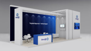
Our brand design agency is proud to unveil Adura, a bold new name and brand for a new joint venture between Shell and Equinor.
Brand Design Background
Shell and Equinor formed an Independent Joint Venture (IJV) to consolidate their North Sea energy operations. They faced a critical brand design challenge. How to establish credibility for a newly formed entity in an industry where heritage and track record are paramount to stakeholder confidence?
We developed a brand identity to project authority, safety, stability, and scale.
Creating the Brand Design
The name Adura, combines the “A” of Aberdeen with the “dura” of durability. This reflects the solid enduring granite geology that forms Aberdeen’s foundation and the new company’s commitment to the North Sea’s long-term economic future.
The visual identity works across extraordinary scale variations. From monolithic offshore oil rigs visible for miles at sea, to hard hats, safety equipment, digital favicons, and corporate communications. It speaks credibly to government regulators, reassures transitioning employees from two energy majors, and resonates with industry partners. As well as the Aberdeen community whose economy depends on North Sea operations.
Design Thinking
The Adura brand design system centres on a bold, confident logotype. As an established and experienced brand design agency we excel at creating custom-design logotypes. Adura balances industrial strength with modern precision. We compacted the letters deliberately to feel dense, to look rock solid, carved out of granite. Even the way the characters interlock reflects the name’s strength and resilience. Unlike its competitor brands, Adura has no brand icon, it stands strong, authoritative and confident.
Our wordmark employs geometric letterforms to suggest engineering excellence and structural integrity. These qualities are essential to offshore operations. The clean, contemporary character signals forward-looking capability.
In addition, Adura’s brand colour palette is inspired by the earthy tones of stratigraphy. A Scottish pulse of purple provides flashes of patriotic optimism and energy. This is in contrast to the competitor landscape, which is filled with blues (North Sea). Vivid and energetic colours are more typical brand palettes of the energy sector in general.
Brand Credibility
The identity successfully positions Adura as a credible player in the North Sea energy landscape. The visual language differentiates Adura within a crowded market of established players.
Few brand design agencies have the experience and skill to create a seriously strong brand design, for a serious infrastructure business built for long-term operations.
Designhouse has partnered with FTSE 250 companies and global enterprises for over 50 years, delivering strategic brand consultancy that creates measurable competitive advantage. If you’d like to discuss your brand challenges, we’d be glad to talk.
This year marks Designhouse’s 55th anniversary. More than half a century partnering with organisations to create brand work that drives business performance.
Origin Story
We started in 1970, when brand design meant typesetting, paste-up boards, and physical craftsmanship.
Through five decades, we’ve navigated every major shift in how brands are built and delivered; from desktop publishing in the 80s to digital transformation in the 2000s to AI-enabled design today.
But technology has never been the point. The point is what survives the technology changes.
Built to Last
Fuller’s Brewery still uses the brand identity we created in the early 1990s, thirty-something years ago. Not because we predicted design trends, but because we built it on strategic foundations that transcend fashion. When Michael, the man who commissioned that work, recently retired, the brand was still going strong. That’s what happens when you invest in design built on business strategy rather than commercial trends.
We’ve seen agencies chase every new tool and trend. Watched big-name studios prioritise principal celebrity over client outcomes. Seen consultancies deliver strategy decks that never get implemented.
Designhouse is an experienced brand design agency. We have always taken a different path: understand the business problem first, apply 55 years of tested experience, deliver work that performs in real markets with real stakeholders.
This longevity isn’t about nostalgia. It’s about earning trust through consistency. With clients like Vodafone, Shell, Centrica, EMCOR UK, and Springer Nature who return because the work delivers measurable value.
Future Proof
As we enter our sixth decade, the questions remain the same: Does this brand support business objectives? Will it work under competitive pressure? Can sales actually use it? Does it command the pricing power you need?
The tools change. The wisdom doesn’t.
Here’s to 55 years of brands built to perform, not just to impress.
Designhouse has partnered with FTSE 250 companies and global enterprises for over 50 years, delivering strategic brand consultancy that creates measurable competitive advantage. If you’d like to discuss your brand challenges, we’d be glad to talk.
Our Senior Designer, Al Connolly, was nominated to represent Creative Youth Charity at the King’s Garden Party hosted at Buckingham Palace.
The prestigious honour was bestowed for outstanding work in the community of South West London, showing incredible integrity and strong moral fibre from one of our key creatives in the team.
We are so proud to have one of our own recognised for contributions to support those with a tougher start than most, raising important funds to create outlets for young people to express themselves through the arts and challenging them to discover their passion and purpose through collaboration and expression.
Last week, the Designhouse team took a break from the studio. We were celebrating CEO Lavinia Culverhouse’s birthday with a visit to the Flowers exhibition at the Saatchi Gallery in Sloane Square.
With over 500 works spanning everything from botanical roots to the intersection of flowers and fashion, it was a rich and genuinely surprising day.
It is easy to underestimate how much time away from a screen can sharpen your thinking. Exhibitions like this one are a reminder that the strongest visual language often comes from nature. Form, shapes, colour – all things that nature designed long before brands existed. For those of us working in strategic brand design, that kind of reference point matters.
The best brand work does not emerge from a brief alone. It comes from people who are curious, who look broadly, and who bring a wider frame of reference to the table. Days like this are part of how Designhouse stays sharp.
Happy birthday, Lavinia, you deserve all the flowers.
It was a bloomin’ marvellous day!
Designhouse has partnered with FTSE 250 companies and global enterprises for over 50 years, delivering strategic brand consultancy that creates measurable competitive advantage. If you’d like to discuss your brand challenges, we’d be glad to talk.
Ever wondered how animated characters can evoke such deep and genuine connections with us?
The magic lies in an animator’s ability to breathe life and personality into not just characters, but even lines and shapes, transforming inanimate drawings, making them feel real and relatable. This skill is even more important in today’s digital and AI-driven world.
From the elasticity of squash-and-stretch movements to the tension built through anticipation, these subtle techniques create strong, visceral connections with the audience. When executed successfully, animation becomes a powerful tool for storytelling and your brand.
A telling stat from Raw Pictures outlines that viewers retain 95% of a message when received through a piece of video content, compared to 10% when reading a communication.
A substantial 71% of consumers are more likely to recommend a brand if they feel an emotional connection to it, emphasising the role of emotions in fostering brand loyalty.
In this article, we wanted to spotlight the following three principles:
Squash & Stretch
The Arc
Anticipation
By mastering these principles, our team crafts animations that do not just move, they resonate. From brand stories with a core heart to dynamic explainer videos communicating a mission, we create work that leaves a lasting impression and a strong identity.
Together with our client partners, we take initial concepts, brief in core values and purpose and deliver emotionally driven motion content that serves a greater purpose:
Squash & Stretch
The Squash & Stretch principle is a technique used to add movement, energy and character to motion.
This principle can be subtle whilst delivering a unique expression, giving text and visuals a sense of weight, flexibility and impact. The more natural and organic a movement feels, the more a brand can benefit from becoming more relatable and emotionally connected.
What feeling does this communicate?
Fluid, expressive motion enhances storytelling, allowing audiences to connect and relate to action and reaction. Whether it’s a squashed bouncing ball or a stretched font style, the Squash & Stretch principle can breathe life into a brand.
The Arc
Designhouse uses The Arc principle to ensure every movement feels fluid, natural and emotionally engaging. In real life, motion follows curved paths – not stiff, straight lines. By applying arcs to character actions, gestures and objects, we bring a sense of realism and flow to every frame.
How does this drive the narrative?
Animations feel lifelike, helping audiences connect emotionally with the story. From a subtle head tilt to a sweeping hand gesture, arcs add personality, believability and depth – turning movement into emotion.
Anticipation
At Designhouse, we use the Anticipation principle to construct stakes and a sense of immediacy and engagement in our motion work.
By building tension, the Anticipation technique keeps an audience hyper-focused and hanging on for the next movement, delivering impact and landing a message with gravitas.
What impact does this leave?
Anticipation goes beyond simply smoothing out motion – it builds excitement, tension and emotion, pulling audiences deeper into the narrative. It transforms basic movement into meaningful storytelling.
Don’t just move, connect
Together with Designhouse, create animations that don’t just move – they connect, allowing your brand identity to thrive and your mission to resonate.
FP Live, Financial Promoter’s annual conference, brought together senior figures from across asset management and financial services. The conversations oreflected a sector wrestling with some genuinely difficult questions about identity, differentiation and trust.
Designhouse Creative Director Peter Dobie joined Tom Lloyd, Ronjit Bose and Hannah Robinson on stage to discuss brand identity across audio, visual and emerging channels. It is a topic with real stakes in financial services. Brand recognition is hard-won and the pressure to modernise without alienating existing clients is constant.
The wider programme tackled the shifting dynamics of global asset management. As well as the growing tension between human-led creativity and automated content. And what it now takes to build a brand that can hold its own in a crowded market. None of these are abstract questions. For firms managing significant client relationships and long investment cycles, brand is increasingly a boardroom concern, not just a marketing one.
We understand the unique pressures the financial sector faces. Our work spans some of the most complex and regulated sectors in business. The themes at FP Live reinforced something we see with clients regularly. The firms that treat brand as a strategic asset rather than a communications afterthought are the ones better placed to compete. The conversation is evolving, and it is good to see the financial sector fully engaged in it.
Designhouse has partnered with FTSE 250 companies and global enterprises for over 50 years, delivering strategic brand consultancy that creates measurable competitive advantage. If you’d like to discuss your brand challenges, we’d be glad to talk.
What a thrilling night to be a brand and design agency!
We’re incredibly proud to have taken home five awards at the Transform Awards Europe 2025:
🏆 Silver | Bring Energy and Designhouse – Best Implementation of a Brand Development Project
🏆 Silver | Bring Energy and Designhouse – Best Naming Strategy (New Name)
🏆 Bronze | Loan Market Association (LMA) and Designhouse – Horizons Quarterly Publication – Best Brand Experience
🏆 Bronze | SRE Ltd and Designhouse – Best Visual Identity from the Property, Construction & Facilities Management Sector
🏆 Highly Commended | Bring Energy and Designhouse – Best Visual Identity from the Energy & Utilities Sector
There is a particular design challenge that comes with building a brand for a platform whose entire purpose is to remove bias. Get it wrong, and the identity undermines the proposition before a single conversation has taken place.
TalentMapper is an AI-powered talent management platform, seed-funded and founded by HR professionals. It is designed to remove bias. To ensure that skills and experience determine outcomes rather than personal attributes. DE&I has moved from aspiration to operational priority for HR teams. As a result, the demand for tools that make fairness systemic rather than dependent on individual judgement, has grown considerably. TalentMapper sits squarely in that space, and it is a crowded one.
We created a brand identity that could hold its own in a noisy market, without resorting to the same noise. The decision was deliberate. Where competitors reach for bold colour and assertive graphics to command attention, TalentMapper’s new identity plays it quieter. A softer palette, a restrained aesthetic, and a design system built around neomorphism principles. Silhouettes that appear to dissolve into the background, suggesting the kind of seamless, frictionless matching that the platform is designed to deliver.
The result is a brand that feels considered in a category that has often not been. Authenticity is difficult to fake in a market built around trust, and TalentMapper’s identity earns it by reflecting the values of the product rather than simply decorating them.
Designhouse has partnered with FTSE 250 companies and global enterprises for over 50 years, delivering strategic brand consultancy that creates measurable competitive advantage. If you’d like to discuss your brand challenges, we’d be glad to talk.
There is a particular design challenge that comes with building a brand for a platform whose entire purpose is to remove bias. Get it wrong, and the identity undermines the proposition before a single conversation has taken place.
TalentMapper is an AI-powered talent management platform, seed-funded and founded by HR professionals. It is built to ensure that skills and experience determine outcomes rather than personal attributes. DE&I has moved from aspiration to operational priority for HR teams. As a result, the demand for tools that make fairness systemic rather than dependent on individual judgement has grown considerably. TalentMapper sits squarely in that space, and it is a crowded one.
We created a brand identity to hold its own in a noisy market without resorting to the same noise. The decision was deliberate. Where competitors reach for bold colour and assertive graphics to command attention, TalentMapper’s new identity plays it quieter. A softer palette, a restrained aesthetic, and a design system built around neomorphism principles. Silhouettes appear to dissolve into the background, suggesting the kind of seamless, frictionless matching that the platform is designed to deliver.
The result is a brand that feels considered in a category that has often not been. Authenticity is difficult to fake in a market built around trust, and TalentMapper’s identity earns it by reflecting the values of the product rather than simply decorating them.
We loved working with TalentMapper, crafting a brand identity that puts people at the heart of talent management. Discover the new brand today here.
Designhouse has partnered with FTSE 250 companies and global enterprises for over 50 years, delivering strategic brand consultancy that creates measurable competitive advantage. If you’d like to discuss your brand challenges, we’d be glad to talk.
The Designhouse team visited the Lightroom in King’s Cross recently for Vogue: Inventing the Runway. It’s an immersive exhibition tracing the fashion show from the intimate couture salons of the early 20th century to the era-defining spectacles of recent decades. Narrated by Cate Blanchett, it is a genuinely compelling piece of experiential storytelling. With incredible Vogue archive featuring designers from Chanel and Dior to Vivienne Westwood and Maison Margiela,
Fashion Show as Brand Statement
What struck us was how clearly the exhibition frames the runway as a communications medium. It’s not just a vehicle for clothes. The show is where a designer’s identity is made legible. It’s where values, references and audience are declared season after season. In that sense, it is not so different from the work we do. Designers of all disciplines struggle with the question of how to make tangible something that is abstract. The challenge is to embody a vision, a set of values, a sense of who you are and who you are for, to make it visible and felt by an audience.
Authenticity is Always In style
The figure who stayed with the team longest was Patrick Kelly.
Born in Mississippi in 1954, Kelly became the first American admitted to the Chambre Syndicale du Prêt-à-Porter, the governing body of the French ready-to-wear industry.
His runway shows looked genuinely fun. Models sashaying and twirling, turning the catwalk into a party. The majority of his models were Black at a time when that was far from the norm.
His signature playful buttons were a direct reference to his grandmother, who mended his family’s clothing with mismatched buttons from her sewing basket. That detail matters: a brand rooted so specifically in personal history, translated into a visual language that was immediately recognisable, joyful and subversive all at once.
Kelly was extremely proud of his roots and culture. He actively incorporated his own background into his practice. And he merged the celebration of Black identity with a contemporary aesthetic. He built a brand with genuine conviction behind it. One that communicated something real rather than simply competing for attention. It is a lesson that transfers well beyond fashion.
Designhouse has partnered with FTSE 250 companies and global enterprises for over 50 years, delivering strategic brand consultancy that creates measurable competitive advantage. If you’d like to discuss your brand challenges, we’d be glad to talk.
Funds Congress is the definitive gathering of fund managers and asset allocators. It brings together top executives to tackle the most pressing challenges facing the asset management industry. From regulatory change and economic outlook to AI and digital distribution, it is all discussed in this forum. The event is one of the most senior conferences in the UK funds calendar. Recognised as Event-led Initiative of the Year at the Financial Promoter Awards 2024.
This year the visual identity running throughout, across the environment, signage and all event materials, is created by Designhouse.
Co-hosted by Carne Group, Dechert, PwC, and Euroclear, the challenge is to reflect the collaborative nature of four significant institutions coming together. To visualise this we use a gradient wave device and a clean typographic logo. This concept communicates connectivity and confidence. It presents the organisers as a unified proposition to an audience of over 1,000 senior delegates.
Seeing our work in place, at scale, and in context, is one of the more useful things a design team can do. A conference identity of this kind is not simply a backdrop. It sets the register of the whole day before anyone takes the stage, and in a sector where trust and credibility are foundational, the visual language carries real weight.
In asset management, trust is the product. Brand is how you build it.
Designhouse has partnered with FTSE 250 companies and global enterprises for over 50 years, delivering strategic brand consultancy that creates measurable competitive advantage. If you’d like to discuss your brand challenges, we’d be glad to talk.
The first weekend of the Six Nations delivered everything it usually promises. Kit design upgrades were in evidence across all the teams. France were imperious in Paris, Ireland edged a tight one in Dublin, and Scotland held off a determined Italy. But alongside the on-the-pitch kit and caboodle, there was a parallel conversation running, one that those of us in brand design found equally compelling.
Rebrand Reactions
The tournament rebranded to M6N ahead of its 25th anniversary in 2025. The new identity was developed by London creative agency How Now. It centres on a slanted, shiny wordmark rendered in a fiery orange gradient, chosen to channel warmth and optimism. The reaction, predictably, was split.
Fans compared it to everything from Mars bar branding to the credits of a 1996 comedy film. Others called it a necessary evolution. That kind of response is familiar to anyone who has worked through a major rebrand with a client. The logo lands first, stripped of context, and people react to a mark rather than a system.
Standing Strong In the Face of Criticism
Michael Ritson, Head of Marketing & Creative at Six Nations Rugby was clear on the intent. It is designed to create memory structures with the brand, attract younger fans, and build something that works as a digital-first identity. The men’s rebrand also aligns with the Women’s Six Nations identity launched in 2023. There is now a unified, intuitive naming structure across M6N, W6N and U6N. As a result, each stands on its own, while also remaining part of the same family.
Ritson’s response to the initial backlash was straightforward: trust the strategy, and see how it comes to life when the games kick off. That is sound thinking. A brand identity is not a logo on a white background. It is colour filling a stadium, players wearing it, broadcasters running it across millions of screens, supporters wrapping themselves in their nation’s colours. Seen in that context, across that first weekend, it worked. Brilliantly.
The Final Result
The M6N rebrand is a useful case study in one of the most consistent truths in brand design. Reaction at launch is rarely the measure of success. The measure is whether the identity holds, scales and builds meaning over time.
And this is most definitely a brand identity that earned its conversion.
Designhouse has partnered with FTSE 250 companies and global enterprises for over 50 years, delivering strategic brand consultancy that creates measurable competitive advantage. If you’d like to discuss your brand challenges, we’d be glad to talk.
Dh CEO, Lavinia Culverhouse, talks to Clare Dowdy at Design Week. about Internships. They discuss what design leaders look for when offering internships and employing young talent. Why it is important to support new talent by providing opportunities to gain industry experience, and how companies benefit from fresh perspectives and diverse backgrounds.
Designhouse is shortlisted in 5 categories at the Transform Europe Brand Awards 2025.
Our nominations include:
🏠 Best Brand Experience for the Loan Market Association (LMA) Horizons Quarterly Sustainable Finance Publication
🖌️ Best Visual Identity for evolving SRE Ltd’s core identity
🖋️ Best Brand Development, Best Naming Strategy and Best Visual Identity for our work on Bring Energy
We are also incredibly proud to celebrate our Strategy Director, Marina Guirey, nominated in the Brand Strategist of the Year category.
Designhouse has partnered with FTSE 250 companies and global enterprises for over 50 years, delivering strategic brand consultancy that creates measurable competitive advantage. If you’d like to discuss your brand challenges, we’d be glad to talk.
2024 was a year of considerable range for Designhouse. Across sectors, scales and briefs, the work reflected something consistent: that strong brand strategy, applied with rigour and creative conviction, produces results that matter beyond the studio. Here is some of what we are most proud of.
New Brands Built From The Ground Up
Bring Energy is a pioneer in city-scale sustainable heating and cooling. We handled naming, strategy and identity from scratch. The resulting brand centres on a multi-coloured palette. This reflects the diverse communities BE serves. The name is designed to do more than identify. The word “Bring”, embedded throughout messaging, gives the brand a conversational quality. As a result the brand name will drive communications for years to come.
For Gulf Oil, a brand with over 120 years of global history, we created something entirely new. Reviva, is a coffee brand extension launching into one of the most competitive consumer categories there is. We developed strategic positioning, naming and full identity. As a result, Reviva made its debut at the F1 Monaco Grand Prix. It has since secured partnerships with Swansea Football Club and the Raffles Hotel.
Established Brands Taken Forward
We worked with VEV, the fleet electrification company founded by Vitol, the world’s largest independent energy trading business. The output is a contemporary identity built around the interlocked EV letterform. The brand is designed to hold its own in a fast-developing and increasingly crowded sector. The project won at the Transform Awards in April. It was also recognised with a Bronze at The Drum Awards for Brand Development, where the client noted that we combine creative and digital expertise with a genuine sense of being part of their marketing team.
For Cruxy, a deep tech growth consultancy, we developed a brand around The Crux. This ident is a precision design device formed by two intersecting lines, anchored in an electric blue and acidic green palette. The brief demanded a visual language that matched their incisive, data-driven positioning for senior private equity audiences.
TalentMapper is an AI-powered talent management platform designed to eliminate unconscious bias. We built a brand around neomorphism principles and a deliberately restrained palette. This stands it apart from a noisy market by playing it quiet, and earning confidence in doing so.
Content That Makes The Case
The first edition of the Loan Market Association’s Horizons ESG publication gave us the opportunity to build a brand story around the LMA’s sustainability agenda, drawing on elemental imagery and a flowing design language to communicate a conservation mission in a sector too often dominated by technical language and dense regulatory copy. The work was shortlisted for Content Campaign of the Year at the Financial Promoter Awards, where Designhouse was also shortlisted for Design Agency of the Year.
Looking Ahead
In 2024, we worked across sectors. From energy infrastructure to fintech, consumer brand launches to financial services publications.
What 2024 demonstrated, perhaps more clearly than any single project, is that the principles of strategic brand design are not sector-specific. The thinking that goes into naming a sustainable energy business is not fundamentally different from the thinking required to launch a coffee brand at a Grand Prix, or to give a fintech firm the visual authority it needs in front of private equity. The problems are different. The discipline is the same.
Designhouse works across verticals by design, not by accident. Sector diversity keeps our thinking sharp, prevents the kind of category myopia that produces safe, predictable work, and means our clients benefit from a perspective that is genuinely broader than their immediate competitive set. A financial services brand can learn something from the energy sector. A consumer launch can inform how we approach a B2B identity. That cross-pollination is one of the less visible but most valuable things we bring to a brief.
Wherever the work takes us, the intention remains constant, and ROI is a given. Designhouse is where strategy takes shape.
Designhouse has partnered with FTSE 250 companies and global enterprises for over 50 years, delivering strategic brand consultancy that creates measurable competitive advantage. If you’d like to discuss your brand challenges, we’d be glad to talk.
In our latest #CreativeChat, designer Victoria H, curated an exhibition exploring the history of zines.
Zines often promote diversity and serve as catalysts for change, amplifying the voices of underrepresented and marginalised groups to bring fresh ideas into focus.
Inspired by this history, each member of the team crafted their own double page spread which were combined to become a Designhouse zine.
Today, we popped across to the Euston Foodbank to drop off some much-needed supplies for those who might go without this holiday season.
Our Designhouse team have been loading food items into our collection box this week as a small favour to help local people in crisis, hoping to provide some form of comfort this Christmas.
We also collected clothing items that seemed better passed to those battling the harsh conditions of winter.
A huge thank you to all the volunteers we interacted with today. You are nothing short of exceptional in your tireless work to better the circumstances of those who are struggling.
The annual awards celebrate female entrepreneurial success, and the achievements of female business owners, like Lavinia.
Everywoman is an expert in the advancement of women in business. For two decades they have hosted highly acclaimed events, elevating female role models and high-quality training programmes, helping to shape tomorrow’s leaders and their teams.
Their learning and development platform, the everywomanNetwork, has thousands of members in over 150 countries, enabling women and male ‘ambassadors of change’ to access first class development resources. The digital platform has been shown to have a positive impact on the way women view their own careers and future progression, whether that’s with their current employers or as entrepreneurs.
Matt Gillman has been at the heart of Designhouse for 10 years, helping steer our agency’s design and branding approach to achieve success for our clients.
He recently led the Cruxy rebrand, driving the creative solution for the tech specialists’ unique positioning. Check out our case study here.
Cheers to a decade of Designhouse brilliance, Matty!
Designhouse has completed a full brand refresh for OncoSil, a global medical device company at the forefront of pancreatic cancer treatment. Founded in 2004 and headquartered in Sydney, Australia, OncoSil has recently received regulatory approval in both Switzerland and Malaysia.
This marks a significant step in its international expansion. To reflect this growing global presence and cement its authority in oncology, a refreshed brand was required.
The brief called for a more dynamic identity that balanced scientific rigour with human warmth. Designhouse evolved the existing brand assets, introduced a refined colour palette of dark navy and electric blue to convey trust and transformation, and adopted the semi-condensed typeface FS Industrie for its clean, technical quality. A new strapline, “Targeted Approach, Positive Impact,” was developed to anchor the brand’s refreshed direction.
The work extended well beyond visual identity. We produced a new
website
social media assets,
exhibition graphics
corporate literature
a suite of video content, including mode of action and dose preparation films tailored for healthcare professionals.
annual report
radiation safety guidelines
corporate brand film to introduce the new identity to employees and external stakeholders
OncoSil’s Marketing Director, Cynthia Azucena, noted that Designhouse delivered creative work and well-considered strategic input, with the new identity effectively capturing the company’s human-centric approach to pioneering science.
Designhouse has partnered with FTSE 250 companies and global enterprises for over 50 years, delivering strategic brand consultancy that creates measurable competitive advantage. If you’d like to discuss your brand challenges, we’d be glad to talk.
In fintech and deep tech, precision is everything. Your brand needs to work just as hard as your data. It must communicate authority and sharpness before a single word is read. That is a brief Designhouse knows well.
When Cruxy came to us, they had a powerful proposition. As deep tech specialists, they operate a proprietary data engine, Cortex. They map over two billion market data points to identify fast, precise opportunities for growth. The challenge is translating that rigour into a visual identity that senior executives would instantly trust and respect.
The answer came from the heart of the brand itself. We developed ‘The Crux’. This design device is built from two intersecting lines, expressing the pinpoint accuracy and absolute precision that defines how Cruxy works. Paired with an electric blue and acidic green palette, the identity carries genuine energy without sacrificing credibility. Bold, but disciplined. Distinctive, but purposeful.
The tone of voice followed the same logic. Cruxy speaks with authority while actively challenging convention. Black-and-white imagery set against vivid colour delivers a confident contrast. Cruxy is not just another data provider, but a sharp and exacting partner for leaders who demand more.
The result is a brand that looks and sounds exactly like what Cruxy is: incisive, rigorous, and built for the top of the market.
To see how the identity came together across every touchpoint, take a look at the full case study.
Designhouse has partnered with FTSE 250 companies and global enterprises for over 50 years, delivering strategic brand consultancy that creates measurable competitive advantage. If you’d like to discuss your brand challenges, we’d be glad to talk.
“Art (Design) is not what you see, but what others make you see.”
Edgar Degas
This morning, Designhouse welcomed Björn Altmann, graphic designer, illustrator and typographer, for one of our Creative Chat sessions, and it was a genuinely inspiring start to the day.
Björn shared his latest publication, Manhole Covers of the World, produced in collaboration with Swiss publisher Niggli AG.
The book is exactly as it sounds, and all the better for it. A meticulous, visually arresting catalogue of manhole cover designs drawn from over 80 countries, presented through 170 crisp white-on-black illustrations.
The result is a quietly extraordinary object, one that reframes something entirely overlooked as a lens through which to explore culture, craft and civic identity.
The conversation that followed was rich. Björn spoke openly about the process behind the project, a creative journey that unfolded over two decades.
From the earliest concept through to finished publication, the commitment required to see something so singular all the way through was not lost on anyone in the room. This is the kind of labour of love that rarely gets made, and even more rarely gets made well.
What struck the team most was the discipline behind it. Twenty years of due diligence. Quietly building something with rigour and curiosity, without losing sight of what made the idea worth pursuing in the first place. It served as a timely reminder of the value of following a creative instinct through, however long the road.
We’re grateful to Björn for sharing his time and his thinking with us. Sessions like these are part of what makes Designhouse the place it is.
Designhouse has partnered with FTSE 250 companies and global enterprises for over 50 years, delivering strategic brand consultancy that creates measurable competitive advantage. If you’d like to discuss your brand challenges, we’d be glad to talk.
Designhouse are delighted to announce that we were awarded Design Agency of the Year last night at the Financial Promoter Awards in London.
We were also awarded Highly Commended for Content Campaign of the Year for our quarterly online publication, Horizons, for the Loan Market Association (LMA), offering thought-provoking commentary on sustainable finance
We could not have won these awards without the dedicated support of our clients who make it all possible and of course, without the hugely talented team we have here at Designhouse.
Designhouse creates strategic brand systems that maintain coherence across visual, digital, and informational touchpoints. We design for humans and the AI agents increasingly shaping how expertise gets discovered.
We are getting excited in the studio as we countdown to the Financial Promoter Awards tonight.
Designhouse is shortlisted for Design Agency of the Year, as well as our work on the Loan Market Association (LMA) Horizons ESG publication in the Content Campaign of the Year nominees.
With a refreshed visual identity, Cruxy can now demonstrate how they operate, cutting through the noise to deliver real impact for B2B tech enterprises, with acidic green and electric blue colours to provide a striking and incisive visual experience.
Keep an eye out for our next update to discover how we approached the brand refresh to reflect Cruxy‘s positioning as growth intelligence specialists. Whilst you wait, discover their re-energised website
Designhouse creates strategic brand systems that maintain coherence across visual, digital, and informational touchpoints. We design for humans and the AI agents increasingly shaping how expertise gets discovered.
We are pleased to share our latest conference branding work for the Loan Market Association (LMA), which recently featured in their annual conference in London, the biggest of its kind in Europe.
This year, over 800 in-person & 500 virtual delegates had the opportunity to engage and network with industry-leading speakers and draw insights on the current & future projections of the Loan Market.
The goal was to create a concept that positioned The LMA as ‘Representing All The Loan Markets’.
The creative execution brought the vastness of the cosmos to life with a visually striking and all-encompassing design featuring a vibrant colour palette and dynamic graphic device.
The tagline “Further Together”, reinforced the industry’s collaborative, ever-expansive nature and positioned the LMA as a leading advocate for the collective growth of its partners.
It was amazing seeing the identity across various digital, animated and printed mediums within the QEII Centre and online through their streaming platform.
Designhouse creates strategic brand systems that maintain coherence across visual, digital, and informational touchpoints. We design for humans and the AI agents increasingly shaping how expertise gets discovered.
Designhouse conceived and created a revitalised brand identity to help portray SRE Ltd’s vision within the build environment consulting sector, reimagining their visual devices and communication to help “Build a Sustainable Future.” See here > https://www.sre.co.uk/
The new brand rollout included a modernised website, engaging social media content, eye-catching event banners, branded merchandise and professional PowerPoint templates.
Our team visited Deutsche Numis at their Gresham Street offices, right in the city’s heart looking over St Paul’s, to film content to support their latest Raised in London campaign…
Designhouse is excited to unveil AMPYR Solar Europe‘s new look identity and website, a dynamic and radiant depiction of their alternative energy solutions
Our brief was to reflect AMPYR Solar Europe’s conscious effort to support landowners and farming communities by offering sustainable power solutions for their land. We hope you agree that the bright and warm palette, coupled with the radiant animated visual device, conveys growth and vitality…
It’s great to see Westminster City Council getting recognition for their efforts in Central London to protect the vulnerable here.
Designhouse devised the name and identity ‘Night Stars’ to represent the idea of stars guiding the vulnerable back home at night. The dynamic neon pink identity ensured visibility and individuality…
As the Paris 2024 Olympic Games come to a close, we wanted to share some Designhouse Olympic history.
In 2005, the then President of the IOC, Jacques Rogge, announced that London would host the Games for a third time.
To commemorate the greatest sporting spectacle on earth returning to the capital, we were delighted to collaborate with Nick Knight on a range of Royal Mail stamps.
These designs demonstrate how creativity and athleticism can come together to showcase something beautiful and inspirational, not to mention the power that branding has to represent elite sportsmen and women and frame record-breaking triumphs…
It pays to kick off a midweek morning with some creative inspiration!
Our Design Director, Matt Gillman, attended an insightful discussion at The Drum Labs yesterday, with the Creative Editor of The Drum, Tom Banks, presenting a new strategic design direction for the namesake’s publication.
At Designhouse, we believe in supporting young people as they take their first steps in the design industry. We are proud that over the last five decades, many students have had their introduction to studio life with us.
The Designhouse gang enjoyed a brilliant summer party on Friday at Denbies Wine Estate Limited in Dorking 🍷🍾🥂🌞
The rain held off as we experienced a fantastic tour of the vineyard grounds and factory, tasting the delicious selection of wines on offer and learning about the history of the grounds, local wine regions and the fermentation process.
We played bowls on the lawn, quizzed, drew our Euros Sweepstake and had lots of laughs.
To celebrate our team’s passion for creativity, we introduced our inaugural poster competition! The theme this month was #Inspiration, one of the Designhouse core values.
Take a look at our first & second place winners and the thinking behind them here.
In honour of Real Madrid C.F. winning the UEFA Champions League Final, the guys and girls at Designhouse decided to highlight the power of creativity and branding in elite-level sport with our very own Football Shirt Friday ⚽
Branding has the power to transcend culture, with our favourite teams’ logo and colour identity recognisable all over the globe!
We were delighted to have been featured in Creativepool’s recent editorial, on our work on the Bring Energy brand! Check it out here.
Our Design Director, Richard Debenham, spoke to creating a new brand name and visual identity for Bring Energy, developing the strategy, naming & positioning of the creative concepts and championing them through delivery, reflecting Bring Energy’s commitment to pioneering low-carbon heating and cooling solutions for cities across the UK.
We are all delighted to celebrate the launch of Bring Energy, a visionary brand dedicated to transforming the energy sector in the UK > https://bringenergy.com/
Through our brand strategy, naming & positioning to the creative concepts and delivery, every detail has been meticulously designed to reflect Bring Energy’s commitment to pioneering low-carbon heating and cooling solutions for cities across the UK.
Bold, colourful iconography forms the backbone of the design language, providing the brand with real differentiation within the sector. The multi-coloured palette reflects the diverse communities both residential and commercial that Bring Energy serves.
Our team had a fantastic night celebrating all things brand design and were delighted to win an award for the brand identity we developed for VEV at the Transform magazine awards!
We’re proud to be part of such an exciting and vibrant industry, here’s to evolving brands to shape the future 🥂
Congrats to ROLEX and their agency for their new campaign celebrating colour and the intrinsic part it has played in defining their brand.
Their iconic green seal, established in 2015, characterises watchmaking excellence and the precision, durability and reliability of their craftsmanship.
Never underestimate the power of colour as a core component of your brand, delivering cut-through in a sea of messages and images.
We are excited to showcase our latest work on the first issue of the LMA Horizons ESG for Spring 2024, to which you can now subscribe below: https://lnkd.in/eE4FPaa7
Our team drew inspiration from the shifting tides of sustainable lending, wanting to incorporate elemental imagery and a flowing brand device which presents the natural beauty in vast landscapes and terrain, driving home the importance of large-scale change to help protect it.
In a sea of protocols and a rapidly evolving regulatory ecosystem, we are helping the Loan Market Association (LMA) communicate the bigger picture to their members by delivering a brand story worthy of its conservation mission.
We attended Rhotic Media‘s Finance Promoter Live as a proud event sponsor. A huge thank you to the Rhotic Media team for organising such an engaging day, bringing together forward-thinking financial marketers.
With our sector experience, we recognise the importance of storytelling in building a strong brand narrative that cuts through crowded marketing communications.
Part of Hartree Partners, Vertree provide companies with high-impact solutions to achieve net zero emissions.
A fantastic collaboration with Lucy Haines MSc PIEMA, Perla Hilario Almonte and team on an optimised user experience, design and build that engages visitors with a simple way to discover more information about their services.
We’re excited to share the British Gas Business and Centrica Business Solutions global reports which have now gone live!
These reports address important issues businesses should be acting on to meet their net zero and sustainability goals. With increasing pressure from all stakeholders, now is a more important time than ever to invest in your sustainability.
Check out our work for the Loan Market Association (LMA) Syndicated Loans Conference that took place at the Queen Elizabeth II Centre in London yesterday!
Every year, the team at LMA host their annual conference with over 800 delegates, the event offers a platform for discussing industry challenges and collaboratively pinpointing solutions as well as determining the best path forward.
We created a suite of deliverables including the conference theme, event stands, banners, merchandise, lunch and cocktail menus and signage.
If you would like to know more about how we can help elevate your event, do reach out to us at dh@designhouse.co.uk
This week we’re excited to share the ‘Gabrielle Chanel. Fashion Manifesto’ exhibition.
This exhibition pays tribute to Gabrielle Chanel’s profound influence on fashion. Highlighting an array of significant Chanel pieces, including an early surviving garment from 1916, ensembles tailored for Hollywood luminaries Lauren Bacall and Marlene Dietrich, an early groundbreaking evening trouser ensemble by Chanel, and selections from Chanel’s final collection in 1971.
Delving into the designer’s trajectory from the launch of her inaugural millinery boutique in 1910 to her ultimate collection in 1971, the exhibition will dissect how Chanel’s own individual style informed her creations, consequently revolutionizing women’s attire forever. While the era was characterized by corsets and voluminous skirts, epitomized by Christian Dior’s ‘New Look’, Chanel drew inspiration from menswear, particularly the attire worn by the British upper class during their sporting weekends in the countryside. She seamlessly integrated many of these menswear elements into her designs, employing tweed and wool, and popularizing trousers and knitwear for women.
Head over to the Victoria and Albert Museum this weekend to check out the first UK retrospective of Chanel’s work!
This week, we’re thrilled to share the “Colors Festival: A Symphony of Hues” exhibition!
Immerse yourself in a vibrant world curated with the brilliance of colors, all brought to life by a diverse array of artists and creators.
From breathtaking installations to interactive workshops, this exhibition promises an unforgettable journey through the spectrum of human expression.
Whether you’re an art enthusiast, a culture seeker, or simply looking for a day filled with creativity and inspiration, the Colors Festival caters to all! 🌟
Head over to Camden this weekend to experience it for yourself!
This week we’re excited to share a Tate Modern exhibition on contemporary African photography!
‘A world in common’ is in London to celebrate Africa’s diverse culture and history, portrayed in photography, audio and film! The exibition explores how images travel through time, creating a beautiful mixture of historic elements weaved in contemporary art.
The exhibition is open to visitors from 6 July 2023 until 14 January 2024, at the Tate Modern Gallery in Banskide London.

 TeamLab Borderless, Tokyo
 Wes Anderson at the Design Museum
 Inside Aardman at the Young V&A
 It was Just An Accident
 Oceanographic Museum, Monaco
 Marilyn Monroe: A Portrait, National Portrait Gallery
 David Hockney, “A Year in Normandie” at the Serpentine
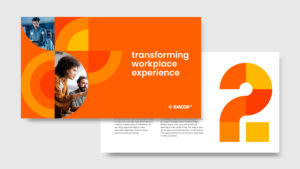
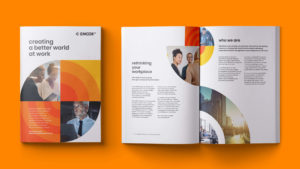
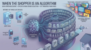
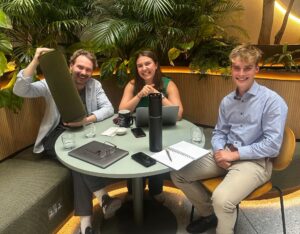
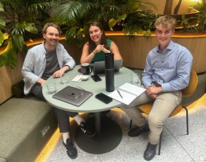
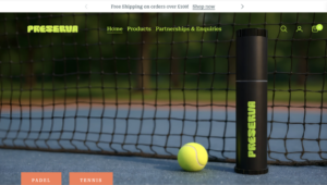


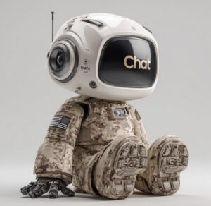


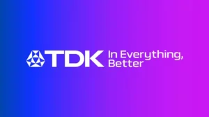


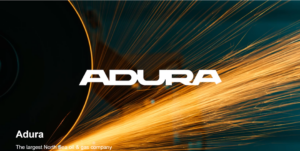


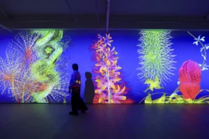
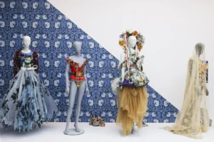
 Happy birthday, Lavinia, you deserve all the flowers.
 The figure who stayed with the team longest was