Designing Without Bias: The Brand Strategy Behind TalentMapper

There is a particular design challenge that comes with building a brand for a platform whose entire purpose is to remove bias. Get it wrong, and the identity undermines the proposition before a single conversation has taken place.

TalentMapper is an AI-powered talent management platform, seed-funded and founded by HR professionals. It is designed to remove bias. To ensure that skills and experience determine outcomes rather than personal attributes. DE&I has moved from aspiration to operational priority for HR teams. As a result, the demand for tools that make fairness systemic rather than dependent on individual judgement, has grown considerably. TalentMapper sits squarely in that space, and it is a crowded one.

We created a brand identity that could hold its own in a noisy market, without resorting to the same noise. The decision was deliberate. Where competitors reach for bold colour and assertive graphics to command attention, TalentMapper’s new identity plays it quieter. A softer palette, a restrained aesthetic, and a design system built around neomorphism principles. Silhouettes that appear to dissolve into the background, suggesting the kind of seamless, frictionless matching that the platform is designed to deliver.

The result is a brand that feels considered in a category that has often not been. Authenticity is difficult to fake in a market built around trust, and TalentMapper’s identity earns it by reflecting the values of the product rather than simply decorating them.

Read the full case study here


Designhouse has partnered with FTSE 250 companies and global enterprises for over 50 years, delivering strategic brand consultancy that creates measurable competitive advantage. If you’d like to discuss your brand challenges, we’d be glad to talk.

Contact us

TalentMapper: A Brand Without Bias

There is a particular design challenge that comes with building a brand for a platform whose entire purpose is to remove bias. Get it wrong, and the identity undermines the proposition before a single conversation has taken place.

TalentMapper is an AI-powered talent management platform, seed-funded and founded by HR professionals. It is built to ensure that skills and experience determine outcomes rather than personal attributes. DE&I has moved from aspiration to operational priority for HR teams. As a result, the demand for tools that make fairness systemic rather than dependent on individual judgement has grown considerably. TalentMapper sits squarely in that space, and it is a crowded one.

We created a brand identity to hold its own in a noisy market without resorting to the same noise. The decision was deliberate. Where competitors reach for bold colour and assertive graphics to command attention, TalentMapper’s new identity plays it quieter. A softer palette, a restrained aesthetic, and a design system built around neomorphism principles. Silhouettes appear to dissolve into the background, suggesting the kind of seamless, frictionless matching that the platform is designed to deliver.

The result is a brand that feels considered in a category that has often not been. Authenticity is difficult to fake in a market built around trust, and TalentMapper’s identity earns it by reflecting the values of the product rather than simply decorating them.

We loved working with TalentMapper, crafting a brand identity that puts people at the heart of talent management. Discover the new brand today here.


Designhouse has partnered with FTSE 250 companies and global enterprises for over 50 years, delivering strategic brand consultancy that creates measurable competitive advantage. If you’d like to discuss your brand challenges, we’d be glad to talk.

Contact us

2024 Review

2024 was a year of considerable range for Designhouse. Across sectors, scales and briefs, the work reflected something consistent: that strong brand strategy, applied with rigour and creative conviction, produces results that matter beyond the studio. Here is some of what we are most proud of.

New Brands Built From The Ground Up

Bring Energy is a pioneer in city-scale sustainable heating and cooling. We handled naming, strategy and identity from scratch. The resulting brand centres on a multi-coloured palette. This reflects the diverse communities BE serves. The name is designed to do more than identify. The word “Bring”, embedded throughout messaging, gives the brand a conversational quality. As a result the brand name will drive communications for years to come.

For Gulf Oil, a brand with over 120 years of global history, we created something entirely new. Reviva, is a coffee brand extension launching into one of the most competitive consumer categories there is. We developed strategic positioning, naming and full identity. As a result, Reviva made its debut at the F1 Monaco Grand Prix. It has since secured partnerships with Swansea Football Club and the Raffles Hotel.


Established Brands Taken Forward

We worked with VEV, the fleet electrification company founded by Vitol, the world’s largest independent energy trading business. The output is a contemporary identity built around the interlocked EV letterform. The brand is designed to hold its own in a fast-developing and increasingly crowded sector. The project won at the Transform Awards in April. It was also recognised with a Bronze at The Drum Awards for Brand Development, where the client noted that we combine creative and digital expertise with a genuine sense of being part of their marketing team.

For Cruxy, a deep tech growth consultancy, we developed a brand around The Crux. This ident is a precision design device formed by two intersecting lines, anchored in an electric blue and acidic green palette. The brief demanded a visual language that matched their incisive, data-driven positioning for senior private equity audiences.

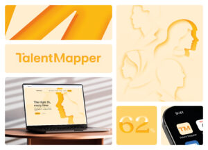
TalentMapper  is an  AI-powered talent management platform designed to eliminate unconscious bias. We built a brand around neomorphism principles and a deliberately restrained palette. This stands it apart from a noisy market by playing it quiet, and earning confidence in doing so.


Content That Makes The Case

The first edition of the Loan Market Association’s Horizons ESG publication gave us the opportunity to build a brand story around the LMA’s sustainability agenda, drawing on elemental imagery and a flowing design language to communicate a conservation mission in a sector too often dominated by technical language and dense regulatory copy. The work was shortlisted for Content Campaign of the Year at the Financial Promoter Awards, where Designhouse was also shortlisted for Design Agency of the Year.


Looking Ahead

In 2024, we worked across sectors. From energy infrastructure to fintech,  consumer brand launches to financial services publications.

What 2024 demonstrated, perhaps more clearly than any single project, is that the principles of strategic brand design are not sector-specific. The thinking that goes into naming a sustainable energy business is not fundamentally different from the thinking required to launch a coffee brand at a Grand Prix, or to give a fintech firm the visual authority it needs in front of private equity. The problems are different. The discipline is the same.

Designhouse works across verticals by design, not by accident. Sector diversity keeps our thinking sharp, prevents the kind of category myopia that produces safe, predictable work, and means our clients benefit from a perspective that is genuinely broader than their immediate competitive set. A financial services brand can learn something from the energy sector. A consumer launch can inform how we approach a B2B identity. That cross-pollination is one of the less visible but most valuable things we bring to a brief.

Wherever the work takes us, the intention remains constant, and ROI is a given. Designhouse is where strategy takes shape.


Designhouse has partnered with FTSE 250 companies and global enterprises for over 50 years, delivering strategic brand consultancy that creates measurable competitive advantage. If you’d like to discuss your brand challenges, we’d be glad to talk.

Contact us

Reboot’s bold new brand identity

Designhouse worked with Reboot, a nonprofit organisation dedicated to driving racial equality in the financial services sector. We created a vibrant new brand identity. The project was on a pro-bono basis, reflecting our commitment to using creative expertise in support of meaningful social change.

Background


Reboot’s mission is to educate business leaders in financial services; to provide a platform to build a more diverse and inclusive workplace. It does this by raising visibility of the challenges faced by ethnic minority professionals. Predominantly using the power of storytelling to bring individual experiences into the mainstream conversation.

Central to Reboot’s approach is its ambassador network. Support comes from senior figures from some of the most prominent names in the industry, including State Street, Numis, BlueBay Asset Management, Invesco, GIC and MFS Investment Management. These voices lend credibility and reach to Reboot’s campaigning, engaging business leaders who have the power to drive meaningful change.

Alongside this advocacy work, Reboot produces research to underpin its messaging. Its flagship annual Race to Equality report tracks and highlights trends around discrimination in the UK workplace. It offers data-driven insight that sits alongside the personal stories at the heart of the organisation’s identity. By combining lived experience with robust evidence, Reboot is able to push for progressive change in a way that resonates both emotionally and professionally.

Attention-grabbing  Identity


The new visual identity created by Designhouse reflects the energy and ambition Reboot’s mission.

The brand mark symbolises positive change. Bold, punchy design choices capture attention and motivate action. At the centre of the identity is a clear call to action: “It’s time to switch the narrative”. This strapline  encapsulates Reboot’s determination to reshape the conversation around race and opportunity in financial services.

For Designhouse, the strategic thinking behind the identity is as important as the visual execution. The aim is to resonate with business leaders, encouraging active involvement rather than passive observation. Every element of the design is considered in terms of how it will inspire engagement; from the colour palette to the typography and overall tone of the brand.

The partnership is a strong example of how design and brand strategy can serve a purpose beyond commerce. The right brand identity adds weight and credibility to organisations working on issues that matter. For Reboot, a compelling and professional identity helps ensure that its message is heard at the right levels. It givesthe organisation the visual authority to sit alongside the major institutions it seeks to influence.

Designhouse continues to work with clients across sectors where brand strategy and design thinking can make a genuine difference.


Designhouse has partnered with FTSE 250 companies and global enterprises for over 50 years, delivering strategic brand consultancy that creates measurable competitive advantage. If you’d like to discuss your brand challenges, we’d be glad to talk.

Contact us