What is the brand story behind the largest IPO in history, and what is stopping your organisation from getting there? Maybe less than you think…
In June 2026, SpaceX went public at a valuation near $1.8 trillion. This is a company that posted a net loss the year before. So what was driving the valuation? Investors were pricing in the strategy. And this is how it works…
The value add
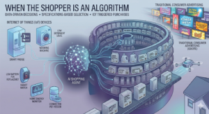
SpaceX is the headline act in a wider portfolio that could hardly be more disparate. Moon rockets and inter-planetary spacecraft; satellite internet through Starlink; social media platform X; the Grok AI engine; and even facilities management.
A single stated worldview holds them all together. And that is a future that is multiplanetary, sustainable and AI-powered, framed throughout as work for the good of humanity. Starlink funds the rockets. The rockets carry the mission. Each venture earns its place by advancing the same idea, so the parts compound rather than compete. Whatever you think of Elon Musk, the clarity is the asset, and the market has put a price on that clarity.
Clarity is the gold standard. The more common business reality looks much more brassy.
The complexity cost, or when 1+1=0.25
We are often brought into complex organisations where nobody can articulate the business strategy, and thus nobody can articulate a brand strategy. When the commercial direction is unspoken, the brand has nothing to give shape to, and every decision after that is amorphous and disparate.
Brand gets treated as a cosmetic wrapper. The assumption is that audience understanding will assemble itself through repeated tactical exposure. Brand equity built like that is vapour thin. And it evaporates the moment the activation stops.
The most insidious erosion happens when an organisation sees itself as a federation of sub-brands. Each sub-brand with its own audience, culture and budget. The assumption being that a single-mission-led voice is beyond reach. Well, not according to SpaceX.
In a fragmented business, 1+1 makes something closer to 0.25. Each sub-brand spends to build its own corner, none of it accrues to the parent. Audiences see a scatter of unrelated signals where there should be one organisation worth considerably more than the sum of its parts (hello again SpaceX).
The market has started to price that cost in the open. The 2025 and 2026 wave of corporate breakups, from Kraft Heinz to Honeywell, is a public admission that brand complexity without coherence erodes value. Brand focus is what releases it.
Business first, brand second
The route through is sequential, and the sequencing is crucial.
Business strategy first, so the organisation knows what it is trying to achieve.
Brand strategy next, so that intent takes a form audiences recognise.
Then an architecture that lets each sub-brand borrow equity from the parent and give it back, so the parts strengthen the whole and the whole lifts the parts.
Scale comes from coherence, from every pound and every message pulling in the same direction.
Discipline pays
SpaceX shows what a clearly held mission allows. It can absorb disparate acquisitions because every deal is narrated back to the same idea: compute feeding models feeding applications feeding the multiplanetary, AI-powered future. That is brand discipline. And the IPO shows how it has been used to create record-breaking value.
Brand investment is a business decision, and we treat it like one. At Designhouse we can help you define your strategy, then make that strategy take shape, so you have a brand strategy and a brand that drives ROI across your entire business landscape.
The trillion-dollar insight is business clarity, not rocket science!
written by Sam Steele, Marketing and Communications Director, FCIM
Designhouse has partnered with FTSE 250 companies and global enterprises for over 50 years. We also work with start ups and scale ups to create brand identities that can grow with their business. If you’d like to discuss your brand challenges, we’re ready to talk.